Premium rum brand Zacapa was looking for a typeface that worked as a holistic typographic system. The new custom font had to be friendly yet retain the boldness and antique flavour that hints at Zacapa’s provenance.
Brief.
The world's largest producer of spirits, Diageo, approached Fontsmith for help with its subtle overhaul of Zacapa's branding. The premium rum brand, which is produced in Guatemala, was already working with London-based agency Studio Something on the brand refresh, and was looking for a typeface that worked as a holistic typographic system.
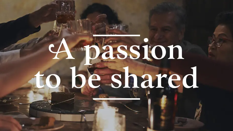
The Zacapa team in partnership with the core agencies had found the current array of fonts used across the Zacapa brand to be disjointed and confusing, and wanted to use type to unify the brand and its assets. The font had to be premium but friendly; and create a flexible, ownable asset for Zacapa that succinctly conveyed its unique tone of voice – bringing a new flavour to a classic typeface style.
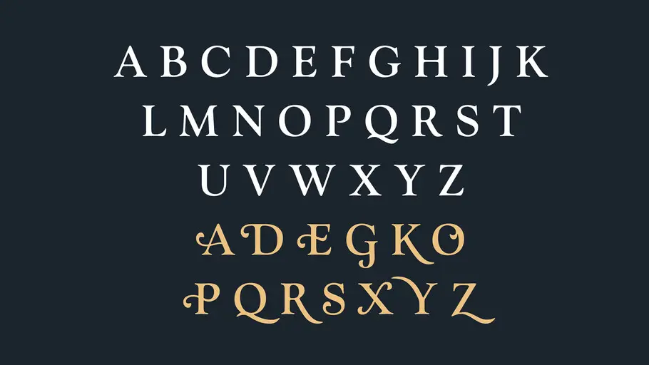
The client wanted to use a typeface within the family of Old Style serif typefaces, and had initially been considering existing fonts like Goudy Old Style and Bembo. Fontsmith’s approach was to take this style – characterised by angular stresses but with a slightly “off” aesthetic that bears a more human look and feel, following more calligraphic principles than a transitional typeface – and create something warmer and friendlier for the brand.
Approach.
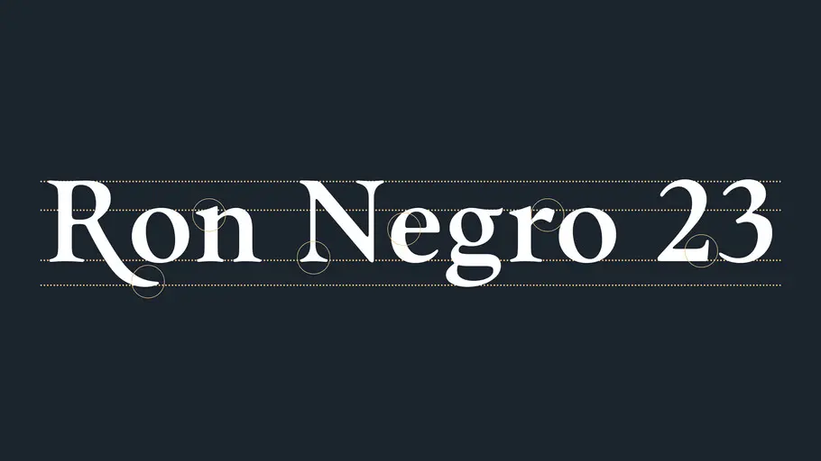
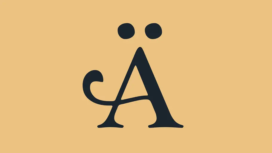
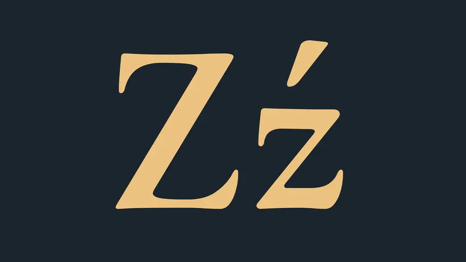
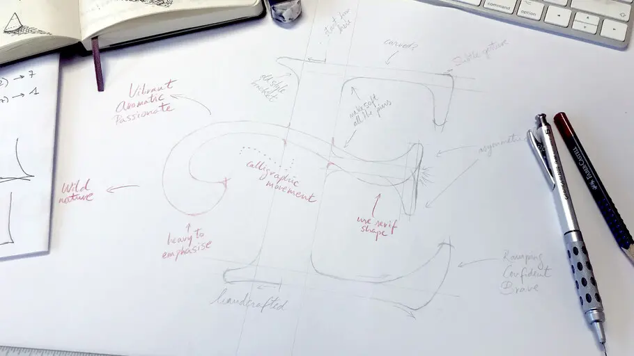
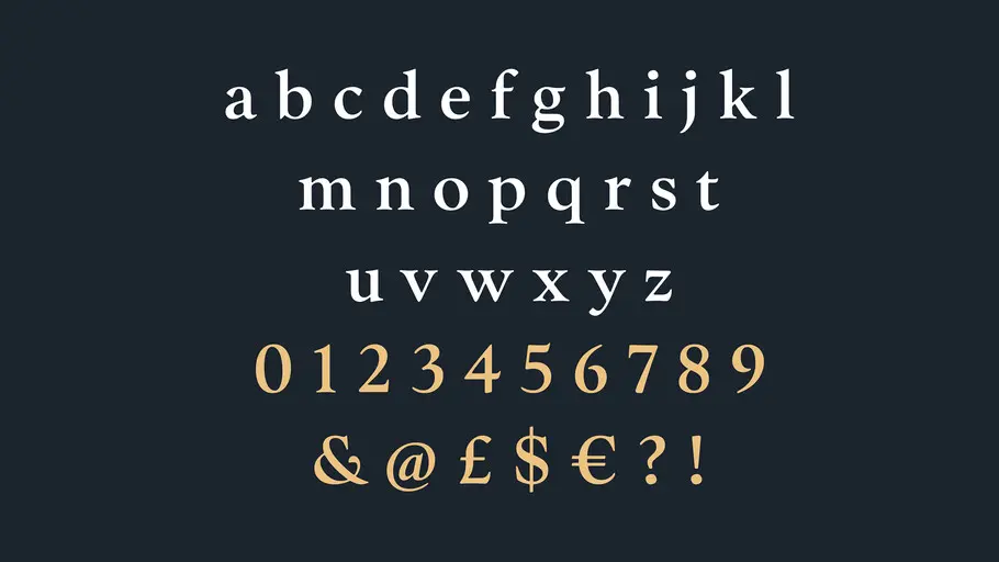
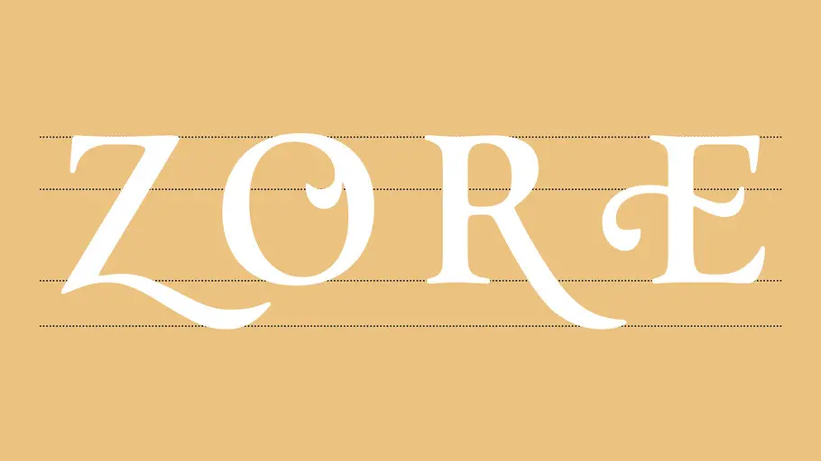
We used a number of “swashes” on uppercase characters in designing the new Zacapa font, creating a sense of playfulness and drama to individual letterforms and bringing in a sense of the brand’s heritage through designs that hint at Latin rhythm, flavour and spirit. Such swashes are particularly dramatic on characters like the “Z”, “X” and “R”, and on the cross bar of the “E”. The “J” is also notable for the way it displays beneath the base line. Wide tracking was used on the headline to give a sense of a premium look and feel for the brand.
Fontsmith’s lettering built on Zacapa's incumbent designs with such swashes, and unified the approach to drawing them across the entire character set. While retaining a sense of playfulness and rhythm, Fontsmith went through multiple rounds of revisions on a few of the shapes to ensure that the new Zacapa typeface was elegant in the way the lines were drawn and the contrast between the characters. One of the main challenges in the design process was in making room for newer characters, like the @ sign, yet retain the boldness and antique flavour that hints at Zacapa's provenance.
Results.
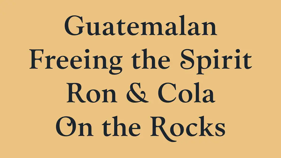
The project was initially focused on creating a display font with all uppercase characters, but while this worked well on larger touchpoints and on the product itself, it was too heavy for marketing online. To give the typeface space to live and breathe, a lower case was developed for the brand’s applications across smaller platforms.
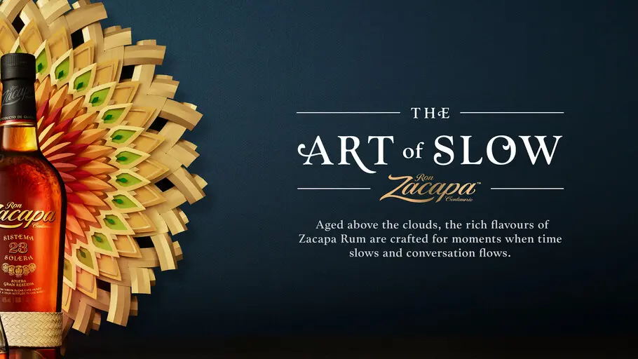
Thanks to Fontsmith’s work, Zacapa now has a solid asset it can rely on as part of its wider toolkit. Using Zacapa Headline means the brand can now easily use the typeface across numerous touchpoints including product packaging, posters and digital marketing; and it really comes to life across its slogans, such as “the art of slow”. Creating the typeface also means Zacapa is free to distribute the font to suppliers with no restrictions. The font is a beautiful part of a considered, consistent look and feel for the brand. The new, bespoke typeface was built entirely from scratch, and delivered with a fast turnaround to ensure completion to a tight deadline.