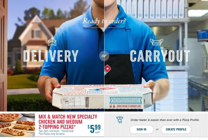
Domino’s Pizza Press
Created in response to a Crispin Porter + Bogusky brief for Domino’s, Weinzierl was tasked with creating a typeface that would introduce a ‘contemporary’ feel, while working alongside the Trade Gothic® design already in use.
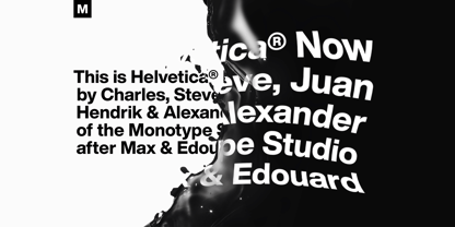
The Helvetica Now Font Family was designed by and published by Monotype. Helvetica Now contains 96 styles and family package options.
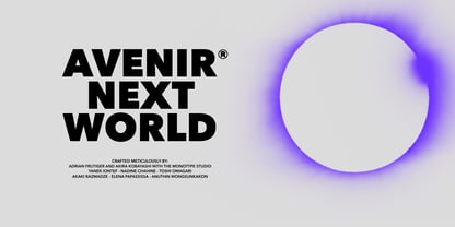
The Avenir Next World Font Family was designed by and published by Linotype. Avenir Next World contains 20 styles and family package options.
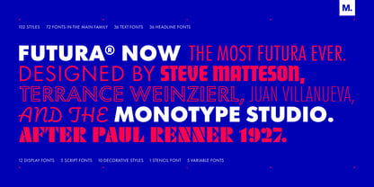
The Futura Now Font Family was designed by and published by Monotype. Futura Now contains 102 styles and family package options.
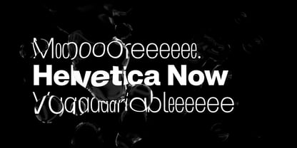
The Helvetica Now Variable Font Family was designed by and published by Monotype. Helvetica Now Variable contains 2 styles and family package options.
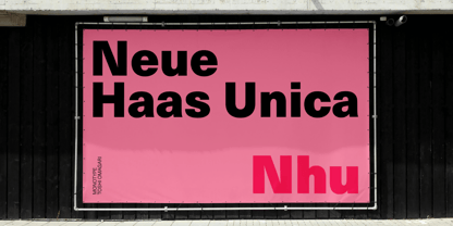
The Neue Haas Unica Font Family was designed by and published by Linotype. Neue Haas Unica contains 18 styles and family package options.
Created in response to a Crispin Porter + Bogusky brief for Domino’s, Weinzierl was tasked with creating a typeface that would introduce a ‘contemporary’ feel, while working alongside the Trade Gothic® design already in use.
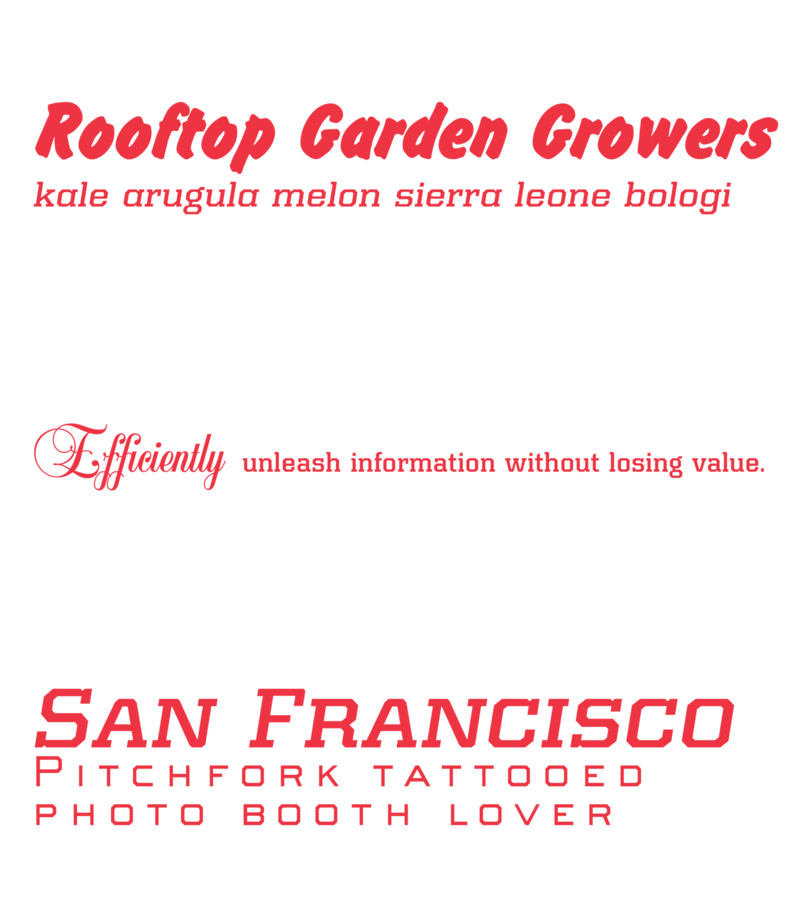
Kairos Sans, designed by Terrance Weinzierl, is an octagonal sans serif influenced by 19th Century Grecians, with the weights and widths of a contemporary palette. The bold simplicity radiates in headlines and sub-heads, with suitable performance in text. Of course, it pairs perfectly with the slab serif companion, Kairos.
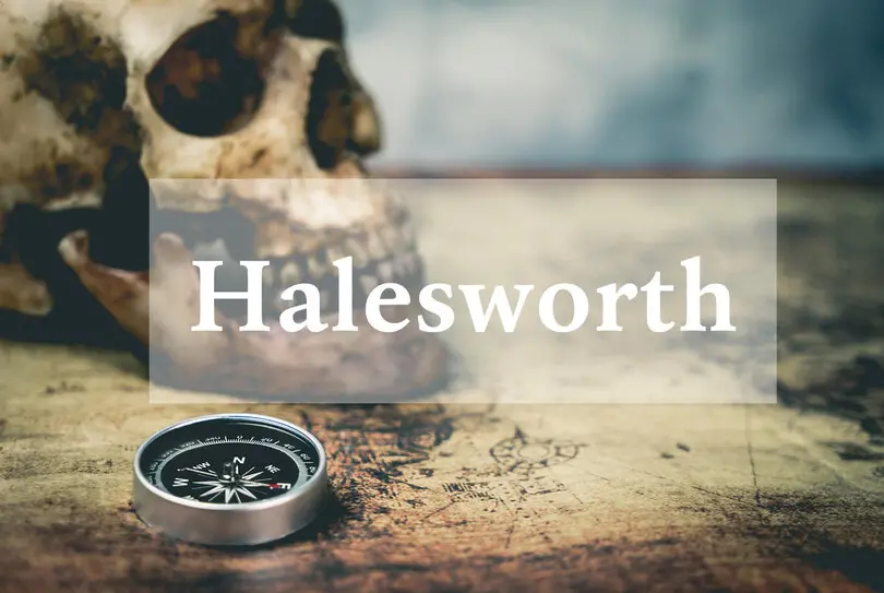
Halesworth is a Venetian Old Style book typeface designed by Carl Crossgrove. It was crafted specifically for comfortable reading on screen. eText typefaces are designed to meet the challenges of extended reading in digital environments such as mobile devices or desktop screens.
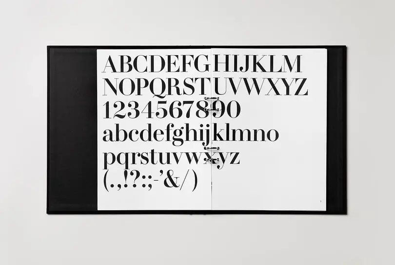
Following the design of HM Amperserif, a typographic guideline was developed for the use of all H&M typography.
Swedish clothing brand H&M's branding materials cover everything from advertising and catalogs, to packaging, films and signage.
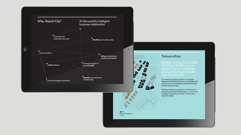
Rescued from obscurity by Doug Wilson, and restored by designer Toshi Omagari, Metro Nova distills the idiosyncrasies of Dwiggins’ Metro No. 1 into a new family that retains Metro’s inimitable sense of character, while still appealing to current design sensibilities.
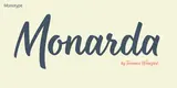
Monarda™ is Terrance Weinzierl’s take on the loud and splashy brush scripts of the 1950s. It’s energetic, playful, and equally at home in hardcopy headlines as it is in interactive banners.
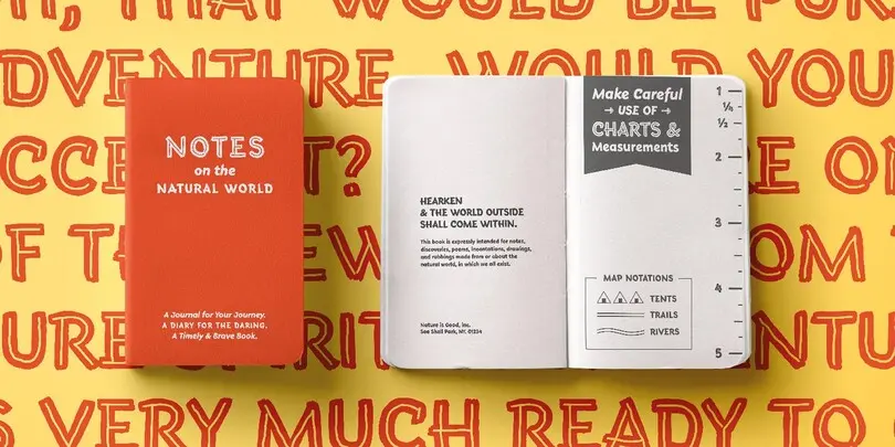
Terrance Weinzierl's Terry Junior typeface is a perfectly imperfect design – one that retains the marks of the brush used to create it and harks back to the craft required to hand make letterforms.
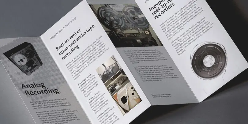
Mundo Sans is distinctive, approachable – and ready to tackle jobs both big and small.
Mundo Sans, by Carl Crossgrove for the Monotype Studio, is distinctive, approachable – and ready to tackle jobs both big and small. Its open counters and large x-height, which give the design a straight-forward no-nonsense mien, are softened by inviting calligraphic undertones.

Drawn specifically for comfortable reading on-screen and in print, Mundo Serif is ready to take on just about any project. While primarily designed for text copy in print and digital, Mundo Serif becomes a powerful display type tool in the lightest and boldest weights.
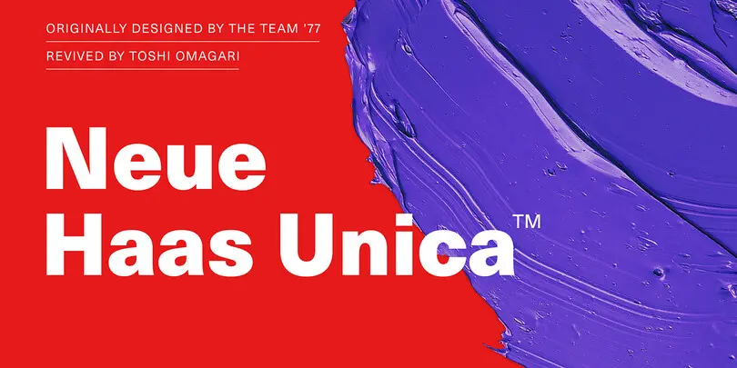
The Neue Haas Unica™ family is an extended, reimagined version of the Haas Unica® design, a Helvetica® alternative that achieved near mythical status in the type community before it virtually disappeared.