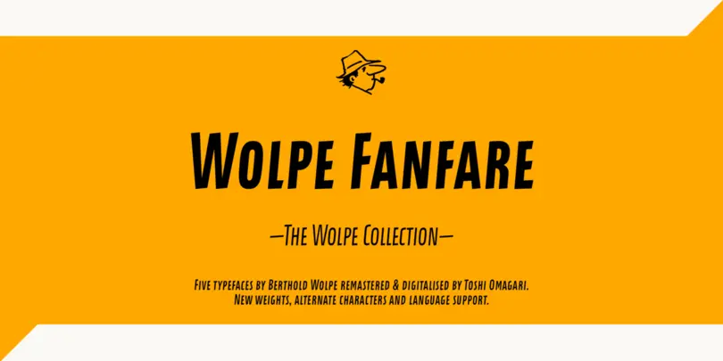
Wolpe Fanfare
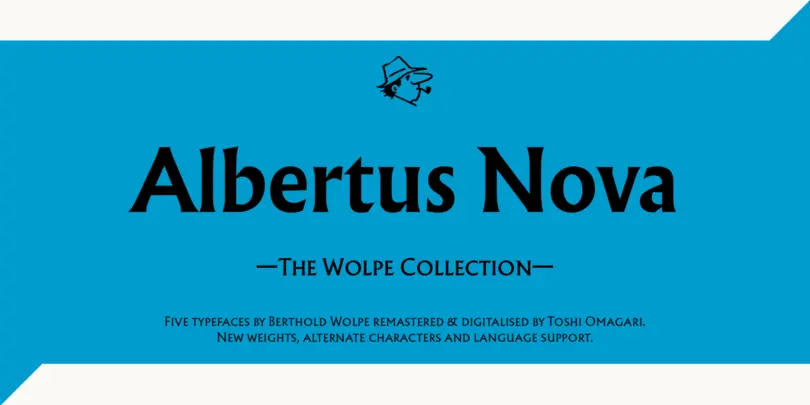
Initially designed for Fanfare Press, the Fanfare typeface packed more into a small space than most typefaces. It was a natural for book and movie titles, and more general branding. Albertus is serious, classical and monumental, while Fanfare is modern, light and playful.