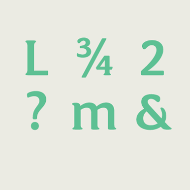
The A-Z of typographic terms.
As type designers we can get immersed in an insular typographical bubble at times. It’s easy to forget that our language, the lingo, words and terms that we use to discuss, critique and refine our designs is under the constant pressure of discourse and scrutiny within, often redefining itself.
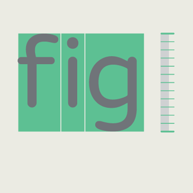
We thought that it would be an interesting project to research and illustrate a few of the key words that we use everyday here in the Fontsmith studio but then before we knew it we were up to nearly 80 terms! Unable to cut the list down we’ve prepared this infographic that lists all the vocabulary in one place. Our new typeface FS Aldrin is used on titles and description info. Its technical and precise shapes seemed perfect for conveying all of the terms in a succinct but also amiable tone of voice.

Anti-aliasing
Semi-transparent pixels along the edges of letterform outlines to smooth jagged edges
Antiqua / Antikva
Serif typefaces designed between 16th–17th century (or new designs following the style)
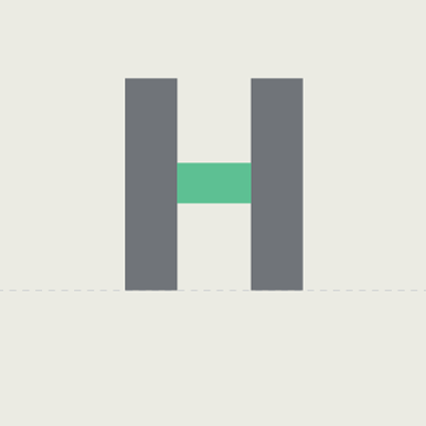
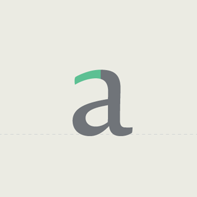
Aperture
The opening of a partially enclosed counter shape
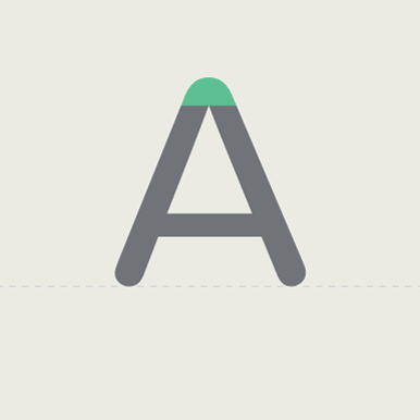
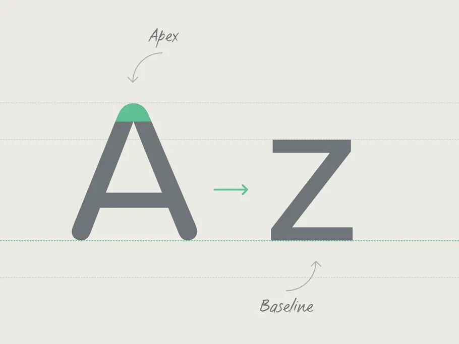
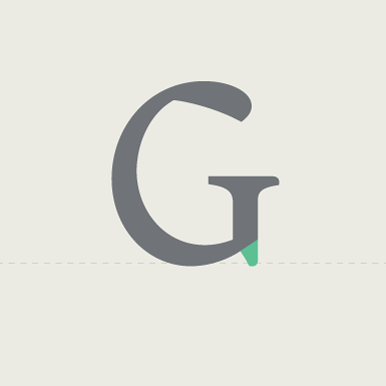
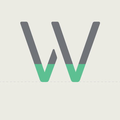
Apex
Point at the top of a letterform where two strokes meet
Arc
Curved part of a letterform leading into a straight stem
Arm
A stroke that doesn’t connect to another stroke or stem on one or both ends
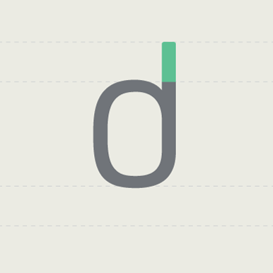
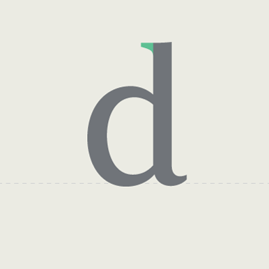
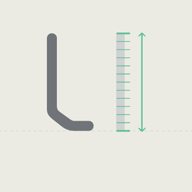
Ascender
The opening of a partially enclosed counter shape
Ascender line
Invisible line marking the height of all ascenders in a font
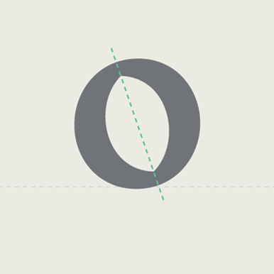
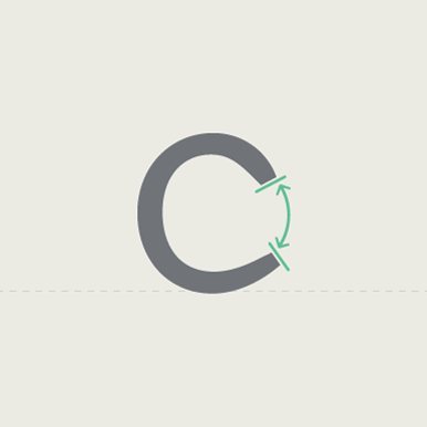
Axis / Stress
Invisible line dissecting the glyph from top to bottom at its thinnest point
Ball terminal
Terminal with a circular shape
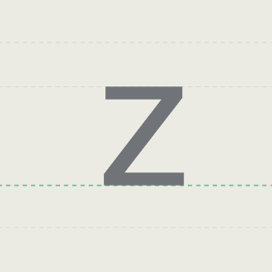
Baseline
Invisible line on which the letters in a font rest
Beak
Decorative stroke at the end of the arm of a letter, similar to a serif but more pronounced
Bilateral serif
Serif extending to both sides of a main stroke
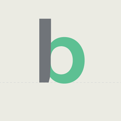
Bowl
Fully closed rounded part of a letter
Bracket
Curved or wedge-like connection between the stem and serif of some fonts
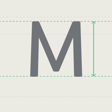
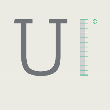
Cap height
Height of a capital letter measured from the baseline
Condensed
Type style designed with narrow width proportions
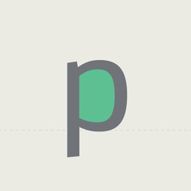
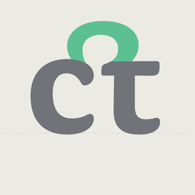
Counter
An area partially or entirely enclosed in a letterform or symbol like an ‘o’, ‘p’ or ‘c’
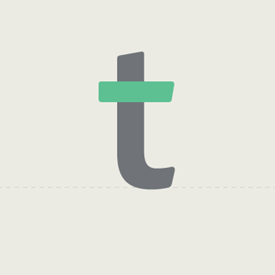
Cross stroke
The horizontal stroke across a lowercase ‘t’ or ‘f’
Crossbar
Horizontal stroke like the middle of an ‘H’, ‘A’ and ‘e’
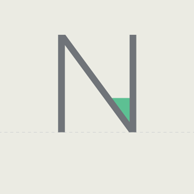
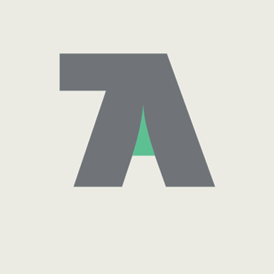
Crotch
Inside angle where two strokes meet
Cursive
Handwriting with joined-up letters. Can be used to describe an italic font which is similar to handwriting.
Descender
Parts of lowercase letters that extend below the baseline
Descender line
Invisible line marking the lowest part of the descenders
Display font
Typefaces used for large type like banners and headlines
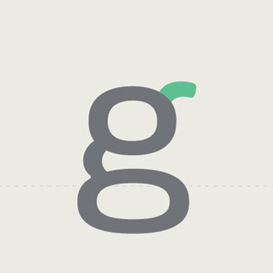
Ear
Small stroke extending from the bowl of a lowercase ‘g’ or ‘r’
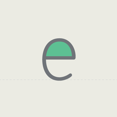
Eye
Enclosed space in a lowercase ‘e’ similar to a counter
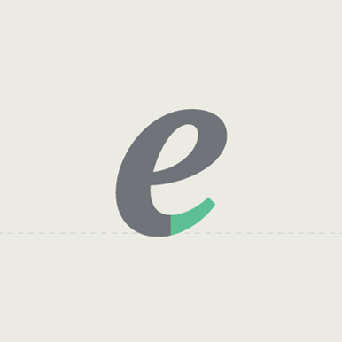
Finial
Tapered or curved end on letters like the bottom of a ‘c’ or ‘e’ or the top of a double storey ‘a’
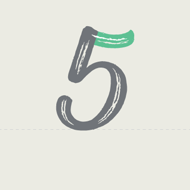
Flag
Horizontal stroke on the figure ‘5’
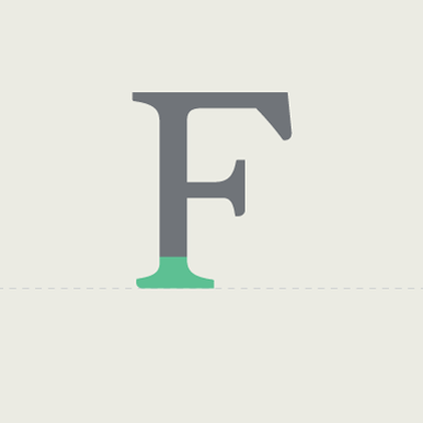
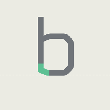
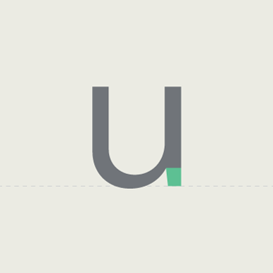
Foot
The part of a stem that rests on the baseline
Gadzook
An embellishment in a ligature that is not originally part of either letter
Glyph
A single character (number, letter, mark or symbol) is represented by a glyph
Grotesk
German name for sans serif
Hairline
The lightest font family weight name; can refer to thinnest stroke of a letter.
Halbfett
German name for the semi-bold weight in a type family
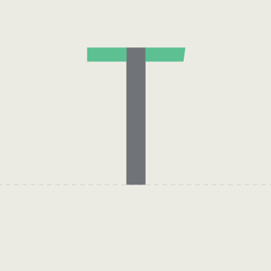
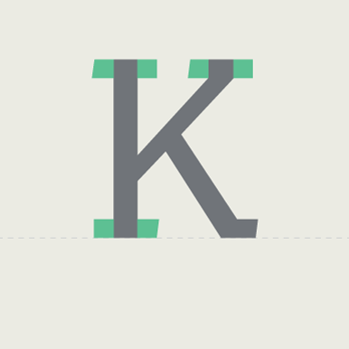
Head serif
Half serif at the top starting point of the letterform
Hinting
Data instructions within a font to help it render clearly at varying sizes
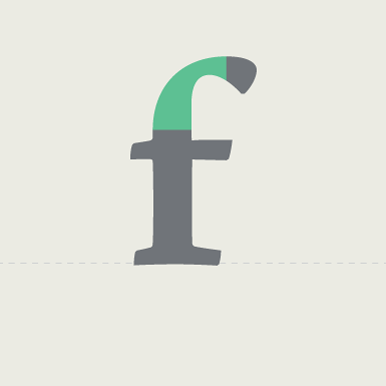
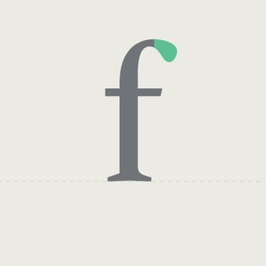
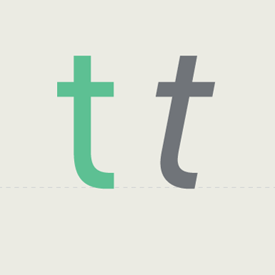
Hook
Curved stroke in a lowercase ‘f’
Ink trap
Areas of the counter are opened to allow for ink to spread, avoiding dark spots.
Italic
Slanted to the right unlike roman typefaces which are upright
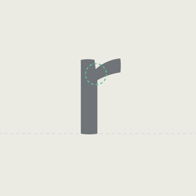
Joint / Juncture
Where a stroke joins a stem
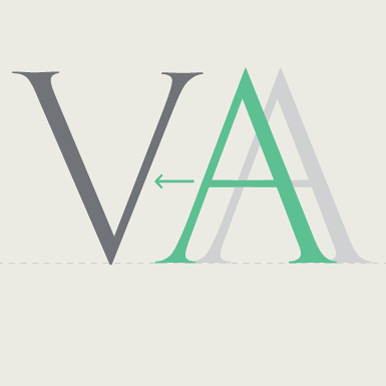
Kerning
Adjustments to the space between pairs of letters, used to correct spacing problems in combinations like ‘VA’.
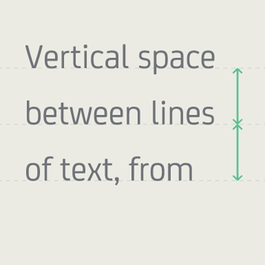
Leading / Linespacing
Vertical space between lines of text, from baseline to baseline.
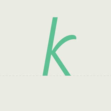
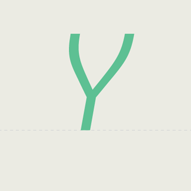
Leg
Downward sloping stroke on a ‘k’ and ‘R’
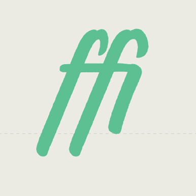
Ligature
Two or more letters joined together to form one glyph
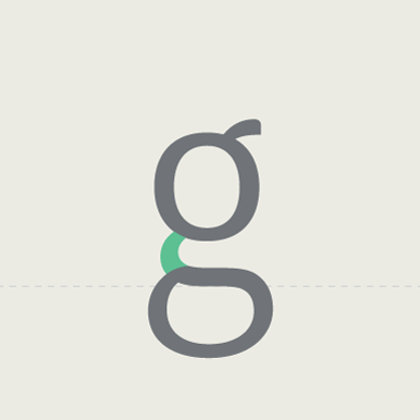
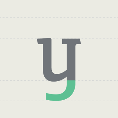
Link / Neck
The link connecting the top and bottom bowls of a lowercase ‘g’
Loop / Lobe
A rounded enclosed or partially-enclosed projecting stroke
Midline
Invisible line resting on the body of the lowercase letters
Oblique / Slanted
Slanted typeface, mechanically sheared unlike italics which are drawn and crafted separately.
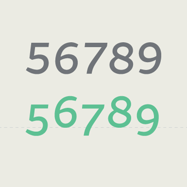
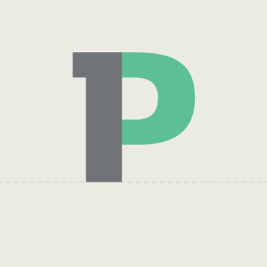
Old style / Hanging figures
Numbers aligned with the lowercase, traditionally used for body text setting.
Overshoot
A round or pointed letter extends higher or lower than a flat letter to make it optically appear the same size
Pica
A unit of measure corresponding to 12 points or pixels
Point
A unit of measure corresponding 1/12 of a pica or 1 pixel
Point size
The size of the body of each character in a font
Pro
Support additional languages including Central European and Cyrillic and/or Greek
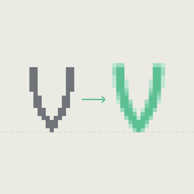
Rasterization
Converting an image from vector to raster (pixels or dots)
Roman
Standard type style or regular weight of an upright typeface
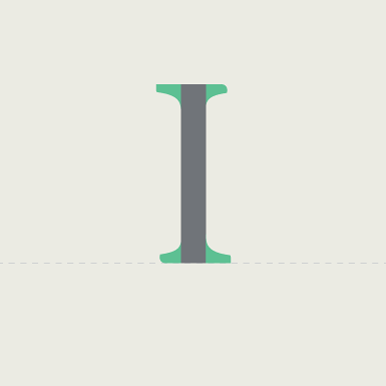
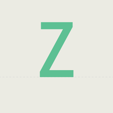
Serif
Small stroke at the beginning or end of main strokes of a letter
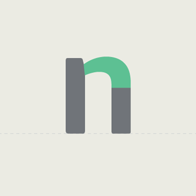
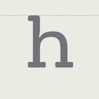
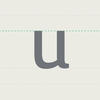
Shoulder
Curved part in a lowercase ‘h’, ‘m’ and ‘n’
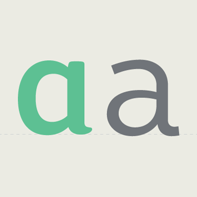
Single-tier
When an ‘a’ or ‘g’ has one counter rather than two
Small caps
Capitals which are a similar height to the lowercase, designed for abbreviation and emphasis in texts.
Spacing
Horizontal space on the side of each character
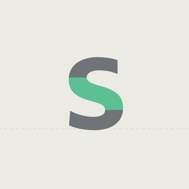
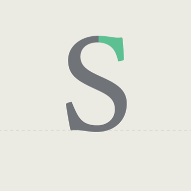
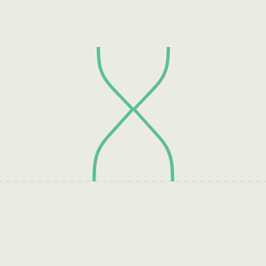
Spine
The main curve in ‘S’ and ‘s’
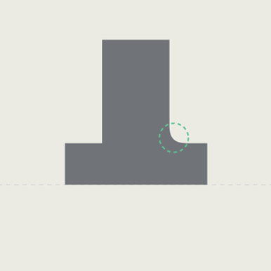
Spur
Small protruding part on a main stroke
Spurless
Curves transition into straight stems without a spur
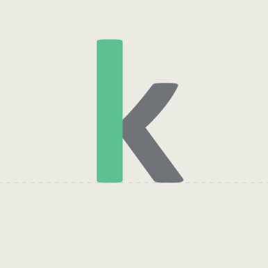
Stem
A vertical stroke in a character
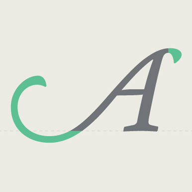
Swash
Exaggerated decorative serif, terminal or tail.
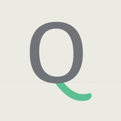
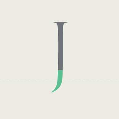
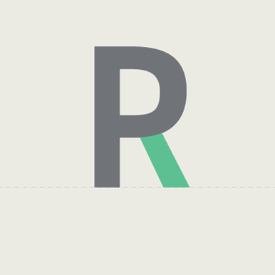
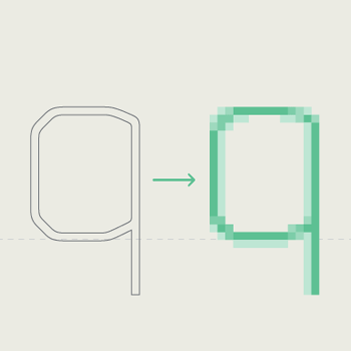
Tail
The descending stroke of the letter ‘Q’
Taper
Thinner and refined end of a stroke
Terminal
The end of any stroke that doesn’t have a serif
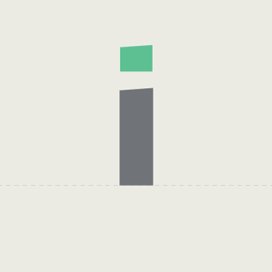
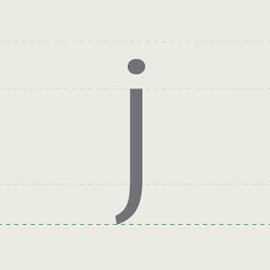
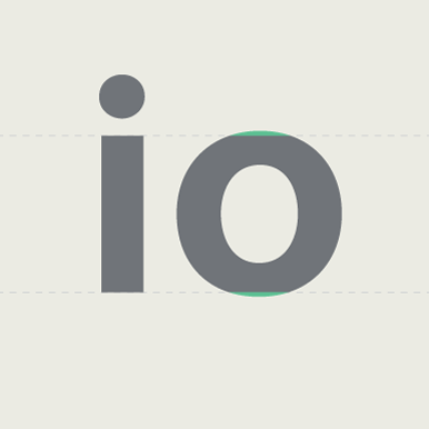
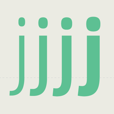
Tittle
The dot on the ‘i’ and the ‘j’
Tracking
Spacing added to or removed from groups of letters outside the original spacing and kerning specified within a font file
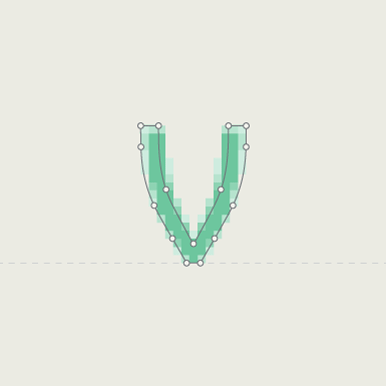
Vertex
The point where two strokes meet at the bottom of a character
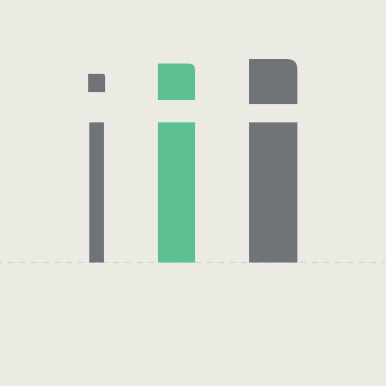
Weight
The heaviness of a typeface, independent of its size; can refer to a style within a font family (Thin or Regular).
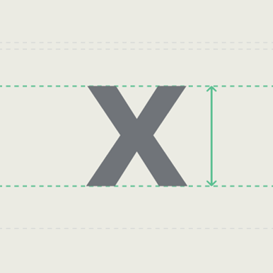
X-height
Height of the lowercase ‘x’ which is used as a guideline for the height of unextended lowercase letters