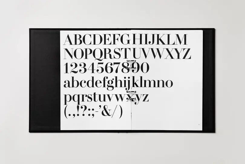
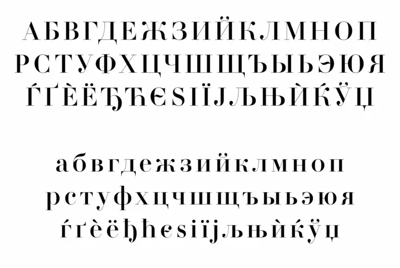
Neo Sans®
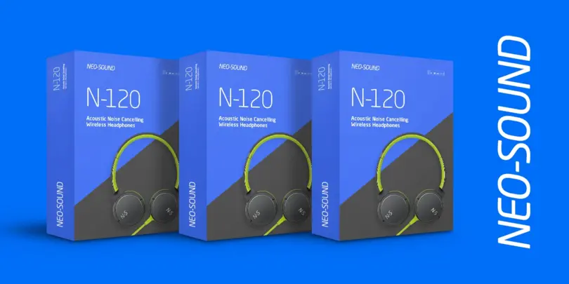
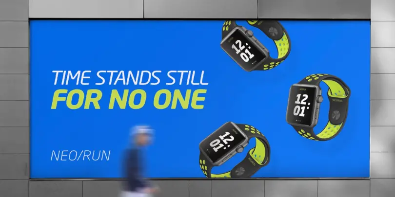
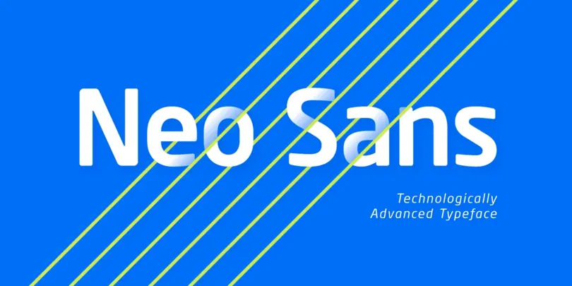
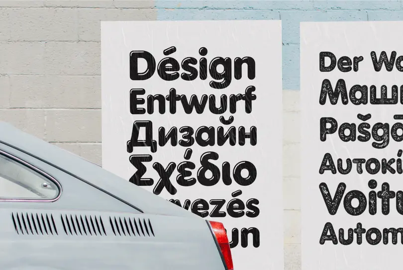
Designer Sebastian Lester describes his Neo Sans type collection as “legible without being neutral, nuanced without being fussy, and expressive without being distracting.” Featuring rounded, square sans letterforms, the Neo Sans family is available in six weights, ranging from light to ultra, with companion italics. Its forward-looking personality makes it an excellent choice for branding projects, as well as for editorial or publication design.
Pair the Neo Sans collection with a serif design for interesting typographic contrast; for more direct continuity, consider the typeface’s sister design—the Neo Tech family also from Lester, available in six weights with matching italics.
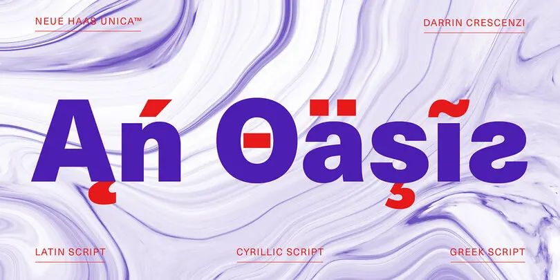
Neue Haas Unica
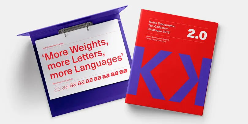
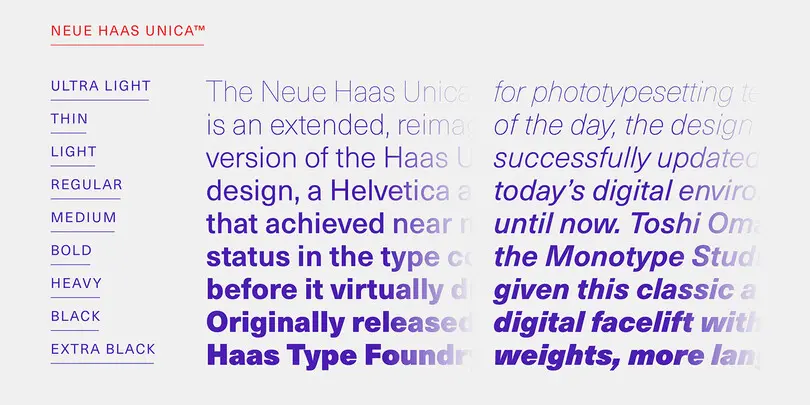
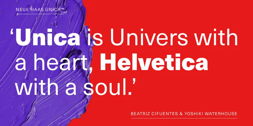
The Neue Haas Unica™ family is an extended, reimagined version of the Haas Unica® design, a Helvetica® alternative that achieved near mythical status in the type community before it virtually disappeared. Originally released in 1980 by the Haas Type Foundry, the design was never successfully updated for today’s digital environments – until now.
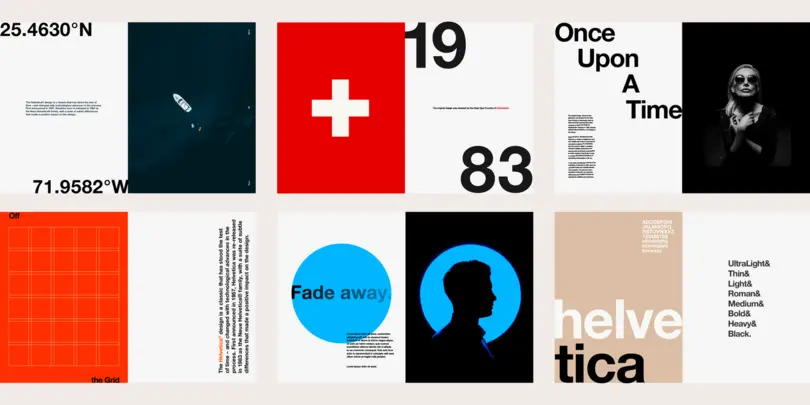
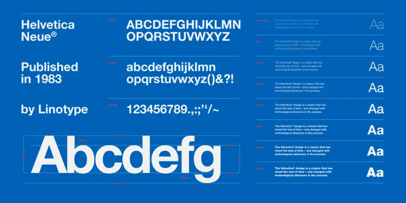
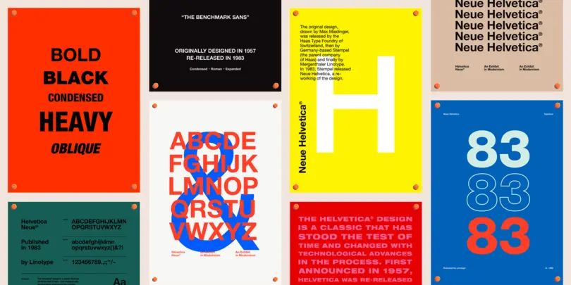
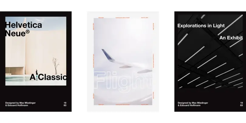
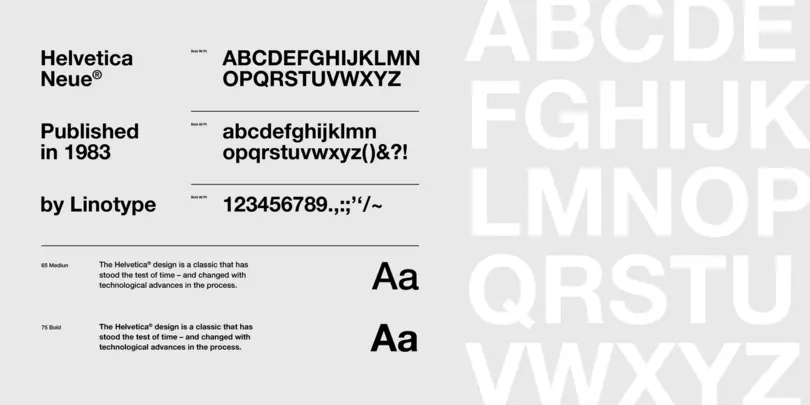
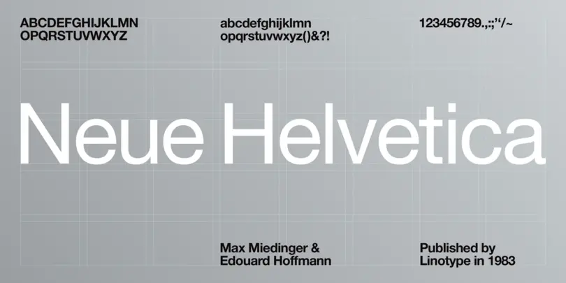
Neue Helvetica®
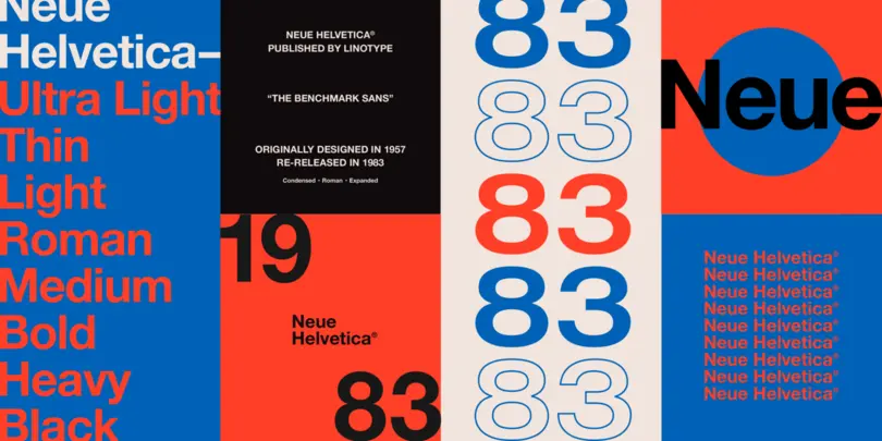
This typeface, designed by Max Miedinger and other project members at the Haas’sche Schriftgiesserei, has become one of the most famous and popular typefaces in the world, thanks to the marketing strategy of Stempel and Linotype. It forms an integral part of many printers and operating systems. The original letterforms of Helvetica had to be modified for the Linotype system. Over the years, Helvetica was expanded to include many different weights, but these were not coordinated with each other.
In 1983, D. Stempel AG redesigned and digitized the “Neue Helvetica” typeface for Linotype and made it a self-contained font family. Today, this family consists of 51 different font weights.
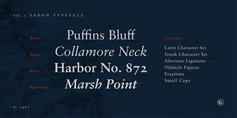
Sabon®
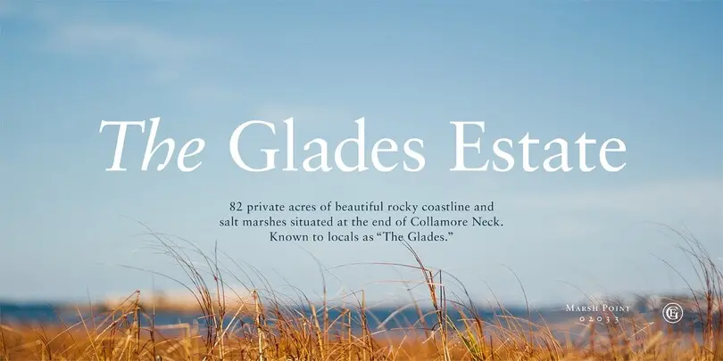
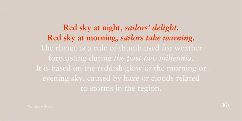
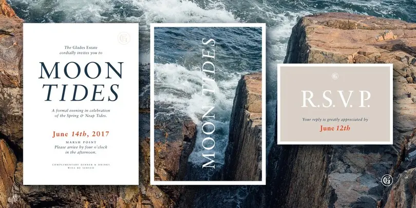
In the early 1960s, the German Master Printers’ Association requested that a new typeface be designed and produced in identical form on both Linotype and Monotype machines so that text and technical composition would match. Walter Cunz at Stempel responded by commissioning Jan Tschichold to design a new version of Claude Garamond’s serene and classical Roman. Its bold, and particularly its italic styles are limited by the requirements of Linotype casting machines, forcing the character widths of a given letter to match between styles, giving the italic its characteristic narrow f. The family’s name is taken from Jacques Sabon, who introduced Garamond’s Romans to Frankfurt. Sabon has long been a favorite of typographers for setting book text, due to its smooth texture, and in large part because Tschichold’s book typography remains world famous.
Sackers Gothic™
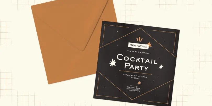
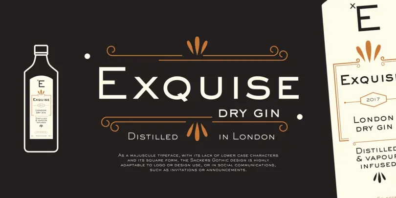
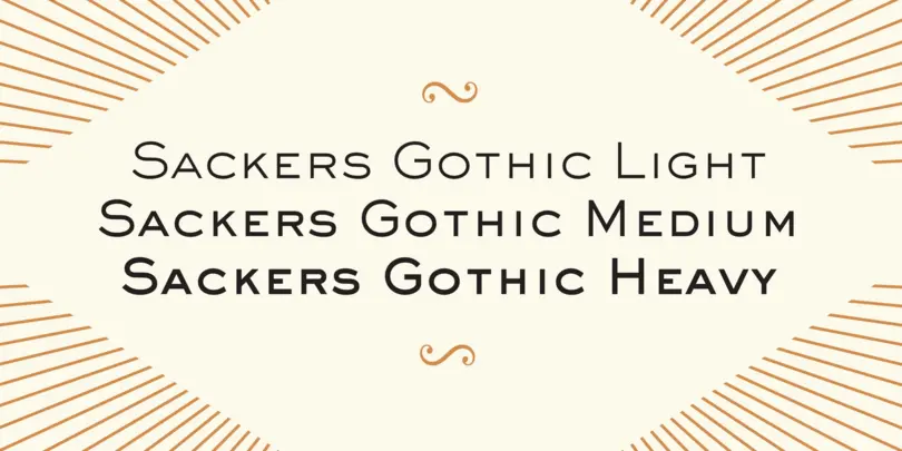
Sackers Gothic is part of the larger Sackers series, a collection of fonts drawn from templates for producing engraved stationery and social cards by Gary Sackers, a Charlotte, North Carolina intaglio printer. Sackers Gothic has since become a popular choice for conveying sincere and plainspoken language on dust jackets, posters, and of course, in stationery. The face pairs well with display faces of a disparate nature, and serves as a ready foil for anything requiring an air of typographic sophistication.
Slate™
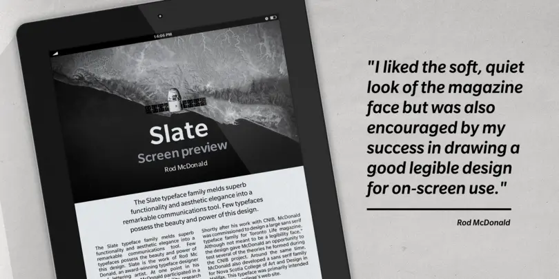
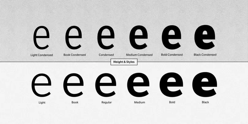
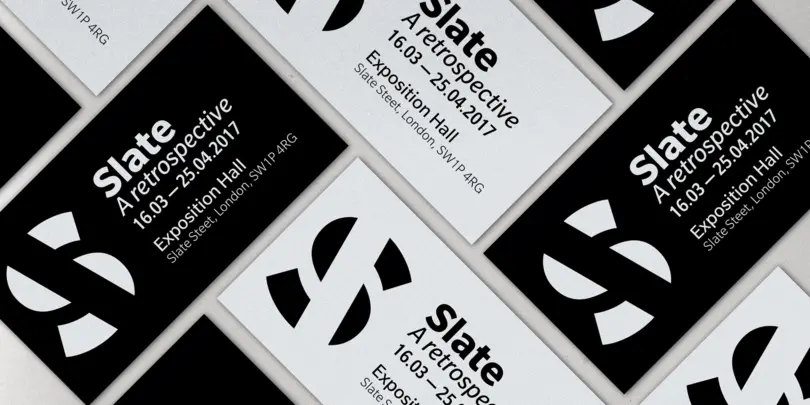
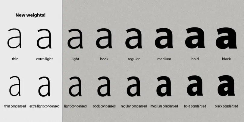
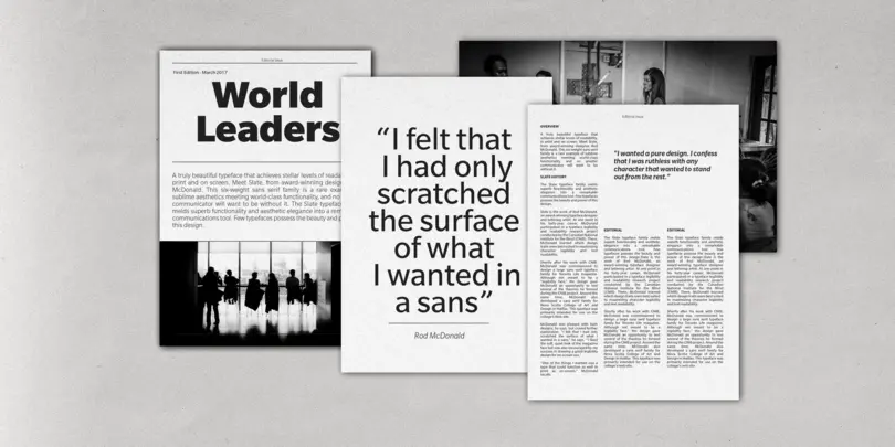
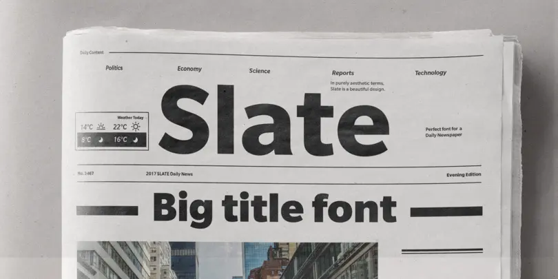
A typeface of grace, power and exceptional versatility, the Slate collection is a truly beautiful design that achieves stellar levels of readability, both in print and on screen. Created by the award winning type designer Rod McDonald, this six-weight sans serif family is a rare example of sublime aesthetics meeting world-class functionality. The typeface’s legible letterforms embody an amalgam of the best traits of both humanistic and grotesque letterforms.
VAG Rounded™
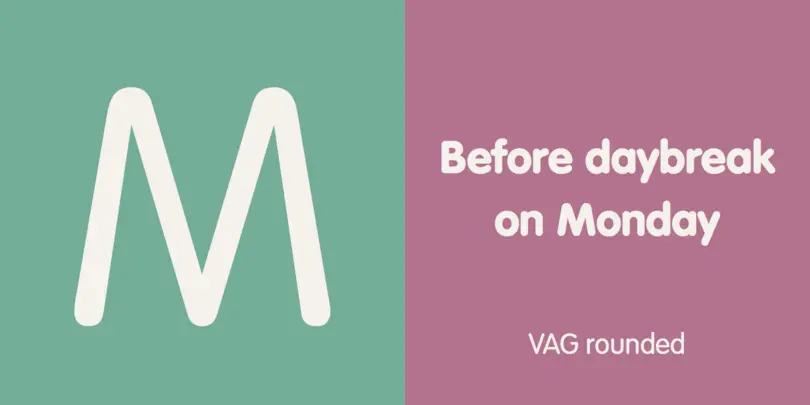
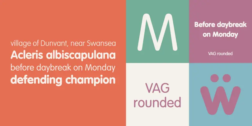
Originally commissioned in 1979 as a new corporate typeface for Volkswagen AG, the VAG Rounded™ family’s geometric sans letterforms feature distinct rounded terminals, imparting the design with a friendly, approachable demeanor. With its design led by Gerry Barney, the VAG Rounded family remained in use for Volkswagen AG’s unified, worldwide automobile marketing for over a decade. The design was released for public use in 1989, and was bundled with many desktop publishing software titles available at the time. This opened the door for millions of computer users to work with the VAG Rounded type family.
Neurons.
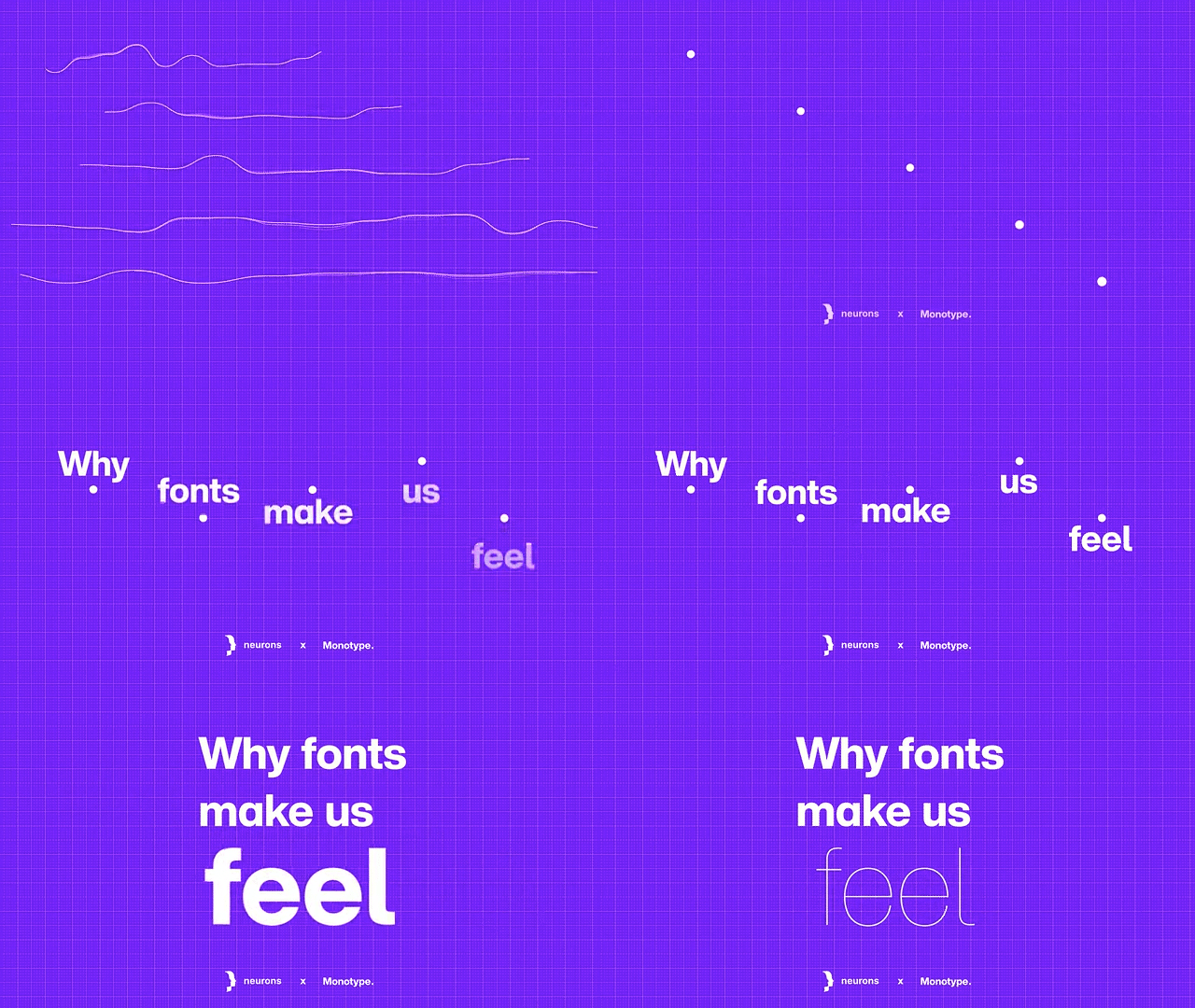
Monotype partnered with applied neuroscience company Neurons to put our deepest held beliefs to the test and find out if different typefaces really do affect our emotional state. Download our ebook or watch the webinar to learn more.
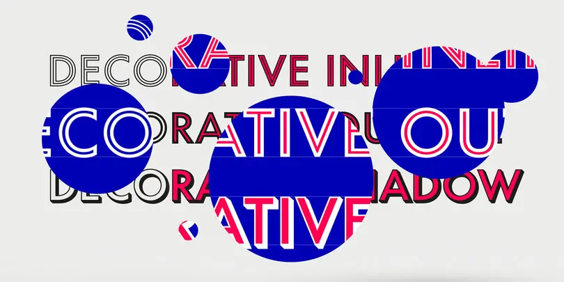
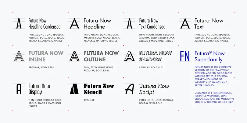
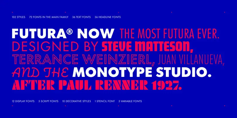
Futura Now
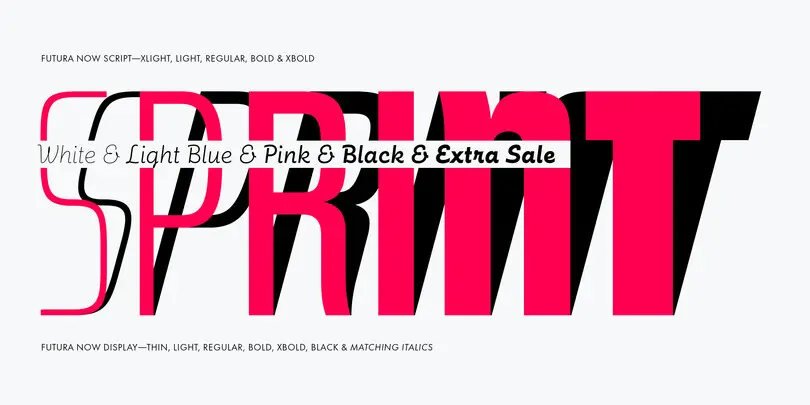
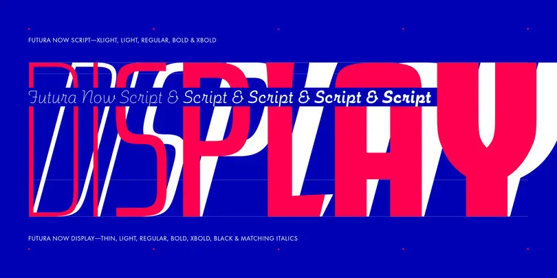
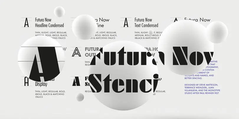
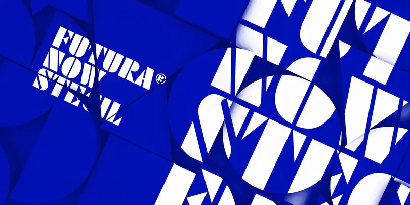
Futura Now Variable, with billions of weights and styles, is different than any Futura ever created. It expands the design range of the family exponentially, while shrinking its digital footprint.
Futura Now’s language coverage makes it more useful to more of the planet. With Latin, Greek, and Cyrillic characters, Futura Now covers 89 languages.
Neue Kabel
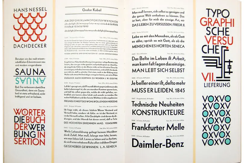
Marc Schütz, a type design teacher at the University for Art and Design Offenbach, took on the challenge of updating and re-imaging the original Kabel® typeface design. His goal was to create forms that perform well in modern imaging environments while keeping the original Kabel’s character and charm.
Neue Kabel maintains the spirit of Koch’s design, and adds to this the consistent traits and family structure of a 21st century design. Text copy set in Neue Kabel echoes the elegance and playfulness of Koch’s design, while delivering the versatility to shine in a wide variety of hardcopy and interactive environments.
Wolpe Pegasus
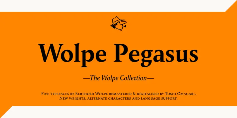
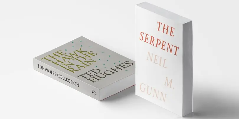
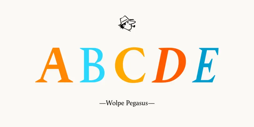
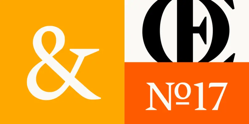
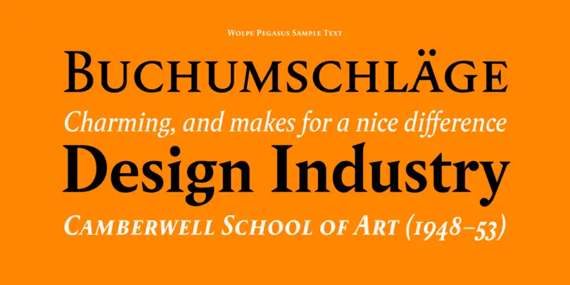
The Pegasus typeface, originally designed by Berthold Wolpe, is full of surprises. The E and F both have oversized serifs. The A and H have cross bars of very different thicknesses. The K and g look a little unhinged, and the g boasts a distinctive, spiky loop. On close inspection, Toshi found that no two serifs in the uppercase letters were of the same shape.
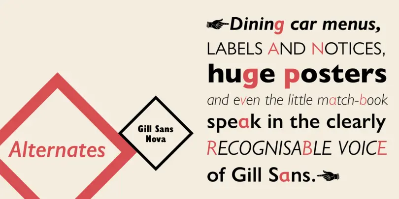
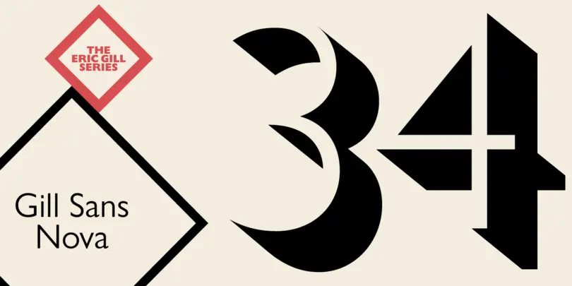
Gill Sans Nova
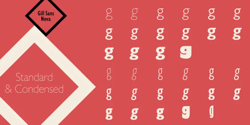
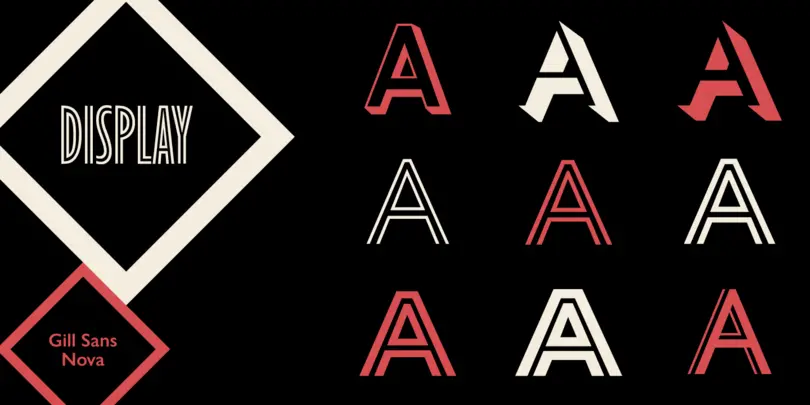
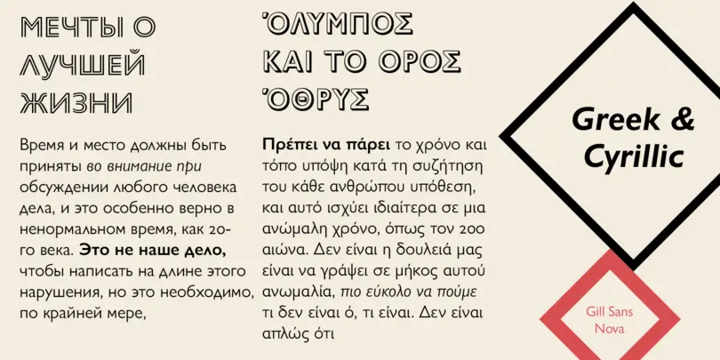
The Gill Sans® Nova typeface expands the much-loved Gill Sans family from 18 to 43 fonts and features a coordinated range of roman and condensed designs. Several new display fonts are available, including a suite of six inline weights, shadowed outline fonts that were never digitized and Gill Sans Nova Deco that was previously withdrawn from the Monotype library.
Shorai™ Sans
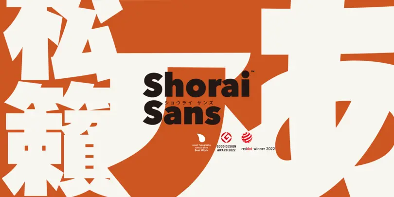
Shorai Sans balances the subtlety of traditional hand-drawn brushstrokes with clean, geometric outlines. An intellectual-looking sans serif, Shorai’s simplified letterforms and vast weight ranges provide creatives with a holistic branding solution, opening new horizons in Japanese typography.
Walbaum
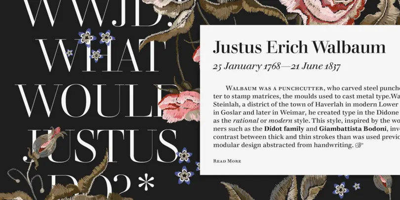
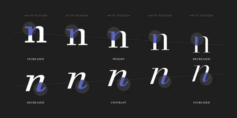
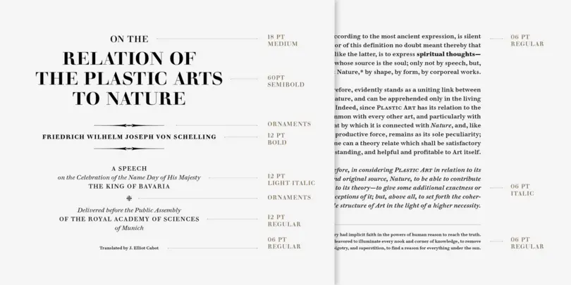
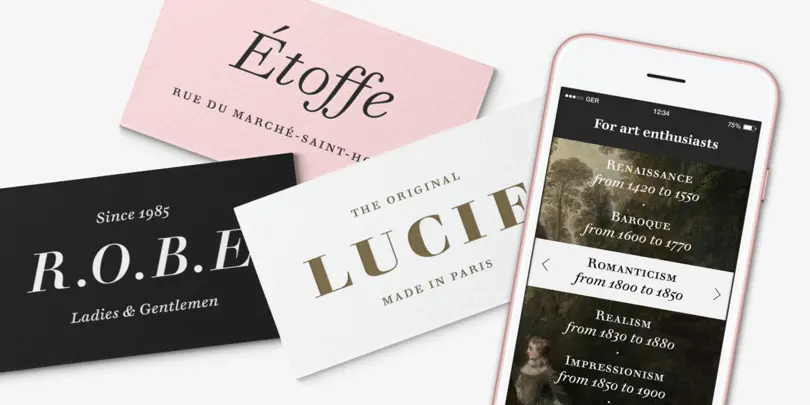
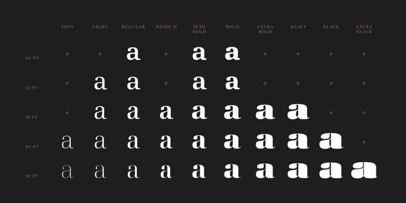
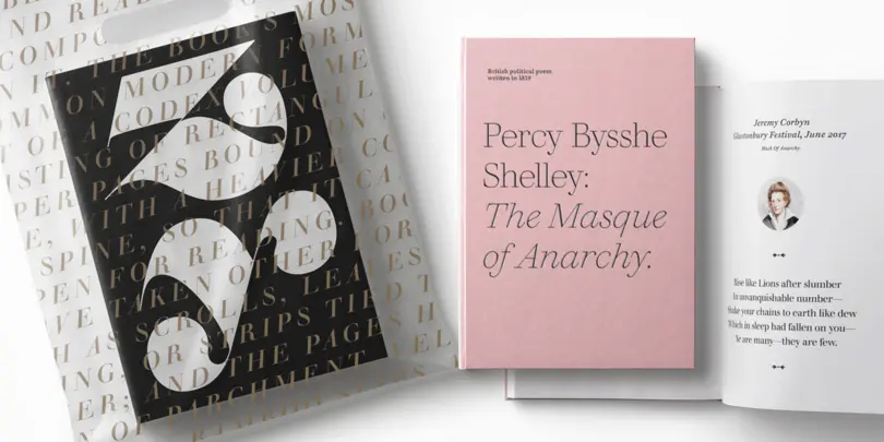
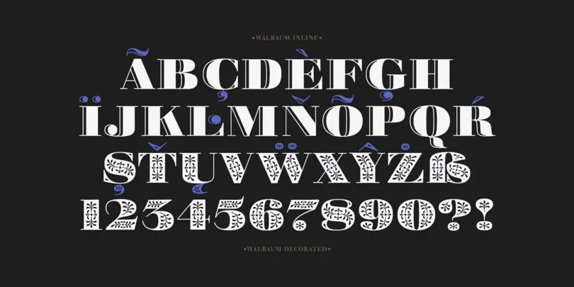
The Walbaum family, designed by Charles Nix, Carl Crossgrove, and Juan Villanueva, is a modern serif design that can be used in a wide variety of placements from micro caption text to massive headlines. Where other moderns preach austerity, Walbaum projects warmth—making it ideal for brands seeking a large type family that blends high style and approachability.
H&M
Swedish clothing brand H&M’s branding materials cover everything from advertising and catalogs, to packaging, films and signage. Although H&M was already working with a bespoke sans-serif typeface design called HM Ampersand – which was also designed by Monotype – it wanted to develop a fuller typographic language that it could use in a range of contexts around the world.
