Type Faces: Meet Henning Krause.
Spotlights
Spotlights
Type Faces: Meet Henning Krause.
Welcome to our Type Faces series, where we’ll be sharing the stories of some of the fabulous people behind the type here at Monotype. From all around the globe and across the organization, our Monotype colleagues truly prove that, like Charles Nix, Senior Executive Creative Director at Monotype, always says, “We are ALL creative.”
Henning Krause has taken on many roles — designer, founder, president, manager — and he’s never stopped evolving. With a lifelong passion for structure, systems, and culture, he’s now helping shape how Monotype thinks about fonts — not just as digital tools, but also as deeply human expressions. Read on to learn more about Henning.
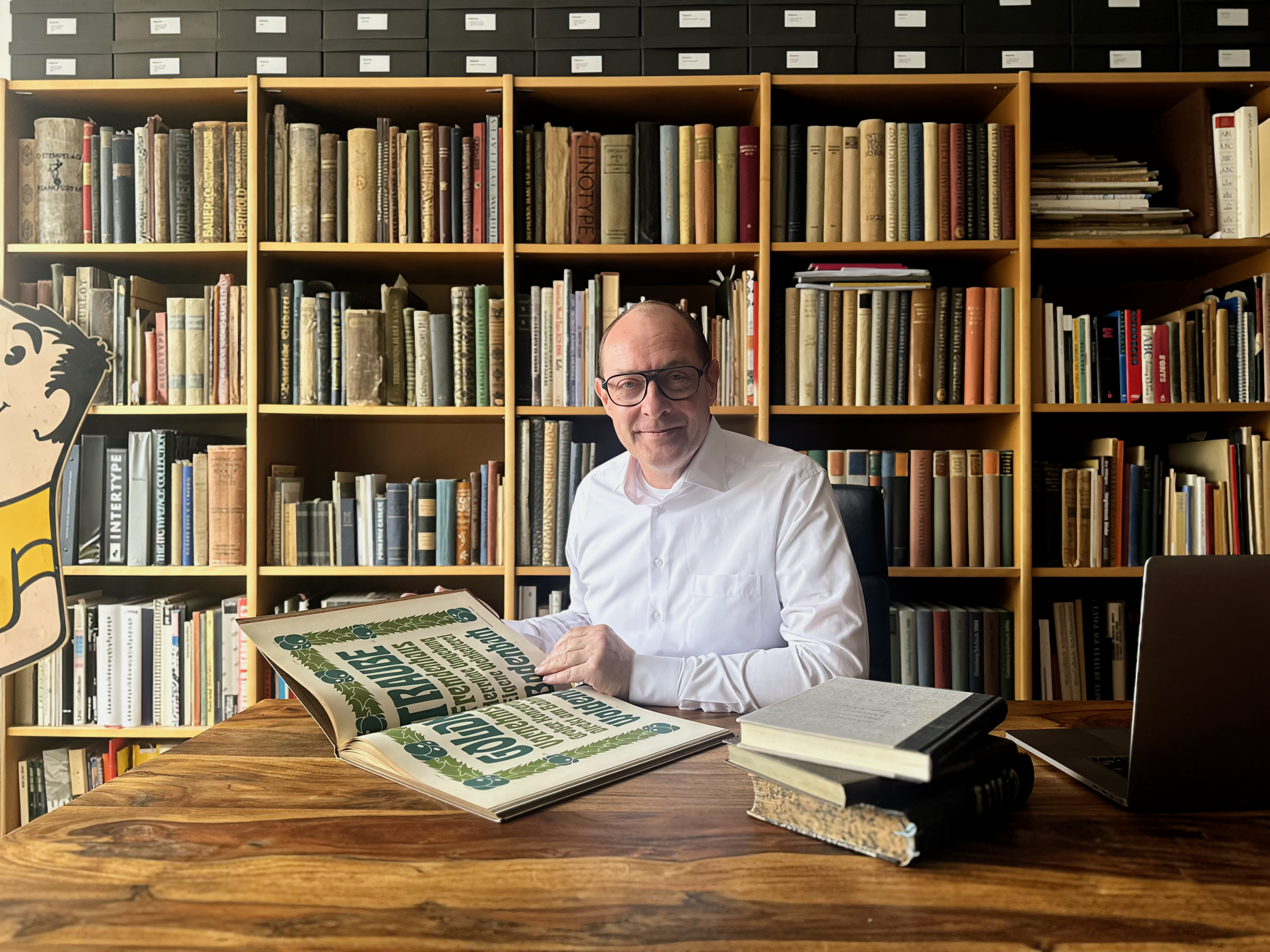
Portrait of Henning Krause in his library, which features historical type specimens and books about typography, as well as one of his advertising collectibles.
What were you like as a kid?
I was the only child of my mother, a former model/photographer, and my stepfather, an interior architect who worked on large-scale commercial spaces. My parents embraced modern parenting ideas: no yelling, no punishments — just personal responsibility. I was independent from a very young age, and I never hesitated to take on responsibility. That hasn’t changed.
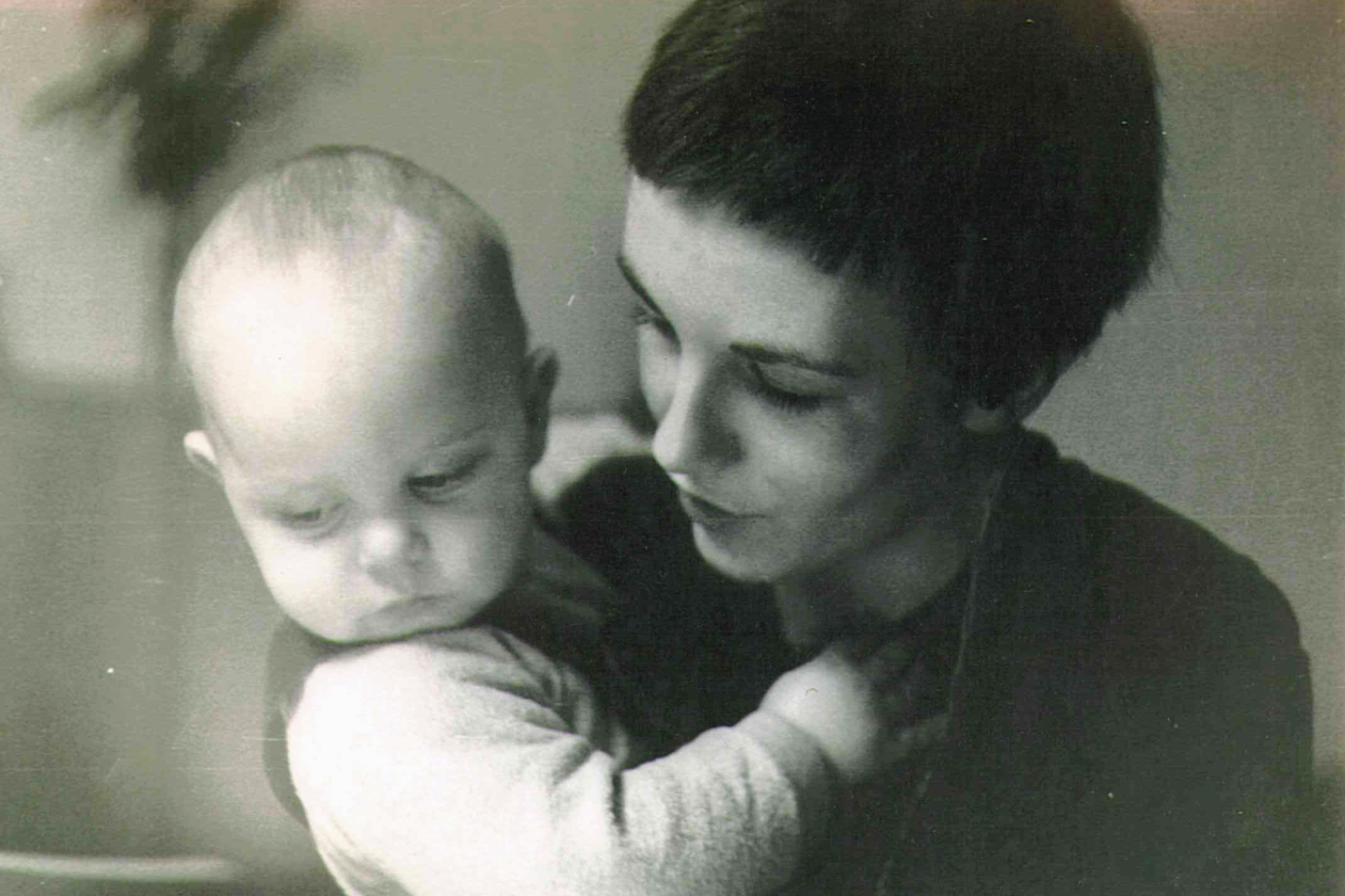
Baby Henning and his mother. Photographer: Volker Krause.
I had many conversations with my mother about women’s liberation and social norms. Of course, this was quite a bit to process when you’re young, but those conversations shaped me into a person who always examines where I have unquestioningly adopted social constructs or patterns into my own actions.
My stepfather was the perfect father figure for me: curious, skilled, deeply knowledgeable. I grew up surrounded by creativity — books on art, architecture, and design were everywhere. I read everything I could get my hands on. Some of my favorites include “Industrial Design” by Raymond Loewy, “Main Street” by Sinclair Lewis, and “Global 2000: The Report to the President — Entering the Twenty-First Century” [PDF] edited by Gerald O. Barney.
What’s a favorite childhood memory of yours?
We spent a lot of time in Italy and France when I was young. I used to speak fluent Italian and loved talking to locals, playing cards, and visiting historical sites.
My mother had lived in France as a young woman, so she’d instantly slip into the culture whenever we were there. Those trips shaped me. They taught me to value other cultures and to find joy in being outside my comfort zone.
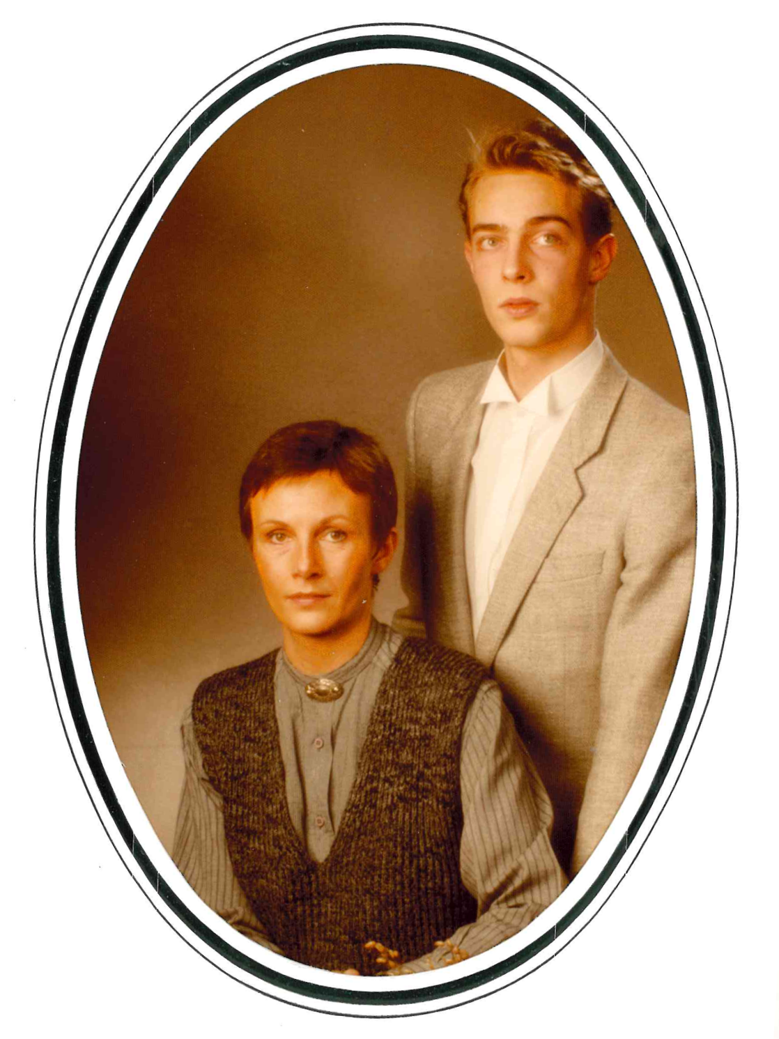
Henning pictured with his mother when he was 16 years old.
How does creativity fit into your life?
I’ve always had music as a creative outlet. Early on, I had instruments and even tried composing. But I realized that design paid the bills, and music would remain my hobby.
I was an early adopter of DJ turntables and had thousands of vinyl records at one point. I’ve since switched to digital gear — Pioneer and Native Instruments setups — and I still play sets at parties for friends. It’s not about competing with pro DJs anymore; it’s just something I love.
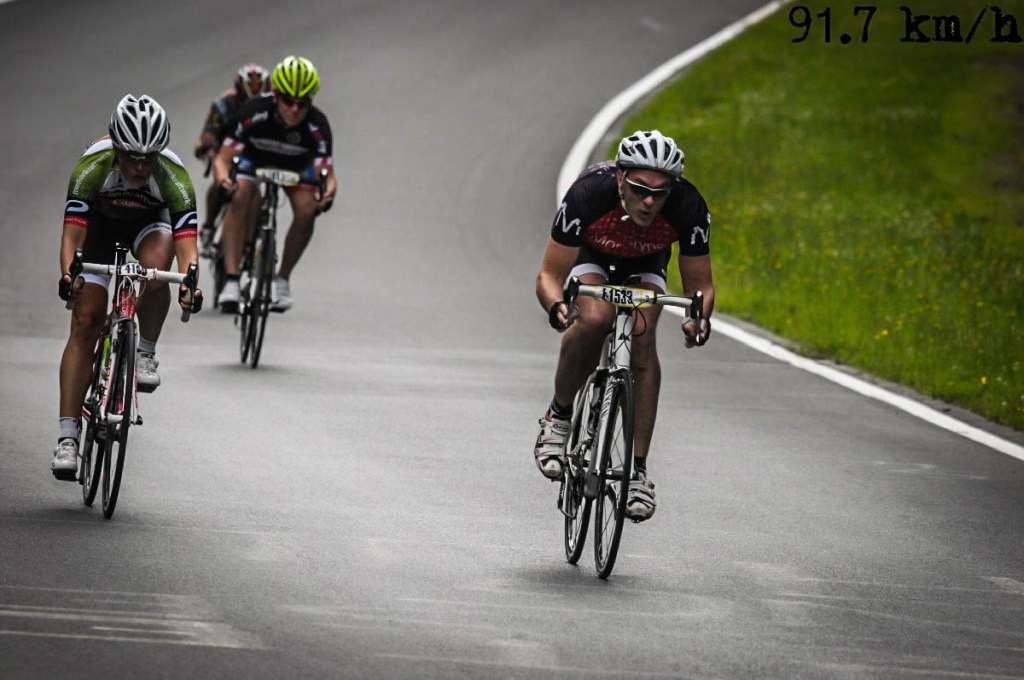
I’m also a cyclist. A few years ago, during a race, I hit 91.7 kilometers an hour going downhill. That speed trap photo still makes me laugh.
Henning, the cyclist in the Monotype jersey on the right, traveling at a top speed of 91.7 km per hour. Credit: Sportograf 2017.
What’s something that would surprise people about you?
A lot, probably. People often see the black-and-white wardrobe, the modern haircut, the serious demeanor, and assume I’m conservative or risk averse. But I’m actually quite the opposite. I’m deeply curious, very independent, and comfortable with change.
Is there anything you like to collect?
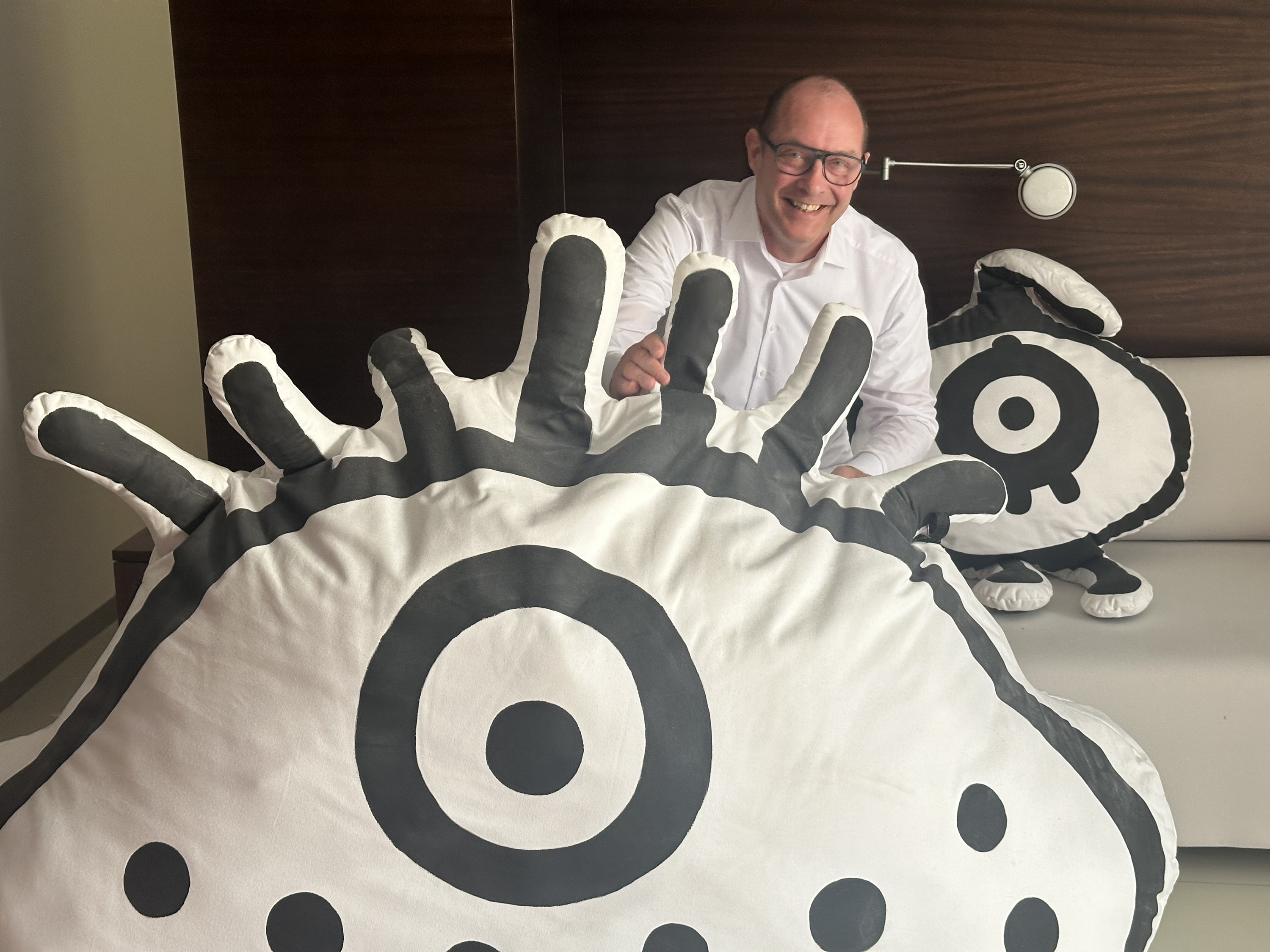
I collect several things, all tied to my design interests. I have a series of abstract art pieces — amoeba-like forms that were originally stage decorations at the Typo Conference in Berlin, where I was a repeat speaker. They now live in my apartment and make me smile every time I see them.
Henning and his collection of stage decorations, created by Steff Stefanidad.
I also collect historical type specimens and books about typography — some more than 500 years old. And early in my career, I used to create large cardboard props for advertising, which sparked a love for oversized, playful objects. I had to stop collecting those because I ran out of space!
What do you love about where you live?
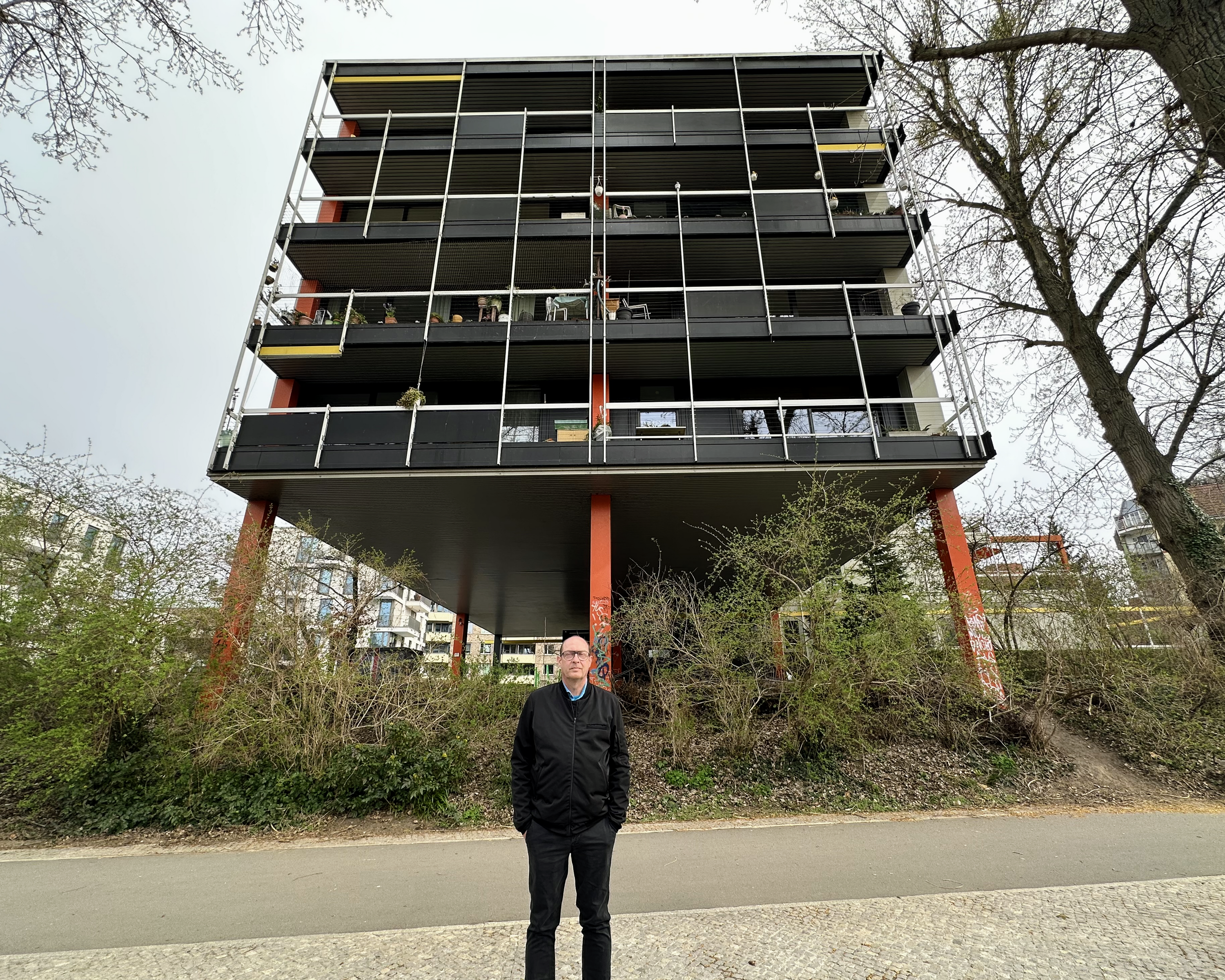
I live in a modernist building near Berlin’s Tiergarten — think Central Park in New York. The building has a steel skeleton and a clever construction that allows the interiors to be completely customizable.
A lot of the other residents are architects or designers, and we’ve formed a kind of informal cooperative. Together, we’re updating the building with energy-efficient features and accessibility improvements while honoring its architectural legacy.
It’s the perfect place for me — where structure meets creativity.
Henning’s unique home in Berlin.
We’re all inspired by different things in life. What inspires you?
Grids. Seriously. I find beauty in how nature, buildings, even laws, follow hidden structures. I see it all as systems — mathematics turned into language. There’s a logic to how things unfold, and it fascinates me.
What do you find interesting about typography?
Typography exists at this perfect intersection of system and expression. It’s grid-based and rule-driven, but also deeply cultural and emotional. It’s a technical process with a social impact. I’m a modernist through and through, and I find joy in how structure enables creativity — not limits it.
Even electronic music works this way. You start with a rigid grid, then introduce small variations that make it human. Typography is like that, too.
What do you love about your job?
My brain is constantly looking for connections and patterns. In my work, I get to study how people use type across different cultures and industries — and how we can make our systems smarter and more helpful.
Design has always been more than aesthetics for me. It’s about responsibility. Industrial products — including fonts — should serve people. Efficiency is part of that. I try to build processes that make things better, not just faster.
What do you do at Monotype?
I’ve been with Monotype since 2014 in various roles. Right now, I’m part of the foundry operations team. We’re focused on font metadata, production systems, and the connective tissue behind how we make and distribute type.
I didn’t arrive here in a straight line. I started as a communication designer and spent 17 years doing custom type work — over 1,000 projects. That taught me to listen deeply and distill what people really want from a typeface. I also ran companies and served as president of a design organization representing 180,000 professionals in Germany.
Eventually, I joined Monotype to lead font engineering and quality assurance (QA). It was the perfect role for someone like me — part creative, part systems thinker. Now, I’m helping shape how we manage and scale the data behind our type libraries. What makes a font valuable isn’t the software — it’s what people imagine they can do with it. That’s the part I’m interested in.
Tell us about a font-related project you worked on and really enjoyed.
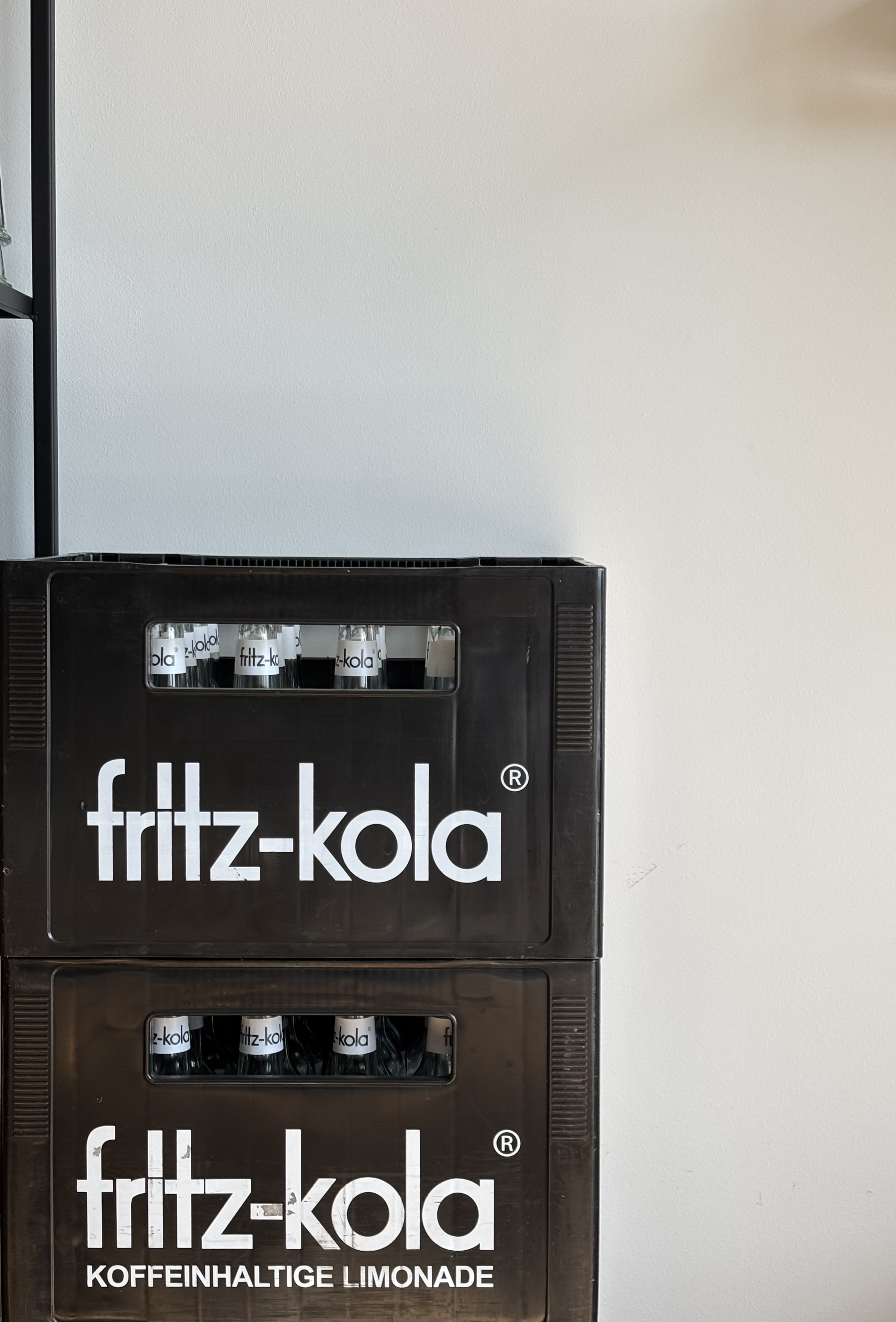
Henning’s original typeface, still in use by fritz-kola.
I created a custom typeface for fritz-kola, back when they were still a small startup. The founders had a vision of using a geometric sans serif with elongated ascenders — something they may have seen in old signage from the late 1920s. This style was briefly popular, during the early days of geometric typefaces inspired by Cubist thinking.
I researched the visual language of that era — lettering, advertising, type samples — and distilled those ideas into a typeface with a subtle historical feel, and just enough clunkiness to keep it from looking too polished.
Years later, the company went through a full rebrand — but they kept the typeface exactly as it was. That made me proud. It meant the typeface had become part of their DNA.

Sr. Manager Foundry & Inventory Experience
Henning Krause
Henning Krause is Sr. Manager Foundry & Inventory Experience at Monotype, one of the largest providers of typography, technology, and expertise. In this role, Henning focuses on font metadata, production systems, and the connective tissue behind how Monotype makes and distributes type.


