Type Around the World – Get to Know Vienna, Austria
Spotlights
Spotlights
Type Around the World – Get to Know Vienna, Austria
In this recurring feature in our “Fonts Having a Moment” series, we’ll be exploring cities around the world through the dual lenses of culture and typography, guided by our friends at Monotype and some of our partner foundries. Join us on this exciting virtual journey!
This time, get to know Vienna, Austria with Joana Correia of Nova Type Foundry.
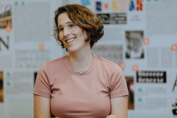
A portrait of Joana.
1. Tell us a bit about yourself and your foundry.
I’m Joana Correia, a type designer from Portugal living in Vienna, Austria. I have owned Nova Type Foundry since 2018.
Since my teenage years, I’ve been fascinated with letters and text through books and album covers. I studied architecture first and then found graphic design and typography.
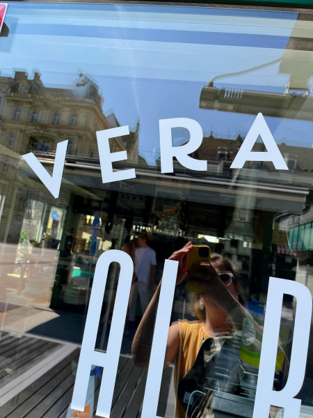
One of Joana’s typefaces, Laca, on a pizzeria shop window in Vienna.
Type design was a natural way for me to express my creativity through letters, and later through complete alphabets for people to use. Most of my fonts are available in my foundry and through Monotype.
2. Tell us about your city. What do you love about it? What’s distinctive about it?
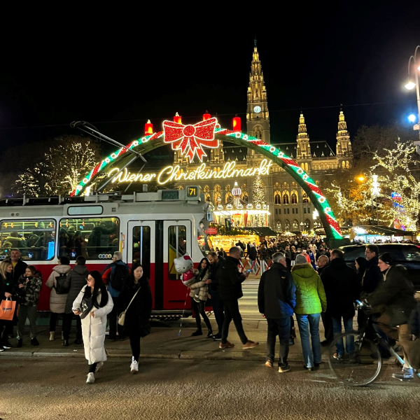
Vienna has a variety of Christmas markets each winter. The largest and most popular is the Wiener Christkindlmarkt on Rathausplatz (City Hall Square).
I currently live in Vienna, and I love it. It’s a beautiful city with fantastic architecture and parks.
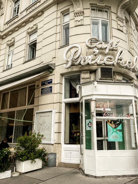
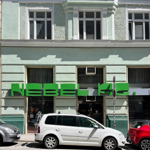
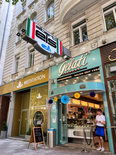
Some of Vienna’s beautiful architecture and storefronts, showcasing a variety of typographic styles that can be found across the city.
I enjoy walking in the town and being surprised by the beauty of every corner.
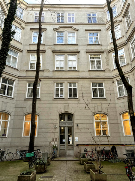
A building courtyard in Vienna.
There are also many great museums where you can immerse yourself in art. The closeness to green areas is super, allowing a disconnect from the city’s busyness.
3. Where would you take someone visiting your city for the first time to explore its creative heart?
In Vienna, the Neubau District (also known as the 7th District) is my favorite, with many independent shops, cafés, and restaurants.
I enjoy walking around, window shopping, sitting in a cozy café, and reading a book.
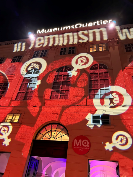
The 7th District is also home to the MuseumsQuartier, where you can find three modern art museums and enjoy some pop art markets and a lovely bookshop.
The MuseumsQuartier in Vienna. The area hosts larger art museums, contemporary exhibition spaces, and festivals.
4. What’s a typeface that you think represents the spirit of your city and why?
Vienna uses Helvetica in its metro system.
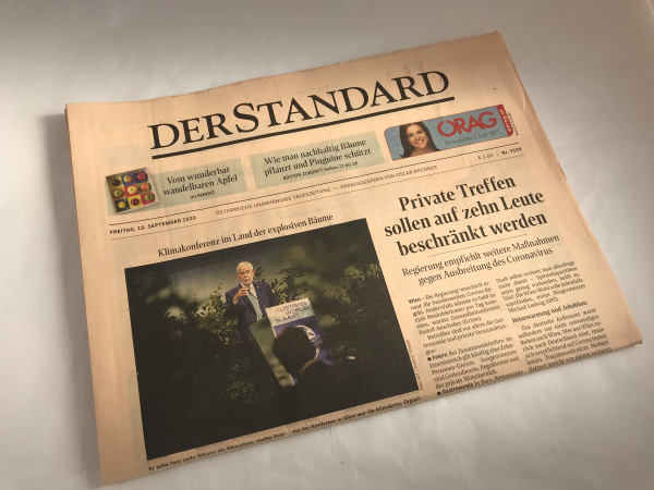
But I think STMatilda, the custom font designed by the FaceType Foundry and my colleagues at Schriftlabor for the newspaper Der Standard, shows the aesthetics of the city with both its elegant serif and practical sans serif designs.
The Der Standard newspaper.
This font expresses the essence of the town with its heritage charm and practical modern-day lifestyle.
All images provided by Joana Correia


