Type Around the World – Get to Know Copenhagen, Denmark
Spotlights
Spotlights
Type Around the World – Get to Know Copenhagen, Denmark
In this recurring feature in our “Fonts Having a Moment” series, we’ll be exploring cities around the world through the dual lenses of culture and typography, guided by our friends at Monotype and some of our partner foundries. Join us on this exciting virtual journey!
This time, get to know Copenhagen, Denmark with Jeppe Pendrup of Playtype.
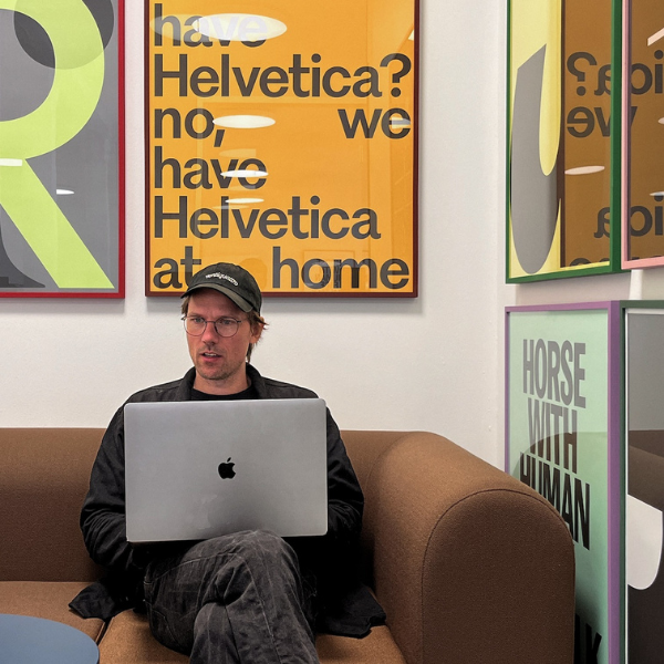
A portrait of Jeppe Pendrup.
Tell us a bit about yourself and your foundry.
My name is Jeppe Pendrup and I’m a senior type designer at Playtype. Playtype was founded back in 2010 by Jonas Hecksher and is situated in the heart of Copenhagen. We’ve been in the same building since day one, and, though the neighborhood around us has changed quite a bit, our walls are still the same.
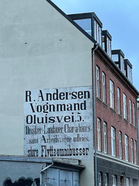
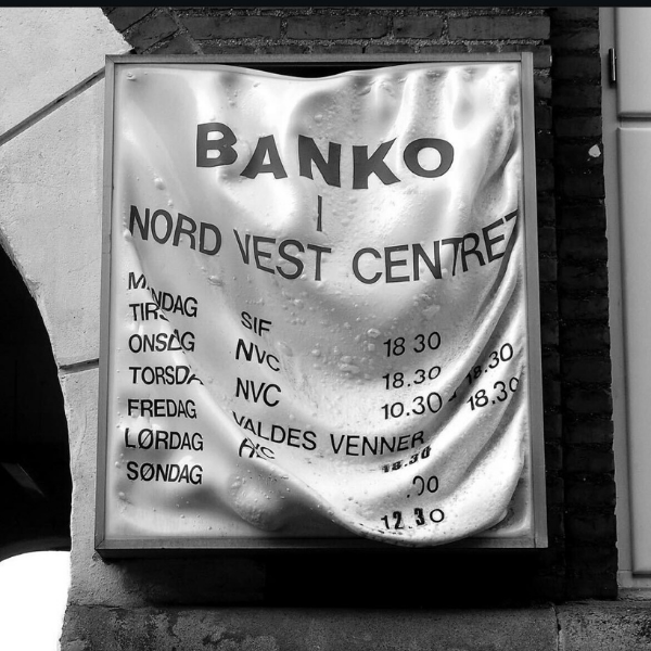
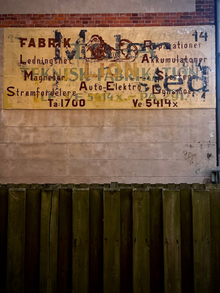
Danish type is defined by a strong sign painting tradition. Throughout Copenhagen, you can still find amazing work by unknown sign painters.
Tell us about your city. What do you love about it? What’s distinctive about it?
I grew up in the outskirts of Copenhagen and have spent almost all my life in this city, so it’s a place that truly feels like home.
One of Jeppe’s favorite typefaces, DS737. This is the Danish version of DIN and is used extensively in wayfinding throughout Denmark. Playtype has digitized and expanded this typeface (whose original maker is unknown) into a contemporary super family with many different widths and weights.
When you grow up in a city, your relationship to that city becomes extremely nuanced. The city and its fluid state become part of your own journey and interweave into all the different chapters you go through. Like many other cities, Copenhagen is separated into different neighborhoods, and each neighborhood has its own vibe — almost like little villages within a bigger village.
I absolutely adore biking, and Copenhagen is one of the most bicycle-friendly cities in the world. You can basically get to anywhere in Copenhagen in about 20 minutes on a bike, and in a somewhat safe state without having to battle too many gasoline-guzzling vehicles.
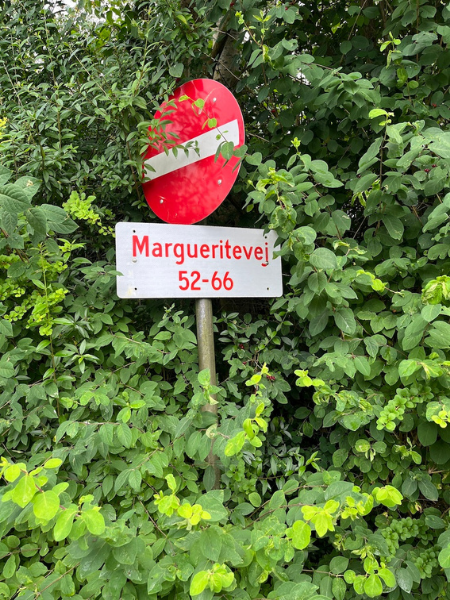
One of Jeppe’s favorite things is when type goes “wrong,” or when it gets weathered or altered in unexpected ways.
I feel as though Copenhagen is very season dependent. In the winter, people seem to go into hibernation mode, staying inside, cozying up with indoor activities. Then, when spring arrives, the city and its people completely change. Everyone takes to the street — eating, drinking, and going swimming.
A great example of the Danish sign painting heritage that’s still found throughout Copenhagen.
Where would you take someone visiting your city for the first time to explore its creative heart? (Art, music, food, neighborhoods.)
Copenhagen in the summertime seems like an all-you-can-eat cultural buffet. There are so many festivals and events going on, and I highly recommend exploring this without a real plan — the best experiences are often the ones you stumble upon by accident.
Copenhagen is gifted with a long list of amazing museums, music venues, and internationally renowned restaurants — all worth having on the list of things to explore.
But more so than specific spots, I would recommend renting a bike and riding around to experience the different neighborhoods and the vibes that define them. Make sure you spend some time in Nørrebro and Vesterbro. Oh, and while in Vesterbro, go visit Mangia for some amazing Italian dining.
What’s a typeface that you think represents the spirit of your city and why?
A couple of years ago, Playtype was lucky enough to get the task of creating the typeface for the city of Copenhagen: KBH Sans.
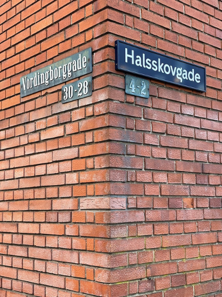
Copenhagen, old and new. An example of KBH Sans, the typeface Playtype created for the city of Copenhagen (right), next to a beautiful old cast iron street sign (left).
The typeface is rooted in the heritage of the city and the long-standing Danish design legacy.
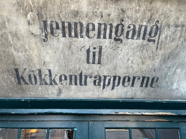
This hand-painted sign includes the curtailed “g” that has become something of a Danish design trait (also called “the Danish g”).
As the typeface is being implemented, it’s really starting to feel native to the city. Now all visual material coming from the city is set in this typeface — all campaign work, letters, posters, magazines, wayfinding, and street signs. I think I probably meet this typeface a hundred times on my daily commutes and when picking up my kids!


