


Tag: Studio
86 articles
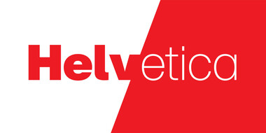
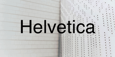
Right place, right time: The complicated legacy of Helvetica, one of the world’s most iconic typefaces.
You can love it or hate it, use it for nearly anything or refuse to use it at all. But however you feel about Helvetica, no one can deny its place in society.

Creating the typeface for SAP Fiori.
Monotype’s Terrance Weinzierl helped software company SAP to develop a typeface for SAP Fiori, for which SAP won a Red Dot Award in 2015. It was important that the design of the typeface works well in text-based UI environments without compromising on personality. The new typeface, called 72, has won a 2017 Red Dot Award.

A digital-ready Chinese sans-serif is born.
Many Chinese typefaces have a reputation for looking dated and not reading easily on small screens— not M Ying Hei. It checks all the boxes that it’s forefathers can’t.

Tazugane Gothic.
The first Japanese typeface from Monotype is a humanist sans serif, designed to work in partnership with Neue Frutiger. Tazugane Gothic sets out to introduce a new typographic standard, allowing designers to comfortably set Latin and Japanese characters alongside one another while maintaining visual harmony.

Meet Hope Sans.
Hope Sans has been selected by the judges of the 22nd Annual TDC Typeface Design Competition to receive the Certificate of Typographic Excellence. It will be included in the Annual of the Type Directors Club, “The World’s Best Typography,” and will also be shown at the 65th Awards Exhibition (TDC65) in New York City.

Introducing Sagrantino.
Sagrantino is a non-connecting script that traces its roots back to hand-drawn letterforms, and the connection between pen and paper. Named after the Italian wine, Sagrantino is bold and full of flavor, while embodying a sense of freedom and fluidity. Its quirky character shines at larger sizes – making it perfect for headlines, posters, or anywhere type is needed to really make a point. The family is available as OpenType Pro fonts, and has an extended character set that supports most Central European and many Eastern European languages.

Meet VAG Rounded Next.
This extended version of the VAG Rounded typeface by the Monotype Studio brings the 1970s design up to date, expanding its language support and adding two new display fonts.

Introducing Amariya.
Created with screen reading in mind, Amariya’s sculpted, understated elegance is specifically designed for long-form copy in Arabic, Urdu or Persian. Its open shapes and streamlined forms are tailored not just to the digital world, but the flow and rhythm required by someone immersing themselves in words.

Neue Kabel: reshaping a lost classic.
Neue Kabel brings back the liveliness of the original’s strikingly quirky characters, while adding in the long-lost italics and missing glyphs needed for it to address a wide range of editorial and branding purposes.

The story of PMN Caecilia Sans.
The making of the serif typeface PMN Caecilia from first sketches to usable fonts took more than seven years. Designed by Peter Matthias Noordzij, it is the child of a time when font technology changed rapidly, not knowing which development the next day would bring. Eventually it was released in 1991 and quickly turned into a quiet tip for designers; not overused, and yet selected for prominent applications. Today, more than 25 years later, Noordzij adds a sans serif companion to his first type family and equips it for today’s needs.
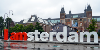
How fonts give voice to a destination.
How do fonts influence your perception of a city and its identity? See how the right choice can convey the image of a place is and what it aspires to become.
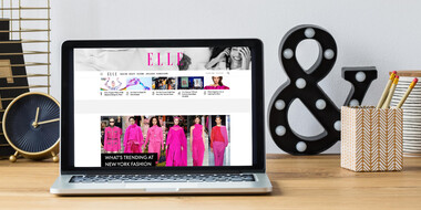
The Role of Fonts in Modern Publishing.
Fonts play an indispensable role in shaping your experience of published media, working in a deliberate way to communicate the information clearly and legibly.

When type goes tiny
When screens get smaller, spacing gets tight, details get lost, and forms blend together. The resulting legibility issues can make for a frustrating reading experience. Here’s how to find the fonts that can fix it.
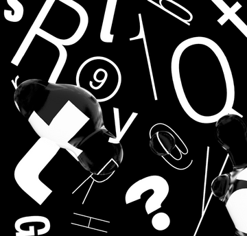
Just how neutral is Helvetica?
In many ways the idea that Helvetica is a ‘neutral’ typeface has become a self-fulfilling prophecy. That’s not to say it isn’t, but the neutrality narrative is only half the story.
Enjoyable discomfort: The many points of view of Ambiguity.
Ambiguity, from Charles Nix, offers a chance to pause for thought, question the state of affairs, and indulge in a little bit of enjoyable discomfort.

Inside Santander’s new custom font from Monotype.
Juan Erquicia, Group Brand Manager at Santander, discusses the hurdles his brand faced heading into its rebrand, and how a custom font from Monotype helped solve those challenges.

Behind the font: Carl Crossgrove of the Monotype Studio.
Behind the font highlights the people and process behind the fonts you love and use. This installment features Carl Crossgrove of the Monotype Studio.

Introducing Neue Frutiger World.
More than 150 languages and scripts are supported in this global super family, which uses the warmth and clarity of the original Frutiger design to help brands communicate around the world with consistency.