


Tag: Studio
86 articles
Meet Neue Plak.
German designer Paul Renner is best known for his Futura design, but Plak, his ‘other’ typeface, is long overdue a rediscovery. Monotype designers Linda Hintz and Toshi Omagari have restored this under-appreciated design, creating a versatile set of 60 weights that draw on the forms of the original wood type.

Why brands love to use sans serifs (and how you can choose one, too).
You know what they say, “classics never go out of style.” Maybe this is true, maybe it isn’t. But one thing is certain: When sans serifs took over typography in the early 1900s, they weren’t just a fad. They came to stay.

What’s behind the rise of ‘quirky’ serifs?
Sans serifs have long dominated the world of corporate branding, but some companies are going for a different look: Fun, funky serifs. What’s behind the change?

Finding your type: How to pick the right font for your brand.
Finding the right brand font requires a deep understanding of who you are as a brand, and how you want to present that identity to the world.

What is optical sizing and how can it help your brand?
Optical sizing has long been part of the type designer’s toolbox, but for many people the term may not be familiar. Here’s why that should change.
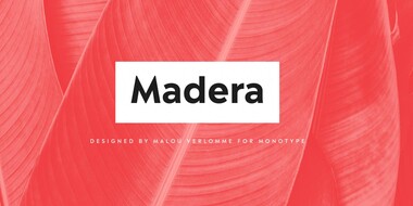
Meet Madera.
Malou Verlomme’s Madera is a fresh addition to the popular geometric sans serif font genre, intended as a go-to typeface for branding and visual communication.
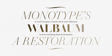
Meet Walbaum.
Monotype’s Walbaum typeface is the modern serif font to beat all modern serifs. Freshly restored by Monotype, this updated family oozes charm.
Embrace Ambiguity.
Monotype introduces Ambiguity, a typeface designed to effectively express a range of attitudes and beliefs.
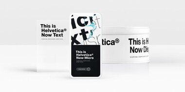
From Neue to Now: How Helvetica evolved for the 21st century.
Designers and studios might be deeply familiar with Neue Helvetica, but it’s the product of a pre-digital era. Here are four reasons why it’s time to switch.

The challenging game of designing for sports.
The World Cup is back, and all eyes are zeroed in on the best football … jersey fonts? We examine the tall task of designing for the world of sport.

A stackable typeface for Domino’s Pizza.
Monotype designer Terrance Weinzierl delivered a taste of modern Americana to Domino’s, with his modular, multi-weight Pizza Press typeface.

Premier League: a brand identity that works hard, plays hard.
One of the best rebrands of 2016, the new Premier League identity features a typeface that performs confidently from screens and jerseys to TV and league tables.

Introducing Johnston100.
Transport for London commissioned Monotype to remaster the 100-year-old Johnston typeface.

Tencent expands global presence.
If you’re using a messaging app in China, chances are it’s owned by Tencent. See the brand identity and typeface that is helping Tencent expand to new markets.