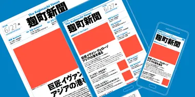
A digital-ready Chinese sans-serif is born.

Many Chinese typefaces have a reputation for looking dated and not reading easily on small screens— not M Ying Hei. It checks all the boxes that it’s forefathers can’t.
The M Ying Hei™ typefaces were designed and built by Monotype’s seasoned typeface designers and longtime collaborators Kenneth Kwok and Robin Hui, and were launched in response to the call for a Chinese sans-serif with better performance and a more modern elegance on screen and in print.
Dressing a best-selling Chinese typeface for the 21st-century
First, a bit about how the M Ying Hei typeface came to be. It’s inspired wholly by the graceful and refined typeface M Hei, a design classic Monotype introduced in the 90’s that soon became a best-selling Chinese sans-serif. Though M Hei is based on the structure and proportions of Chinese’s traditional formal script, Kaishu—with its minimal, razor-sharp stroke design—it is classified as a Heiti typeface. The Heiti genre is essentially an unfussy, stripped-down version of the more elaborate Kaishu typefaces that have defined the look of Chinese characters for 1,500 years.

M Ying Hei specimen
Of all categories of Chinese typefaces, Heiti have increasingly become the most popular amongst graphic designers and are now the voice of contemporary life, much like the grotesque san serif type styles (like the Helvetica® typeface) have become in the west. Heiti appear calm and neutral, impressing on the reader an air of modernity without extraneous fuss. They translate well across language boundaries, working diplomatically with other scripts that share the same monolinear characteristics.
Because of its Kaishu-like qualities, the structure of M Hei is quite traditional in contrast to other Heiti designs. Striking a happy medium between the older Kaishu typefaces and the newer Heiti typefaces, the M Hei design came to be seen as a rare gem in the world of Chinese typefaces. For 25 years, it served as the typeface of choice for continuous reading in Hong Kong and Taiwan. Then came the advent of mobile technologies.
A Chinese sans-serif for the information age
With sleek, ultra-readable and ultra-versatile Chinese typefaces needed for use on mobile phones and other small screens, Monotype’s type design team saw an opportunity to whip up a high-performance Heiti design that displayed just as beautifully on digital screens as it does on other applications. Monotype’s M Ying Hei typeface was created with this in mind.

M Ying Hei can claim a much wider zhonggong
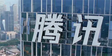
What makes this new design work where its predecessors didn’t? It can claim a much wider zhonggong, which is akin to having a large x-height in Latin. This tweak makes it pair wonderfully with clear and functional typefaces like Neue Helvetica and has helped it to come across as modern and friendly. Most importantly, the expansive zhonggong—the central part of each Chinese character—has increased this design’s legibility on both screen and print, allowing for more white space on the inside of each character, so that it performs well on signage and can overcome backlit situations easily.
Big-time legibility even at a glance
The M Ying Hei typeface was designed with legibility top of mind, and much work went into optimizing it for display of information on vehicle dashboards and GPS systems. For our typeface designers, the stakes feel even higher with these assignments, as drivers need to be able to quickly and accurately recognize the text display on screen, so that they can shift their attention back to the road, reducing driver distraction.
Mission accomplished! According to the article ‘The effects of Chinese typeface design, stroke weight, and contrast polarity on glance based legibility’ (published in Display and coauthored by researchers at Monotype and the MIT Age Lab), text set in M Ying Hei could be read accurately in shorter exposure times than the other Hei and Ming style typefaces tested in this study. For example, it required 33.0% less time than the least legible typeface Monotype Sung PRC, a “Ming” style typeface, 20.9% less than with the Microsoft YaHei Regular, 19.0% less than with the CYuen2PRC SemiBold, a “Rounded Gothic” style typeface.

The lower the exposure duration needed to maintain the same accuracy level, the more legible the typeface is.
Plays well with others
Some more things to love about M Ying Hei: Global brands will find it pairs exceptionally well with popular corporate typefaces like Neue Helvetica®, Neue Frutiger®, Avenir® Next, Univers® Next, Trade Gothic® Next, and Neue Haas Unica™
A well-conceived system of weight variants
As is essential in any contemporary type family, the M Ying Hei family has five weight variants, enough to handle the demands of most applications and to establish effective information hierarchies. The smooth weight transitions allow optimal display quality in a range of media, from printed documents and back-lit signage to offset lithography in publications as well as high-resolution small screen devices. The weight variants also make it easy to match this typeface with a range of different Latin typefaces.
Ready to go to work
The M Ying Hei family has filled an important gap in the market for Heiti typefaces and for Chinese typefaces overall. If it’s anything like its parents, we’re sure it will enjoy a long and happy life in the arsenal of today’s international designers.
Visit fonts.com to get M Ying Hei PRC (Simplified Chinese) or M Ying Hei HK (Traditional Chinese)
The Studio team.
Robin Hui.

Robin Hui joined Monotype Hong Kong as a type designer in 1988. He is currently the Chief Typographer and Production Manager of Monotype Hong Kong, responsible for a wide variety of type design and technology projects, including compression, hinting, and rendering control of typefaces across different platforms. Before joining Monotype, he spent 10 years as a professional typesetter, where Robin gained experience in how type is used effectively while also developing a strong passion for Chinese typography.
