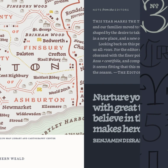
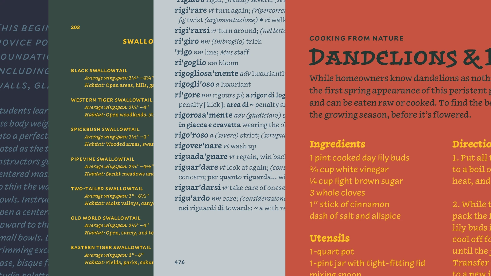
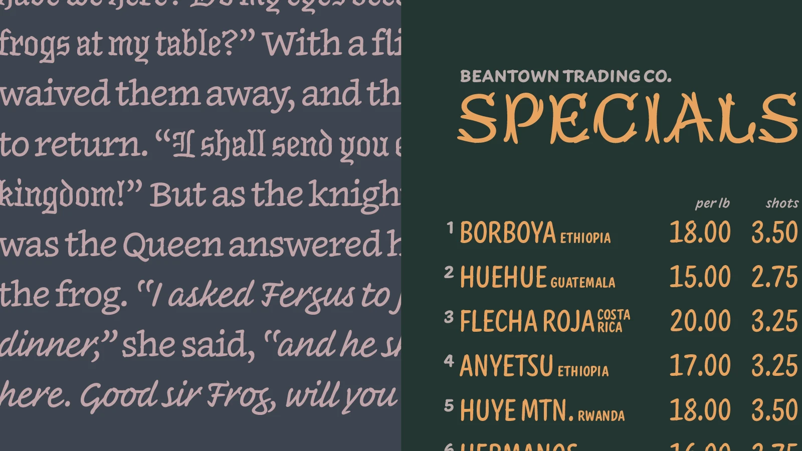
What if a typeface could speak the way handwriting does?
Not in one voice, but in many, moving from careful text to expressive capitals, from quiet annotation to decorative flourish, the way a handwritten note naturally shifts with intention. That’s precisely what Inkwell does.
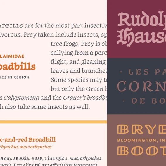
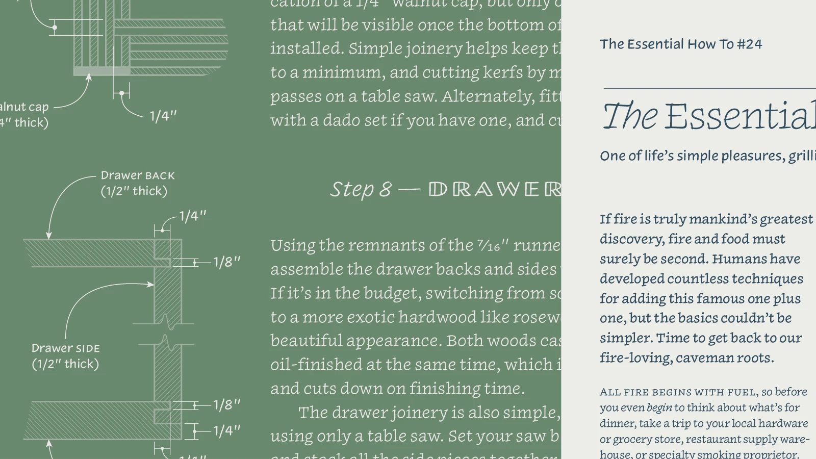
Inkwell was originally designed by Jonathan Hoefler for Hoefler&Co, now part of the Monotype family. Inkwell brought serif, sans, script, and display styles into one connected system, united by the familiar qualities of the pen. Every member of the family spoke differently, yet each belonged unmistakably to the same conversation.
Four new voices.
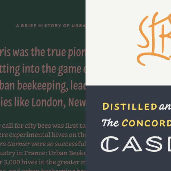
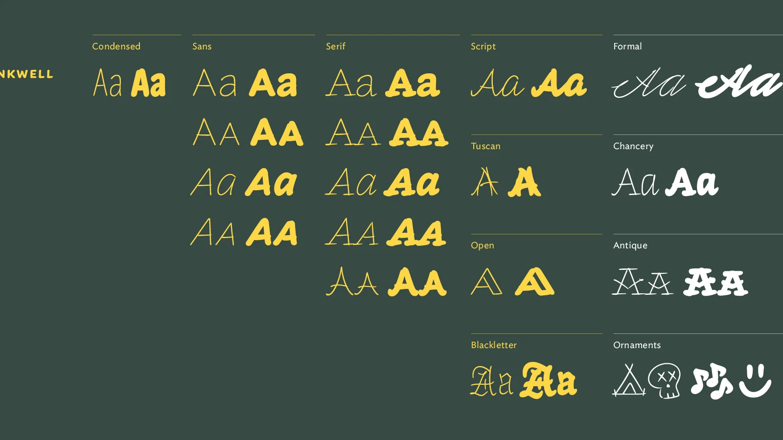
Today, that conversation continues. Monotype is expanding Inkwell with four new styles from Jordan Bell, Senior Type Designer at Monotype: Antique, Formal, Chancery, and Ornaments. Each broadens the family’s range while remaining true to its original handwriting-led philosophy.
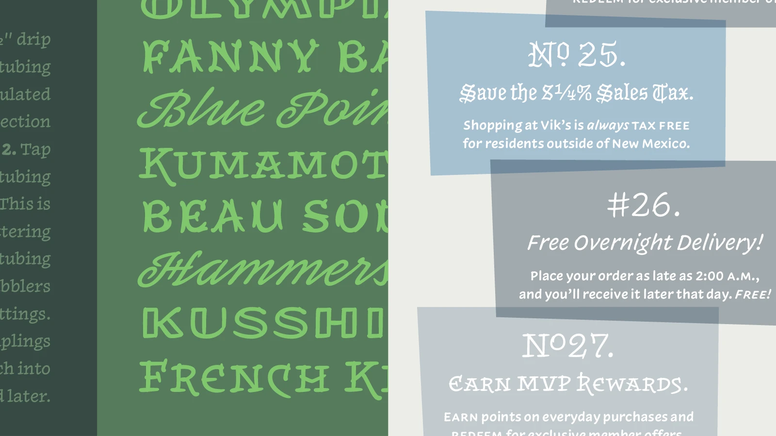
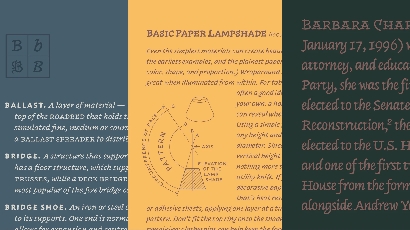
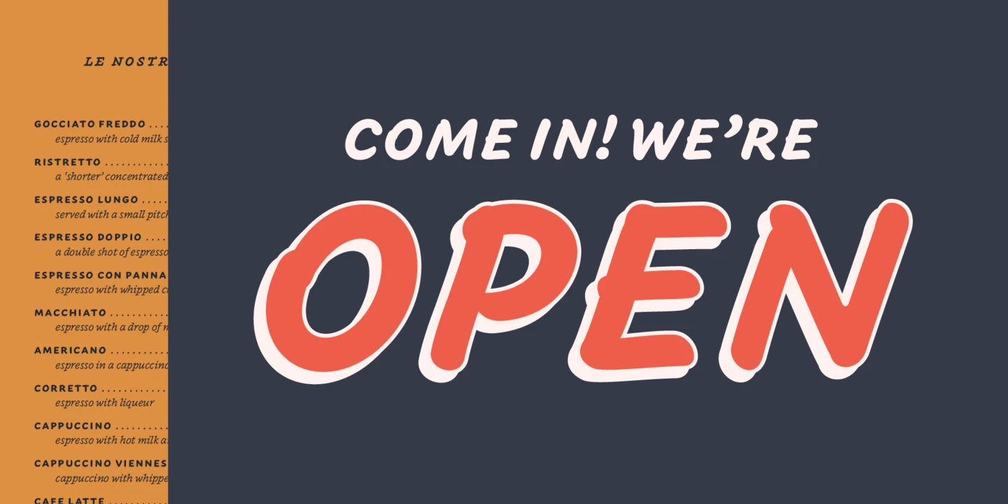
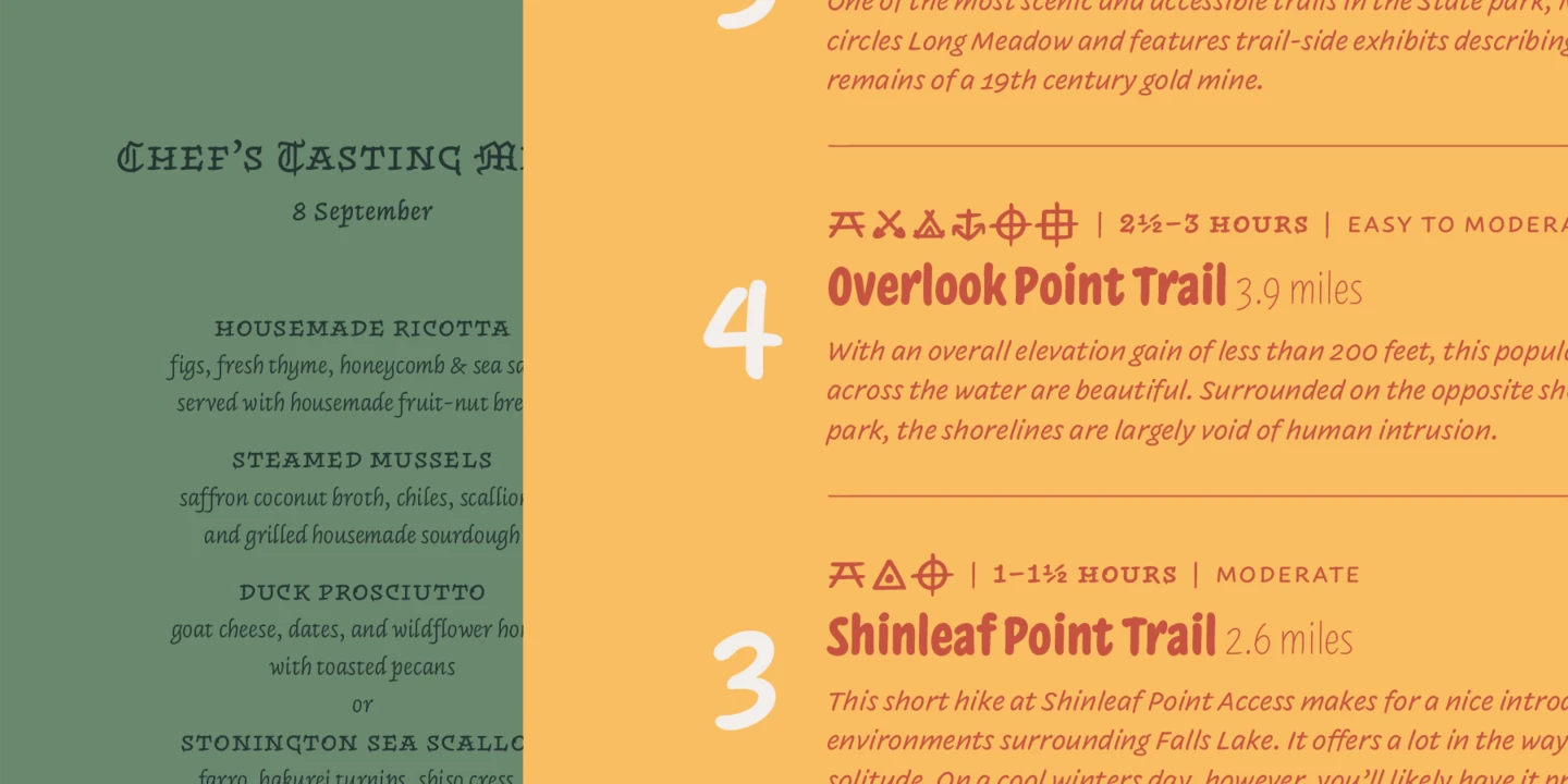
- Inkwell Antique, inspired by ornamented lettering from the Victorian era, adds historic character for branding, packaging, posters, hospitality, and editorial design.
- Inkwell Formal offers a new twist on the classic engraver’s script, using contextual and position-specific characters to preserve natural handwritten variation for hospitality, events, wine labels, and luxury branding.
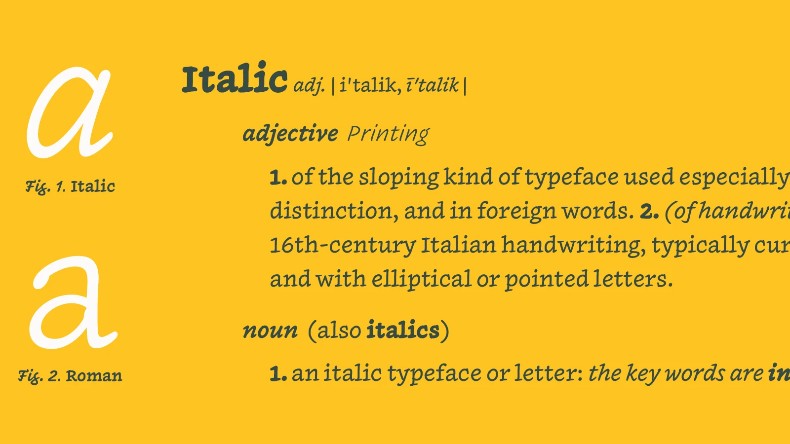
- Inkwell Chancery draws on Renaissance writing traditions, with swash capitals and contextual alternates, creating useful contemporary family publishing, museums, cultural institutions, and ceremonial work.
- Inkwell Ornaments extends the family beyond letterforms with charming emoji and illustrations, along with arrows, pointing hands, musical symbols, weather devices, and cartographic elements — bringing Inkwell back to its origins in mapmaking.
All at once.
“Inkwell is without a doubt the typeface I have worked on longest throughout my career. It also happens to be the typeface that has taught me the most about type design. With its unusual balance of cohesive and disruptive details, unity in diversity, and drafting on both paper and screen, Inkwell has given me an entire education in the type design process that has frankly changed the way I look at letterforms.”
Jordan Bell, Senior Type Designer and lead designer for Inkwell expansion, Monotype
Together, the four additions give designers new ways to create emphasis, atmosphere, and personality. Inkwell has always believed a typeface could speak with many voices, not just one. This expansion builds on that belief. The result is a larger universe, built on the same expressive foundations, ready to move between drafting and decoration, and balanced for print and digital environments, all within one coherent language.
Explore the expanding Inkwell family in the Monotype library, or try the four new additions as part of a Monotype Fonts subscription.