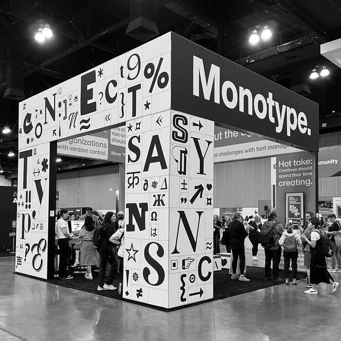
Did you Find the Font?
Almost 1,500 people played our Find the Font game at Adobe MAX, which asked people to answer a series of questions using the fonts displayed on our booth.
The answers tell us a lot about the impact and perception of fonts. Notably, many of the opinion-based questions had one or two clear favorites, which shows us that certain fonts or font styles have strong associations with certain descriptors or cultural markers. Several archetypes are firmly embedded in our collective consciousness - high contrast conveys elegance, for example, while restraint and simplicity signal professionalism. So, if you’re a brand looking to convey a specific feeling, chances are there’s a font that will evoke the right mood for a large number of your audience.
However, even in cases where a question had a clear frontrunner, a large majority chose something else. This diversity of responses reflects the individuality we all bring to our daily lives - perhaps exacerbated by the design-conscious, font-loving attendees at Adobe MAX. And it goes to show that typography offers limitless opportunities for expression and connection.
Elegance, thy name is Keiss.
A whopping 39% of participants chose Keiss Big for question 1, which asked guests to “Locate a font that conveys elegance.” 13% chose Cotford. Keiss Big is a very high-contrast font, with extreme thick and thin strokes, and bears a strong resemblance to fasion mainstay Bodoni. The looping, curving serifs and ball terminals give it a whimsical flair. Cotford, by Monotype’s Tom Foley, shares some of the same characteristics, but is more restrained and subtle.
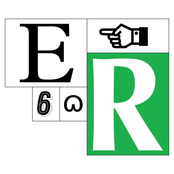
Has anyone seen Helvetica?
Turns out Helvetica is pretty difficult to spot! We asked people which font they thought was Helvetica, and the three most popular choices were … not Helvetica. That accounted for 67% of all responses. This highlights a challenge many organizations face: font recognition is difficult! In the real world, it isn’t always obvious that you’re using the correct, brand-approved font. Thoughtful font management means they don’t have to - ensuring teams are always using the right fonts in the right place.
Helvetica appeared once in our grid, and only 9% of our participants found it. Like many other typefaces, Helvetica has been copied and mimicked countless times, making it challenging to spot. But as they say, imitation is the best form of flattery.
Black Rider is a punk rocker.
When it comes to punk, Black Rider was by far the most popular choice for question 3, which asked guests to choose a font for a punk band. 30% of participants chose this font, more than three times the second, third, and fourth most popular selections. And while the name is more Finnish death metal than punk, this brush script captures the latter’s handmade, DIY spirit and would look great on a flyer promoting an upcoming all-ages show.
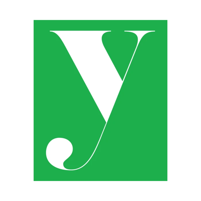
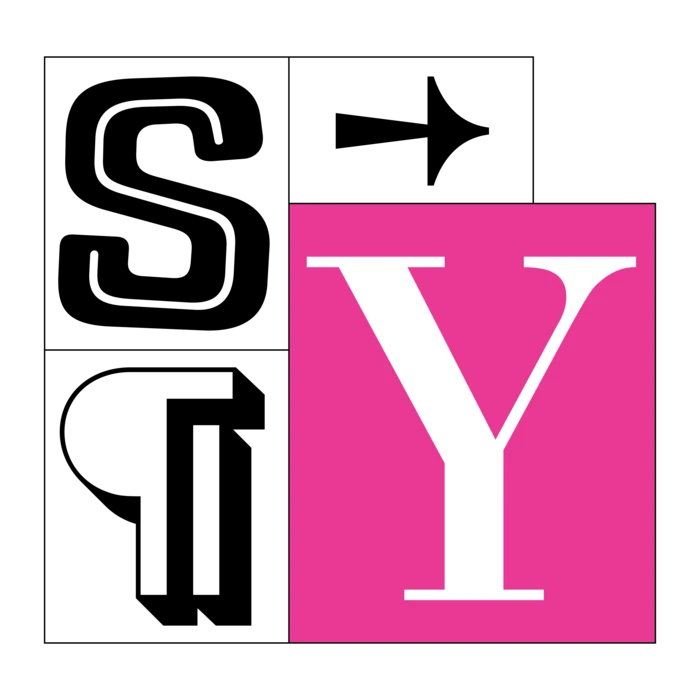
In sync (literally).
We asked people to find the word “sync” hidden in our wall, and as if that weren’t enough, they then had to tell us which font we used for the letter Y. The answer was Bodoni, and 35% of our guests got it right!
Bodoni is one of the most ubiquitous fonts in the world, often used in fashion and lifestyle industries, and famously - ironically - by Nirvana.
To infinity and beyond.
Two fonts led the way in response to question 5, which asked people to choose which font they’d use for a spaceship or sci-fi movie. Just over 19% of our guests chose the appropriately named Neo Sans Pro, which has echoes of sci-fi favorite Eurostile. Eurostile has appeared in countless sci-fi classics, from Alien to the Starship Enterprise, and Neo Sans has similar square letterforms with rounded corners and terminals.
Just under 19% chose the rugged, industrial Russell Square, which would look great on some interplanetary mining spacecraft, pre- and post-alien encounter.
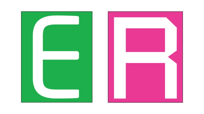
There’s a new serif in town. Name’s Optima.
We once again asked participants to find a word embedded in our wall and then identify one of the fonts used in that word - this time the R in “serif.” 37% of our guests correctly recognized Optima, Hermann Zapf’s graceful (and very popular) humanist typeface, released in 1958. Optima is almost a serif, with terminals that gently spread outward, giving the typeface a sturdy footing without full, proper serifs.
The best interview advice? Be yourself.
The question guests pondered the longest also resulted in the broadest range of answers: Which font would you send to a job interview on your behalf?
The most popular choice, was Helvetica - the model of modern sophistication - but only 2% of participants chose it. Close behind was Total Black, a bold, heavy sans serif that would easily own the room and make a strong case for itself. Other popular choices were Optima and Gotham. (Note that we did not specify that the font had to be from our wall.)
Overall, modern sans serifs were by far the most popular stylistic choice, with 60% of selections falling into this category. Another 25% chose traditional serif fonts. Both of these styles convey steadiness, reliability, confidence, and clarity in their own way, with sans serifs leaning toward minimalist sophistication and serifs conveying trust and stature. But the absence of a clear favorite font shows that people really took this question seriously and personally. Our guests chose fonts that reflected their individuality and unique qualities rather than coalescing around a general idea of what the ideal font candidate might be.
We asked people to tell us why they chose the font they did; here are some of our favorite explanations:
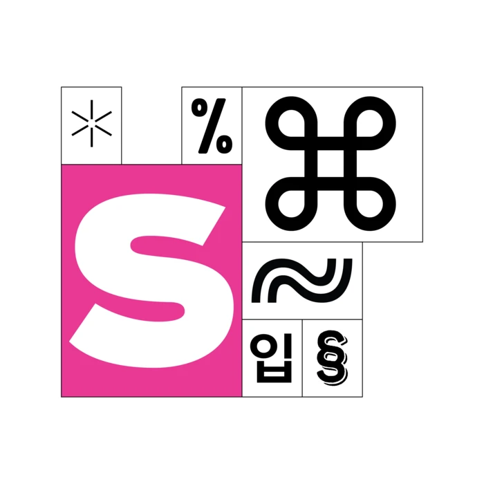
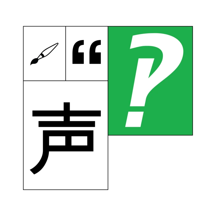
I’m sorry, did you say “Interrobang?”
We sure did. Our final question - technically a bonus question - asked participants to find the interrobang hidden in the grid. 30% of them did locate this quirky combination glyph that combines an exclamation point and a question mark and has arguably the best name in all of typography.
Thank you to everyone who played Find the Font - we loved seeing you all and appreciated the passion and deep contemplation that was on display as people circled our booth and scrutinized our walls of fonts. We love type and we’re glad you do, too!
Each of these fonts is available for unlimited prototyping through Monotype Fonts, along with 250,000 others. Check them out and test out our innovative font search and management tools today: