


Walbaum
スタイル充実の復刻書体

スタイル充実の復刻書体
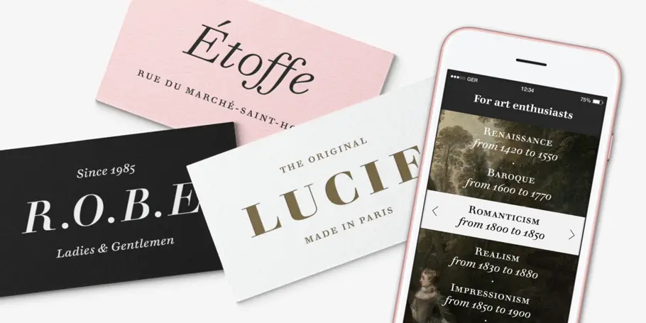
WalbaumはCharles Nix、Carl Crossgrove、Juan Villanuevaが手がけたモダンセリフの書体ファミリーで、極小サイズのキャプションから巨大な見出しまで揃っているので、さまざまな用途に使えます。他のモダン書体が簡素な雰囲気なのに対し、Walbaumは温かみのあるデザインのため、高級感と親しみやすさを兼ね備えた大きな書体ファミリーをお探しのブランドにはおすすめです。


WalbaumはCharles Nix、Carl Crossgrove、Juan Villanuevaが手がけたモダンセリフの書体ファミリーで、極小サイズのキャプションから巨大な見出しまで揃っているので、さまざまな用途に使えます。他のモダン書体が簡素な雰囲気なのに対し、Walbaumは温かみのあるデザインのため、高級感と親しみやすさを兼ね備えた大きな書体ファミリーをお探しのブランドにはおすすめです。
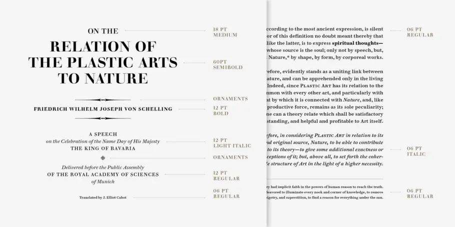
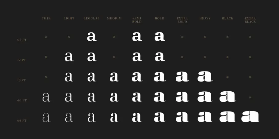
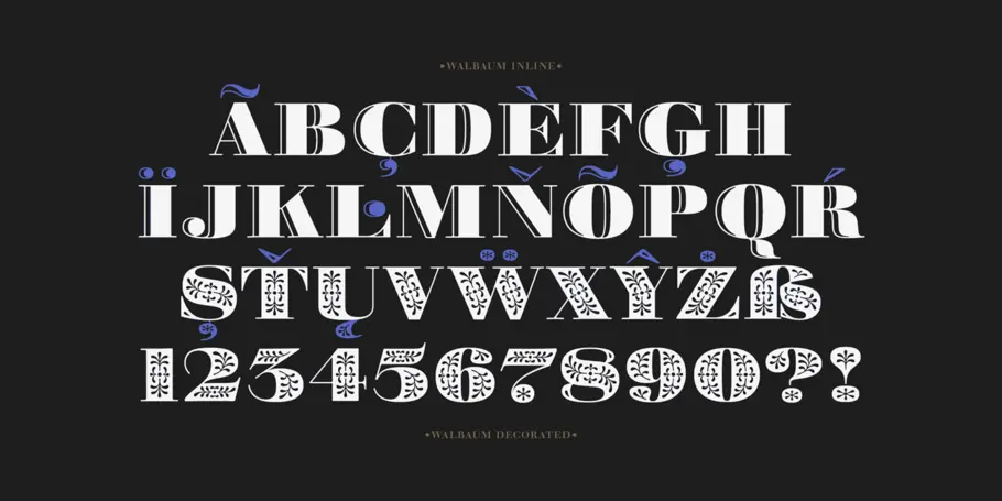
Walbaum was designed with a full range of size-specific cuts, from 6 to 96 point, with tailored weight and contrast for maximum legibility, utility, and impact. In addition to the huge range of weights and sizes, the family contains two decorative display cuts and an uncommonly generous host of ornaments.

Charles Nix is a Creative Type Director, designer, typographer and educator. He designed a number of popular typefaces in the Monotype Library, including Walbaum and Hope Sans, which received a Certificate of Typographic Excellence in the 22nd Annual Type Directors Club Typeface Design Competition. He’s also designed custom typefaces for Google Noto, Progressive Insurance and the Philadelphia Museum of Art.

Carl Crossgrove is a Senior Type Designer at Monotype. From Carl’s early interest in calligraphy and drawing, through his youth and college years studying fine arts and book arts, to his eventual degree from Rochester Institute of Technology in Printing/Typography, the constant thread in Carl’s life has been his fascination with letterforms.

Juan Villanueva は、ニューヨーク市にある Monotype Studio のシニア・タイプデザイナーです。Monotype Library には彼のデザインした Walbaum や Sagrantino などの書体があります。これまで Tencent Sans、Ricky Zoom、複数の Google Noto フォントなどのカスタム書体を手掛けてきました。
We offer a number of ways for you to start working with our typefaces.


Monotype’s Walbaum typeface is the modern serif font to beat all modern serifs. Freshly restored by Monotype, this updated family oozes charm.

リリースから60年、Helvetica®はその明快さと中庸さで常に人気を誇ってきました。しかし多くの書体にたがわず、時代や技術の変化とともに、この書体に求められるものも増えてきました。スイスデザインのシンプルさを体現したHelveticaは、これまで以上にさまざまな場面、さまざまなサイズでの活躍が期待されています。
