What is optical sizing and how can it help your brand?
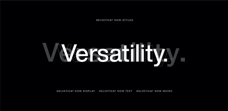
Helvetica® Now, the newest release from the Monotype Studio, features three optical sizes—Micro, Text, and Display—aimed at optimizing legibility across a range of applications. Optical sizing has long been part of the type designer’s toolbox but for brand managers, marketers, and even some graphic designers, the term may not be familiar. Let’s take a look at what it is and how it helps brands deliver clear and effective messaging to their customers.
Designing for context
Optical sizing is the practice of designing different versions of a font with consideration to how and where it will be experienced. For example, you experience Helvetica differently when it’s used on a billboard compared to when it’s used on a phone screen or in body text. Optical sizing accounts for these contexts, and for how the nuances of character shape, spacing, and kerning impact both legibility and style. Common practice is to design the font at one optimum size and hope it works well—or acceptably—at all sizes, but single-size (or single-master) type designs ignore these nuances.
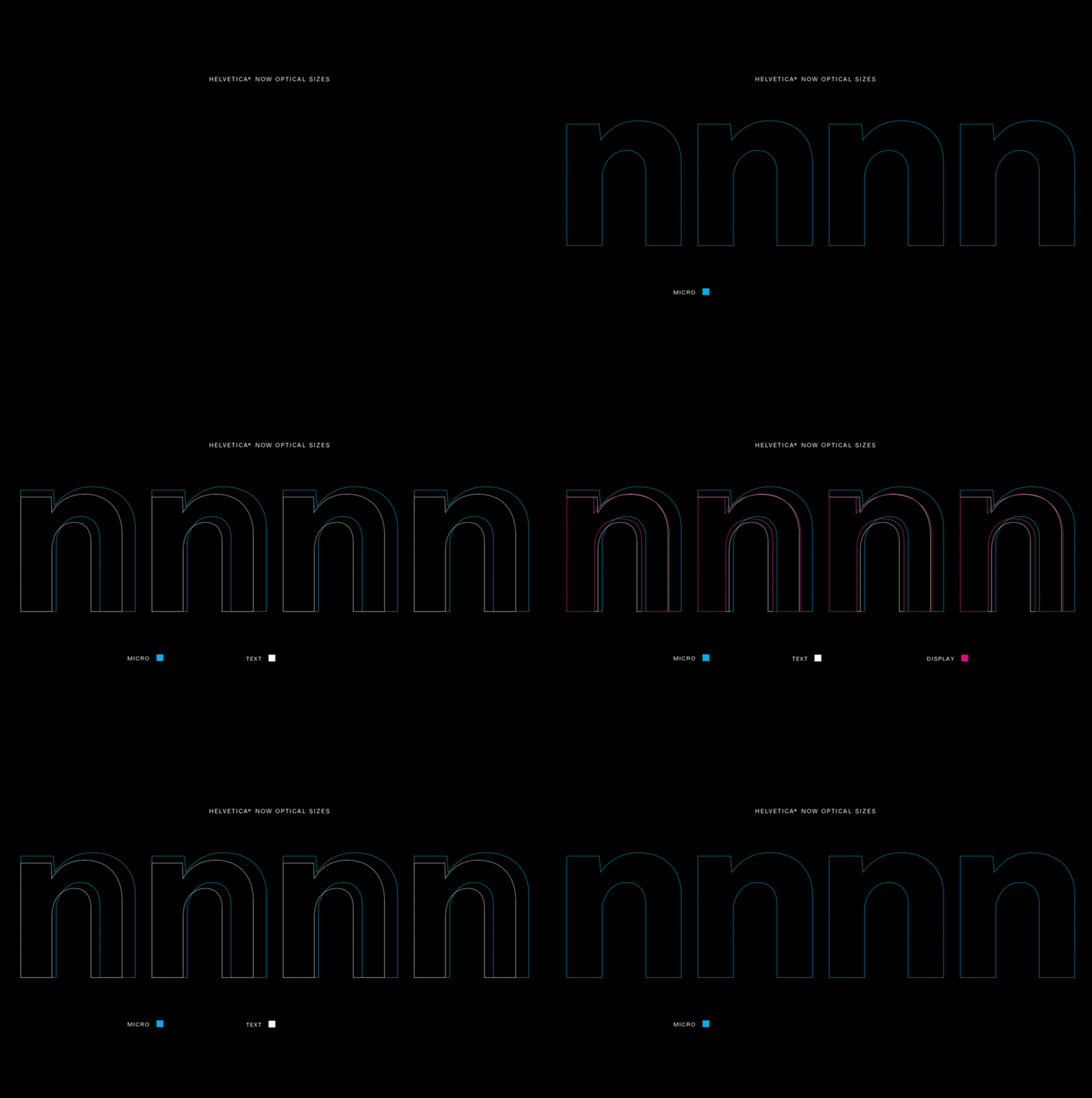
The optical sizes in Helvetia Now enable it to unction flawlessly in a range of applications, from large, eye-catching display text to hyper-legible micro type.
When restoring Walbaum, a classic serif type family, for the digital age, Monotype Type Director Charles Nix explained it this way: “Imagine if we all decided that 10-year-olds were the optimal human form—and rather than having babies, we just shrunk 10-year-olds to baby size and enlarged them to the size of a full-grown adult. Babies aren’t miniature 10-year-olds, and 5-point type isn’t simply tiny 12-point type.”
Before the use of computers, type designers varied the designs for each size of a typeface to retain the style and legibility throughout the range. Smaller sizes required wider spacing between characters and larger letterform openings to improve legibility. Conversely, bigger sizes benefited from refinements like greater stroke contrast and more elegant details. However, when type was digitized for computers and single-master designs, the one-size-fits-all approach became the norm.
What is normal?
Now, knowing that one size does not fit all, foundries are designing and digitally restoring fonts with size-specific optimizations to maintain design integrity.
Though there are some key design elements to address first, the approach to designing optical sizes is both art and science, according to Nix.
It requires an artistic sensitivity to the shapes of forms and the spaces between,” he says. “But improvements are made through observation, hypothesis, and experimentation. It’s study, trial proofing, and refinement—the standard iterative design process.”
For Nix, he always begins with a question. “What is normal? I ask myself when designing a font with optical sizing. It sounds like an existential crisis but designs for very small sizes need to convey the impression of the normal text size. And designs for larger sizes need to refine normal for the scrutiny of a close up. What is normal? It’s the essence of what the design is trying to achieve—its ethos.”
When re-imagining Helvetica, a family introduced more than 60 years ago, the Monotype team stayed true to the original intent: a font that delivers clarity, simplicity, and neutrality. The result, Helvetica Now, is Helvetica improved for today’s needs. Consisting of 48 fonts in three optical sizes—Display, Text, and Micro—the family excels in high-res and low-res environments and, Nix says, functions “flawlessly across the range of design applications—from large, eye-catching display text in advertising to hyper-legible micro-type in multi-level information design.”
The larger Display sizes, made for point sizes 14 and above, are carefully drawn to show off the subtlety of Helvetica and spaced with headlines in mind. The standard Text sizes, made for sizes 8-12, are drawn and spaced to deal with the rigors associated with legibility in extended text. The strokes are robust, contrast is reduced, and spacing is relaxed—all adding up to comfortable reading. The range of weights provides an ample palette for information-rich environments.
The Micro sizes for point sizes 3 through 7 are for very small typesetting and type in low-resolution environments. The forms are simplified and exaggerated to maintain the impression of Helvetica and the spacing is purposely loose—an essential ingredient to hyper-legible micro-text.
Why brands should care
Optical sizing creates a better user experience, facilitates reading and comprehension, and adds versatility, accessibility and flexibility. This allows brands to quickly and effectively communicate with their audience in an unlimited range of media without disrupting their visual identity.
From posters to in-app experiences, style and legibility are crucial. Brand messaging has to function flawlessly in a hyper-competitive environment. Any hindrance to legibility or slip in style is a mark against a brand. Optical sizing not only functions better, it simply looks better.
To explore Helvetica Now or download a free weight, visit the Helvetica Now specimen page.
