
デジタルノイズの中でブランドを際立たせるためにできること.
世界中のあらゆる企業がアプリ、オンラインサービス、その他のデジタル施策を立ち上げ、COVID危機による混乱に対処する中で、多くのブランドはこの急増したデジタルノイズの中で、どうやって自社を際立たせることができるかを考えていることでしょう。
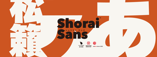
The Shorai Sans Font Family was designed by and published by Monotype. Shorai Sans contains 10 styles and family package options.
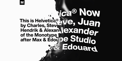
The Helvetica Now Font Family was designed by and published by Monotype. Helvetica Now contains 96 styles and family package options.
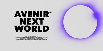
The Avenir Next World Font Family was designed by and published by Linotype. Avenir Next World contains 20 styles and family package options.
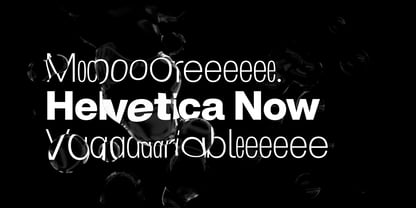
The Helvetica Now Variable Font Family was designed by and published by Monotype. Helvetica Now Variable contains 2 styles and family package options.
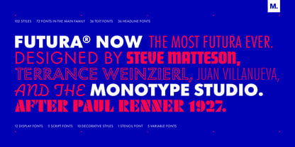
The Futura Now Font Family was designed by and published by Monotype. Futura Now contains 102 styles and family package options.
世界中のあらゆる企業がアプリ、オンラインサービス、その他のデジタル施策を立ち上げ、COVID危機による混乱に対処する中で、多くのブランドはこの急増したデジタルノイズの中で、どうやって自社を際立たせることができるかを考えていることでしょう。

最大の課題は、かつての日常にどう戻るかではなく、私たちが思い描いていた未来のビジョンをどう手放すか、ということかもしれません。
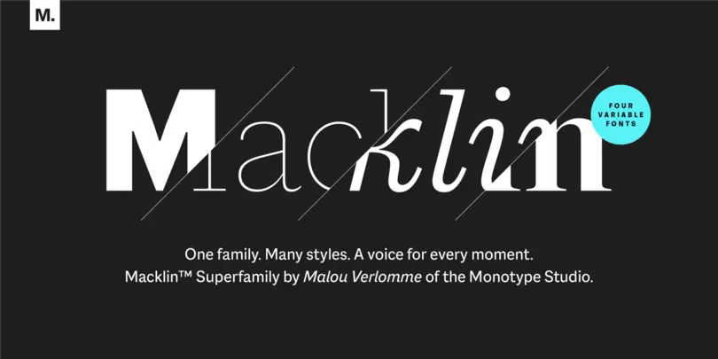
Macklin is inspired by the era when type leapt off the pages of books and onto large-scale posters and advertisements. With a distinct twist on its typographic predecessor, Macklin’s sharp yet elegant forms push the superfamily to a place that’s more suited to contemporary use and modern design.
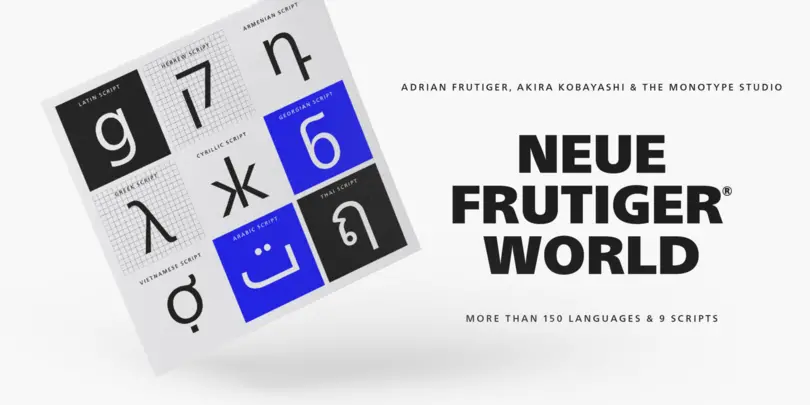
Neue Frutiger Worldは、グローバルな利用を想定して設計されており、Ultra LightからExtra Blackまでの10種類のウェイトと、対応するイタリック体もそろっています。Adrian Frutigerのオリジナルデザインが持つ温かみと明瞭さを受け継ぎつつ、ブランドがビジュアルアイデンティティを維持し、言語を問わず一貫したトーンでコミュニケーションを図ることができるように設計されています。Neue Frutiger Worldは、ラテン文字、ギリシャ文字、キリル文字、ジョージア文字、アルメニア文字、ヘブライ文字、アラビア文字、タイ文字、ベトナム文字を含む250以上の言語と文字体系に対応しています。
英語ページのNews and Pressをご確認ください。

Fonts in games have a subjective role, helping to convey the theme and atmosphere of a game while shaping expectations about its content. And there’s the more practical job of conveying information quickly, legibly, on any kind of screen and in multiple languages, so that no one gets left behind or in the lurch.
Malou VerlommeによるMacklinスーパーファミリーは、19世紀後半のディスプレイ書体に対して、控えめながらも型破りな視点を加え、エレガントなひねりを通して現代向けに再解釈された書体です。1つのスタイルを選んでもよし、ファミリー全体をバリアブルフォントとして、タイポグラフィのツールボックスのように活用することもできます。
カスタムブランドフォントで、Duolingo が自分の声と翼を見つけたストーリーを紹介します。

Monotype エグゼクティブ・クリエイティブ・タイプディレクター、Phil Garnham は書体デザイナーとして長年活躍し、世界ブランドの専用書体の開発でも豊富な経験があります。デザインスタジオや企業クライアントとの協働を通じて、ブランドにとって統一感のある書体を持つことが、いかにクリエイティブやビジネスの面で重要であるかを実感しています。