Posterama™
Un voyage entre l’espace et l’écriture.
Découvrez, gérez et utilisez des polices avec votre abonnement.
Achats de polices individuels pour tout projet.
Découvrez, gérez et utilisez des polices avec votre abonnement.
Achats de polices individuels pour tout projet.
Un voyage entre l’espace et l’écriture.
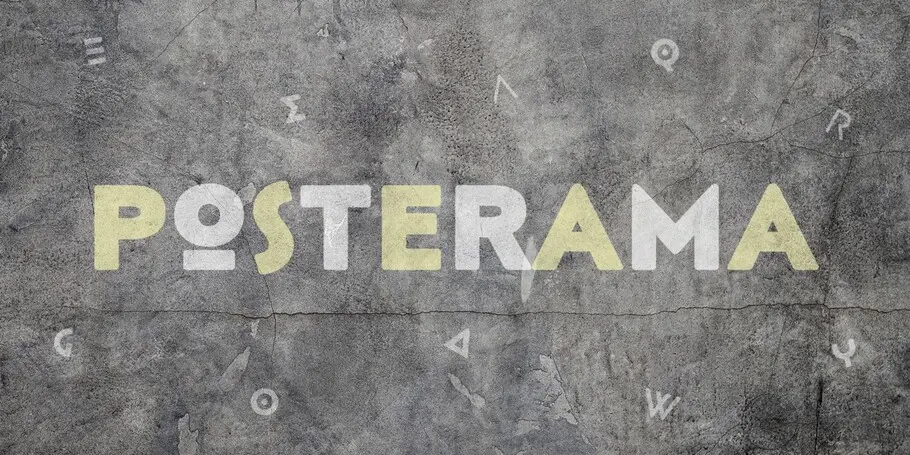
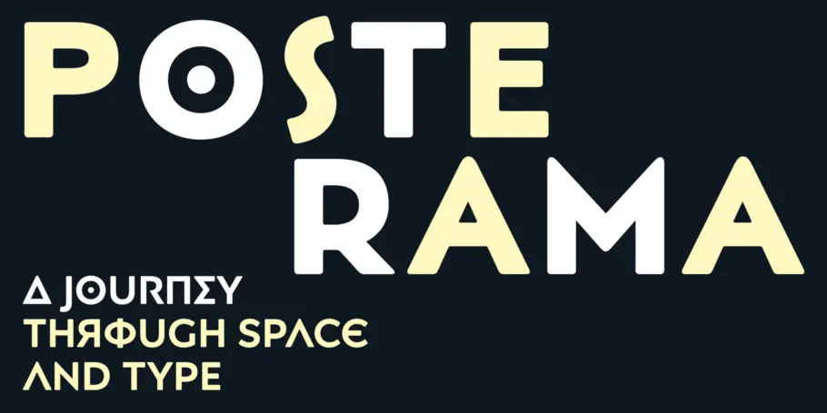
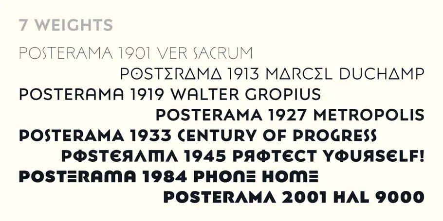

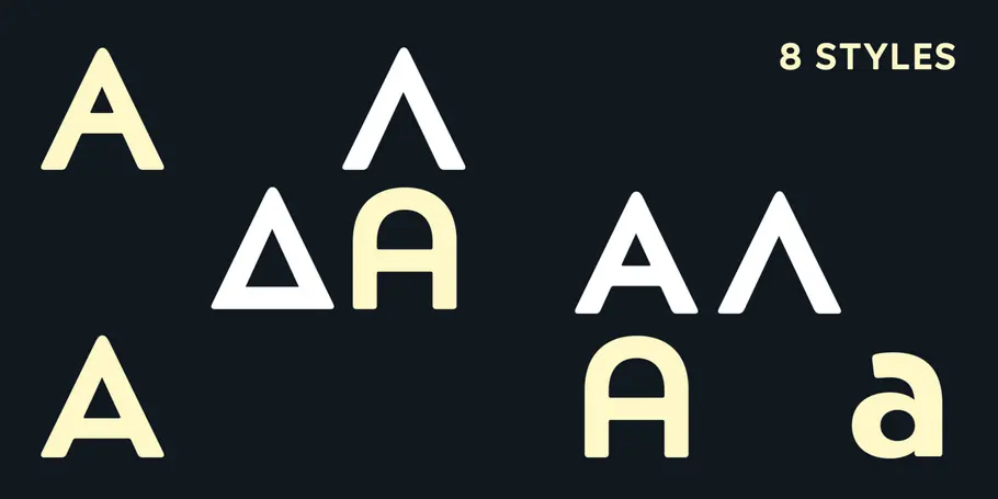
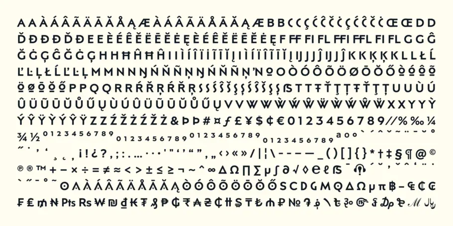
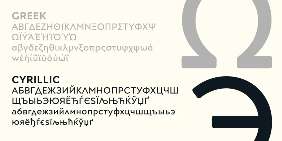
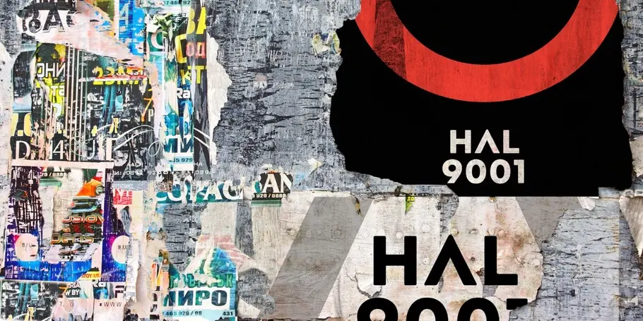
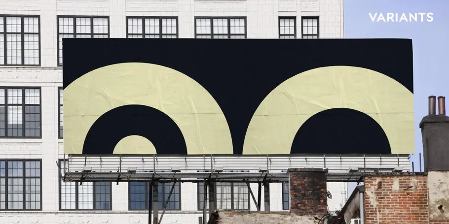
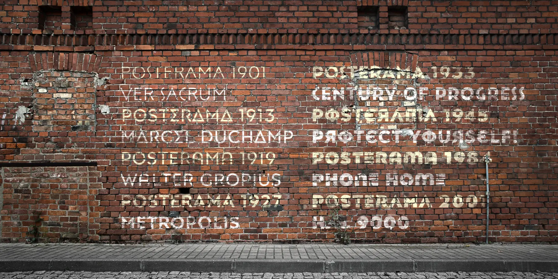
Posterama™ is a modular series of geometric sans serif families, inspired by events, movements and typography of the 20th century. The original design had notes of Futura and Gill Sans, with a softness reminiscent of letterpress, phototype and other forms of printing. Corners are manually rounded to achieve this effect.
Posterama™ is the ultimate retro-futurist type kit; a typographic time machine reflecting a monumental century of growth. A typeface out of time and into the future. Posterama™ provides a wide palette that encourages typographic play. It has the familiar charm of iconic 20th century design, and can transform seamlessly to accommodate different moods and themes.

Jim Ford is a visual artist and designer from Chicago. Jim works predominantly in type design, but includes custom lettering, art and illustration in his growing portfolio. He has designed custom typefaces for agencies, corporations, publishers, software and hard- ware manufacturers, video games, devices, you name it! In addition to customer-driven work, Jim also has a wealth of original typeface designs, ranging from traditional text faces to innovative display lettering.
We offer a number of ways for you to start working with our typefaces.
It’s safe to say that few people, if any, set out to commit copyright infringement. The reality is that most individuals and brands fully intend to pay.
Finding the right brand font requires a deep understanding of who you are as a brand, and how you want to present that identity to the world.

