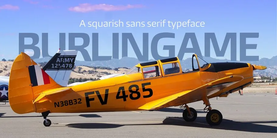
Burlingame®
Menton carré et gros bras.

Menton carré et gros bras.


Designers
Fonderie
Burlingame is a multi-purpose font family that started out as a single typeface with a more specialist purpose. There’s a clue in the name: it was originally intended for a game identity. It has found a wider purpose following pioneering investigations by Monotype into the legibility of vehicle displays. The research revealed a set of optimum criteria for dashboard display fonts: large counters and x-heights, simple shapes and a loose spacing of characters .
A search of Monotype’s own library turned up nothing that fitted the bill exactly, so Carl Crossgrove was asked to develop his game font, Burlingame, with its open, clear shapes, into a family of faces that could meet the high-performance demands. His refinements, increasing the x-height, loosening the spacing and paring down the corners, improved the clarity and led to a design in two widths and nine fine weight grades, suited to a wide range of uses, from packaging and publishing to game and motion graphics.

Carl Crossgrove is a Senior Type Designer at Monotype. From Carl’s early interest in calligraphy and drawing, through his youth and college years studying fine arts and book arts, to his eventual degree from Rochester Institute of Technology in Printing/Typography, the constant thread in Carl’s life has been his fascination with letterforms.
We offer a number of ways for you to start working with our typefaces.
If you want to license Burlingame to use with your brand or project we can help you.

An all-in-one solution for font discovery, expertise, collaboration and management.

If you want to purchase a single weight or the entire Burlingame font family with a range of licencing choices.

Behind the font highlights the people and process behind the fonts you love and use. This installment features Carl Crossgrove of the Monotype Studio.
