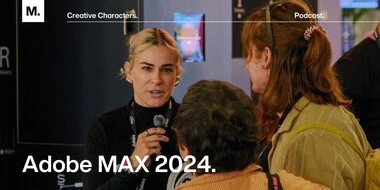
Creative Characters S4 E17: Searching for our inner child at Adobe MAX 2024.
Listen in for a behind-the-scenes look at Adobe MAX 2024. Tune in now to hear from twenty or so voices at MAX, all of whom were kind enough to share their time and their stories with us on the mic.
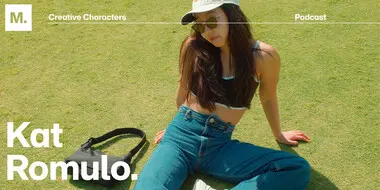
Creative Characters S4 E10: The power of initiative: Kat Romulo on following your creative passions.
Host Livia Halltari sits down with designer Kat Romulo, whose work spans the gamut from playful branding to engaging content creation. The conversation emphasizes the importance of designing for oneself to combat burnout, as well as Kat’s philosophy of seeking client work that aligns with her values. Tune in now.
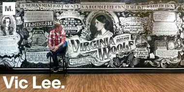
Creative Characters S4 E7: Reinventing yourself at any age with Vic Lee.
Hear Monotype Creative Director Graham Sturt in conversation with Vic Lee, an artist, illustrator, and self-described “ragamuffin.” If you need some creative inspiration or are looking to reinvent your creative practice, this episode’s for you!
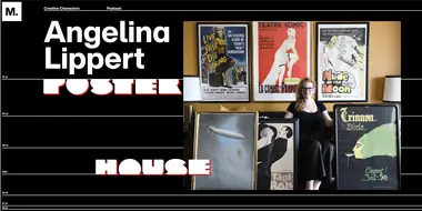
Creative Characters S4 E9: Angelina Lippert: Charting the human experience through poster design.
Creative Type Director Charles Nix talks with Angelina Lippert, Chief Curator at the Posterhouse museum in New York City, about the history of poster design, the unseen hands behind some of the more iconic posters from history, and the finicky wonder of Rubylith.
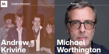
Creative Characters S2 E8: Andrew Krivine and Michael Worthington.
This week we’re welcoming Andrew Krivine, author and punk rock collector, alongside Michael Worthington, faculty at CalArts and co-founder of Counterspace. The creative duo is here to tell the tale of how they co-created the largest exhibition of punk and new wave graphics ever shown on the West Coast.
Historias de fundiciones tipográficas de Monotype Fonts.
Si estás aquí es porque probablemente usas, aprecias e incluso adoras las tipografías. Puede que tengas predilección (o sientas rechazo) por alguna fuente concreta. Como cualquier obra de arte, cada fuente tiene un origen, una historia y un equipo creativo que le dio vida con pasión. ¿Cuánto sabes de las personas que han diseñado y creado esas letras? Conoce a algunos de nuestros diseñadores favoritos y descubre cómo empezaron, en qué se inspiran sus obras y cómo te hacen llegar sus diseños a través de Monotype.
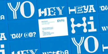
Siete maravillosas renovaciones tipográficas de marca que han sido un éxito.
Hoy en día, las marcas deben seguir el ritmo de un vertiginoso mundo digital y adaptarse a la «nueva normalidad» que se está definiendo tras haber pasado lo peor de la pandemia. Los últimos años han supuesto un cambio en las expectativas digitales de todo el mundo, la forma de operar de las marcas y, en algunos casos, en sus modelos de negocio.
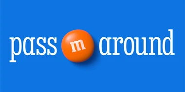
All Together: un tipo de letra nueva y divertida que refleja el carácter jovial de M&M’S.
M&M’S® lleva más de 80 años uniendo a personas de todos los rincones del mundo. Este año, la emblemática marca se sometió a un lavado de cara para modernizar su imagen y renovar su propósito de crear un mundo al que todas las personas sientan que pertenecen. Como parte del proceso, la marca también renovó la estética y actualizó la personalidad de sus famosos personajes M&M’S, adoptó un tono más inclusivo y acogedor, e incorporó un tipo de letra nueva y llamativa llamada All Together para crear una familia amplia, cálida, divertida y cercana.
Behind the Font: Font Licensing, demystified (Part 1 of 3).
In the first-ever edition of our new podcast miniseries series Behind the Font, we dive in to the often murky and mysterious waters of font licensing. In part one, we get a crash course in recent font history to understand how licenses have evolved and why this matters to today’s brands, designers, and agencies. Tune in now.
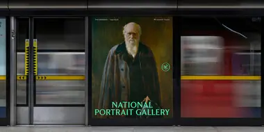
Letras que retratan: un tipo de letra personalizada para la National Portrait Gallery.
A principios de otoño del 2022, EDIT invitó a Monotype a colaborar en uno de los rediseños de marca más esperados de Londres, el de la National Portrait Gallery, que alberga algunos de los retratos más célebres e innovadores. Sigue leyendo para conocer la historia completa del cliente.
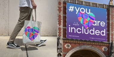
Participamos en el Pride Amsterdam creando una familia tipográfica única.
Monotype se asoció con D8 para crear una nueva identidad fluida para Pride Amsterdam, una de las mayores celebraciones de este día en todo el mundo, que atrae a miles de visitantes. Lee el caso de éxito completo para conocer más detalles.
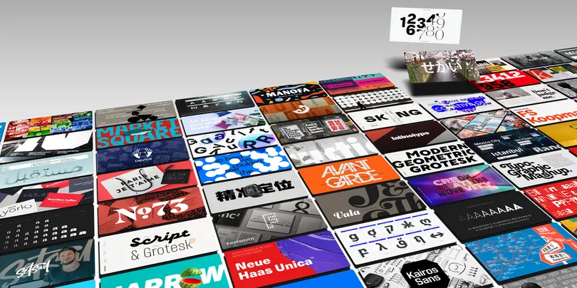
Con la mayor colección de tipografías galardonadas y la posibilidad de acceder a las fundiciones y los equipos de diseño tipográfico más demandados del mundo, Monotype Fonts permite a los equipos creativos dedicar menos tiempo a las tareas administrativas y más a diseñar experiencias de marca significativas.
Características clave
- Lo mejor del mundo en fuentes, equipos de diseño tipográfico y fundiciones tipográficas.
- Gestión de fuentes segura y fiable.
- Integración con las herramientas que usas cada día.
- Control de los costes anuales.