


Monotype and Pantone® Present: The Ingredients for Building a Modern Brand.

Elley Chang, President, Pantone.
Learn about the interplay of type and color and how Monotype & Pantone assets work together to drive modern brand-building.
Monotype and Pantone® joined forces at the 2024 SXSW Conference to present insights on the ingredients of building a compelling brand in today’s dynamic creative landscape. Technological advances continue to democratize the creative industry, providing accessible tools and platforms that empower individuals from across the globe to express themselves. The rise of user-friendly graphic design apps and video and photo editing tools means that creating professional-quality content is within anyone’s reach – without the need for costly equipment or specialized training. Additionally, online platforms and social media allow individuals to instantly connect with new audiences worldwide, facilitating swift and widespread dissemination of ideas, content, and artistic expressions. With all these tools at their fingertips, anyone can now harness their creativity, cultivate a unique brand identity, and seamlessly connect with audiences who resonate with their distinctive perspectives.
On March 14, Pantone® ‘s Elley Cheng and Monotype®’s Charles Nix joined Tristen Nornman of Getty Images, and Canva’s Silvia Oviedo Lopez for an exciting panel titled The Ingredients for Building a Modern Brand. Together, these experts representing typography, color and imagery discussed issues impacting modern brand-building and what it means for the future of the creative industry.
In modern design and brand-building, the powerful interplay of type and color emerge as the designer’s most impactful ingredients. The intersection of Pantone® and Monotype® lies at the heart of comprehensive and cohesive brand aesthetics, where color and typography converge. Both companies play integral roles within the visual identity and design industries, offering solutions for designers, marketers, and brands seeking a cohesive and harmonious visual representation. Meeting to collaborate and share their expertise and perspectives, spark innovation, and generate fresh ideas, the panel centered on creating experiences that will both inspire and help people build a brand presence and facilitate explorations of design theory that can help designers produce great work.
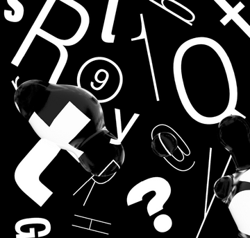
The Interplay of Color and Type in Branding.
Let’s explore several key areas where the relationship between color and type plays a crucial role in a brand’s identity, personality, and message:
Brand Recognition.
The combination of specific colors and fonts not only captures attention but creates a compelling visual narrative that becomes synonymous with the brand. In today’s crowded marketplace, where everyone is vying for the spotlight, a carefully curated color palette and font duo has the capacity to steal the show while instantly creating meaning that resonates with the audience. For example, Tiffany & Co.’s iconic use of a vibrant robin’s egg blue, paired with a timeless and elegant font, is the epitome of a strong brand identity that immediately invokes a sense of luxury, sophistication, and exclusivity.
Examine the logos below. Is there a sense that something feels slightly amiss?


Many of the brand identities above have become so ingrained in our cultural psyche that switching the fonts and logos creates a feeling of confusion. Immediately, our brain recognizes the colors and fonts before registering that the words and logos have changed. For example, swapping the color and logo of Coca-Cola and Pepsi forces a mental adjustment and challenges your pre-existing associations as you grapple with this unexpected visual shift.
The Psychology and Color of Type.
Pantone® and Monotype® understand that the choice of color and fonts in brand identity not only serves as a visual representation but also functions as a potent cultural communicator, shaping and reflecting the prevailing zeitgeist. In our highly visual society, color is an ambassador for a brand’s image, conjuring emotions and perceptions that become synonymous with its personality, values, and overall identity. Similarly, the careful selection of fonts can elicit specific responses, creating a subconscious connection that profoundly influences brand recognition and consumer loyalty. Marie Boulanger, brand designer at Monotype® and lead director of the research, asserts that much like color, “typography is art, typography is science, but most of all it is culture.” Therefore, the strategic use of fonts can intricately guide an audience’s response to the application of color. Together, the two can powerfully create a cohesive and impactful design language that shapes a brand’s identity and communicates a resonant message.
Below are the elements of color and font psychology:
Brand Personality.
Colors and fonts are powerful tools to communicate a brand’s personality and values. For example, a playful and casual brand might use bright, vibrant colors and a whimsical font, while a professional and serious brand might opt for more subdued colors and a formal font.
Emotional Impact.
Colors and fonts have the power to evoke specific emotions and help determine how people feel about the brand. For instance, red can convey excitement and passion, while blue can signify trust and reliability. Similarly, while fonts like Times New Roman evoke feelings related to tradition, authority, and formality, fonts like Comic Sans evoke feelings of playfulness and humility.
Differentiation.
In a competitive market, colors and fonts can help a brand stand out. Unique or unusual choices in typography and color can make a brand more memorable and distinctive.
Target Audience.
The selection of fonts and colors must resonate with the brand’s target audience. For example, a brand targeting children might use bright, cheerful colors and playful fonts, while a luxury brand targeting affluent adults might opt for sophisticated and elegant choices.
Consistency.
Consistency in the use of fonts and colors across all brand materials, from logos and websites to advertising and packaging, is vital. This consistency helps reinforce the brand’s identity and makes it more recognizable.
Interested to learn more? Keep reading about how fonts can help you rebrand for the future.

Pantone x Monotype: how colour and font make an iconic brand.
Some recent research has shown that companies increasing their design budget grow substantially faster than the competition.
Join Monotype & Pantone to discover the main components of design, and learn why fonts are the element that holds it all together.
You’ll hear from Alice Palmer, Vice President of Marketing at Monotype, and Laurie Pressman, Vice President of the Pantone Color Institute.
![[Webinar]: The science behind the emotional impact of type.](/sites/default/files/styles/380x190/public/2022-05/Monotype%20x%20Neurons.-low.gif?itok=I-ST9WUK "[Webinar]: The science behind the emotional impact of type.")
[Webinar]: The science behind the emotional impact of type.
Can fonts influence our response to taglines and slogans? Can they encourage us to perceive a company logo in a more positive way? Do they really build trust between brands and consumers? Watch our webinar to learn more.

The Neuroscience Behind the Emotional Power of Typography at Brand Talks London.
Marie Boulanger, brand designer at Monotype, presented at Brand Talks London in November 2022, giving an overview of our ongoing research into the neuroscience of typography.