What are font superfamilies and why do we need them?
Terrance Weinzierl.

Typefaces have come a long way since the days of the print shop, when having a handful of typefaces was considered a great range of choice. Now, brands and designers need a whole toolbox of type that spans different styles, sizes and languages. This has given rise to a greater need for superfamilies—vast collections of type that can meet a multitude of needs without compromising on consistency. But what defines a superfamily, exactly?
“I usually think of a superfamily as having more than one style, let’s say a sans and serif component, but that’s not set in stone,” explains Monotype Senior Type Designer Terrance Weinzierl. “I think if a typeface has a wide variety of weight and widths, it’s just a big family. What makes it ‘super’ is the ability to shift personalities or voices while remaining in harmony and keeping some of the same system, perhaps vertical metrics and visual weight color.”
One useful comparison is analogous colors. While a large typeface family might offer light to dark blue, a superfamily offers a fuller spectrum of that color—from green-blue through to yellowish and purple shades. By relying on the same underlying letter architecture, superfamilies allow designers to pair different styles without creating awkward combinations.
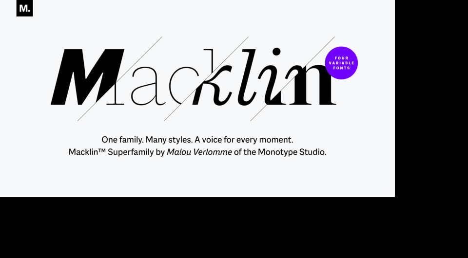
Malou Verlomme’s Macklin superfamily is a good example, as it brings several different letter styles into a single family that includes a sans, slab, text and display. Because they share a common skeleton, each of these styles can work alongside one another.
A full toolbox for brands.
This internal harmony is precisely what makes superfamilies so valuable for brands. They allow companies to invest in one typeface that can address multiple creative needs while giving designers room to experiment in the future.
Superfamilies can be extremely valuable for editorial, where sans and serifs may need to work with one another rather than in contrast, or for companies that need a monospaced font for coding environments. Brands launching new products, expanding the scope of what they do, or establishing themselves on new platforms often require a fresh design approach. A superfamily allows them to do this while keeping branding consistent.

This image shows how three styles of Macklin—Slab for the headline, Sans for the subhead, and Text for the body—can be used to lay out a single editorial piece. Superfamilies like this give you the range to distinguish different blocks of text while maintaining a strong visual throughline.
“You can use a superfamily in your style guide to distinguish a new product line, a different attitude or a different tone of voice that’s similar and recognizable,” says Weinzierl.
“Imagine a furniture company starts a product line for children,” adds Weinzierl. “The main brand uses the sans, and the kid’s line adopts the rounded version of that typeface. It’s instantly more friendly and safe-looking, while recognizable as being from that brand. This approach is about using a closely neighboring typeface, not a contrasting one.”
Terrance Weinzierl.
With such a range of choice, superfamilies can leave designers unsure of where to begin. For designers feeling overwhelmed by what’s on offer, Weinzierl recommends starting small. Investing in just a few weights allows users to ease in and familiarize themselves with the typeface. This also gives designers time to understand what else they need to supplement and contrast. Investing in a limited palette that can be expanded later is also useful for startups, or designers working on the early stages of branding, and reduces some of the initial cost of licensing.
“Superfamilies are useful for the beginning stages of a larger project, speculating on what a brand might need in the future,” says Weinzierl. “Let’s say you’re working on a new brand, and you’re not certain what the final deliverables are, but you need to choose something while prototyping. Choosing a superfamily at that stage gives you a starting point with the flexibility to pivot to lighter or heavier tones later on. This may also serve the longevity of a brand just starting out.”
“You might have a sans, a serif and a rounded, and not know what you’ll use all the styles for, but they’re there for the future. A real food pantry of a typeface,” he adds. “That way, a few years down the line, if you have a new sub brand or product, you don’t have to rebrand everything. You can choose from that big palette that you started with.”
Fit for the future.
Superfamilies offer potential for the future beyond just branding and visual identity. Virtual reality and augmented reality are growing in use, and likely to become more prevalent as technology develops.Operating systems can now respond to changes in the day, or light settings. All of these developments will put greater demands on existing typefaces, and as a result, on the companies using them.
Superfamilies could become an integral tool for keeping pace with changing technology, and the needs of virtual and three-dimensional environments. They’ll offer the typographic choice needed, allowing companies to flex the mood and style of their brand typeface across platforms, without compromising on communication.
“As our computers, and all of the design and code around them gets more and more complex, the question becomes, how can we change the mood a little within the design?” says Weinzierl. “Why can’t the font be rounded under this circumstance? Why can’t it be a serif under that one?’ Limitations will become opportunities, because everything else is so open.”


