Creating a consistent identity for an iconic banking group.

Santander is now well-equipped to communicate with customers on all channels in a way that is recognizable, legible, and distinct.
About the company.
Banco Santander is a leading retail and commercial bank, founded in 1857 and headquartered in Spain. It has a meaningful presence in 10 core markets in Europe and the Americas and is the largest bank in the euro zone by market capitalization. With more than 142 million customers worldwide, Santander’s brand is valued at €5.6 billion, making it one of the world’s 100 most valuable brands in Interbrand’s Best Global Brands report, and establishing it as one of the most valuable financial institutions in the European Union.
The challenge.
Santander has been growing globally for nearly three decades. Although known for its European banking operations, it has extended operations across the Americas. Through acquisitions and regional expansion, as well as a growing product range, Santander was increasingly challenged in maintaining a common visual appearance across the banking group. Additionally, Santander is also addressing looming market changes, including:
- Digital transformation, and a preference for new channels of brand communication
- Adapting to how younger consumers relate to brands in general - and to banks in particular, omparative to previous generations
- The need to offer a meaningful, unified experience that engaged customers locally while aligning across the global portfolio
As part of the rebrand, it was clear that Santander would need to develop a more consistent and future-forward typeface strategy. When Interbrand and Monotype first engaged to discuss the potential of a new, exclusive typeface family for Santander, the brand had 4 different font families in use for various purposes: FF Kievit, Berling, Open Sans, and Arial.

The solution.
To begin, Monotype worked with the brand and Interbrand to address the word mark, the word “Santander,” which combined features of typeface classics like Times, Century, Berling, Garamond and Bodoni, making it appear a bit dated. Santander wanted to define a personality beyond colour and symbol, one that was identifiable and aligned with the brand’s positioning, “real prosperity every day” and values: “simple, personal, and fair.”
— Borja Borrero, Executive Creative Director, Interbrand.
Logo redesign: two options.
When redesigning the wordmark, there were already several adopted features from previous brand workshops, e. g. the closed lower case “a” and the “t” with a halved horizontal bar. As such, Monotype’s designer, Hendrik Weber, was able to focus entirely on the overall typographic style. He offered two stylistic directions: first, a more humanistic recommendation, with calm letters but a strong personality, and second, a more “sportive” or “modulated” option, slick and timeless. Santander and Interbrand chose Option A, the humanist approach.
Refinements and the logo typeface.
In order to fully accommodate Santander’s brand architecture, a complete alphabet was then developed based on the seven glyphs in the wordmark (S, a, n, t, d, e, r). The resulting logo font included a complete character set available in Regular and Light weights. The “flame” within the logo was optimised and simplified to better engage with the glyphs of the wordmark, using a grid which guaranteed equidistant lines, interiors, and uniform angles. It was also built into the typeface system, ensuring an easy use of the combined symbol-wordmark (size, ratio, and distance).

The need for a text font.
Once the logo and logo font were developed, it became clear that Santander needed to extend the identity system to communicate its brand voice across all channels, in both digital and print. The first step in this process was for Weber to develop a text font, which adapted the logo glyphs to make them readable in text sizes. He extended the “x” height, the ascenders and descenders, plus tracking. He also made drawings of alternative lower-case letters “g” and “a,” based on antiqua forms. From there, a workshop was held between Monotype, Interbrand, and Santander where further alternative glyphs were discussed, and outlines were developed.
Other design concepts for the text font included: hooked “i”, “j”, and “l”; adding a “b”, “m”, and “r” with spurs; and finally a “f” and “t” with a crossed bar.
In order for the identity system to work across all channels, regions, and sub-brands for Santander, Interbrand and Monotype recommended maintaining as close a visual connection as possible between the wordmark and text font. In particular, headlines and titles needed to bear the similar characteristics of the logo. The narrow characters and their design properties were essential. Micro text was also included in the plan to account for primarily digital channels as well as contracts and other small print environments.
Results.
During this project, Monotype aimed to design a typeface that could be easily handled by every department of Santander, without subsequent adaptations or complicated instructions. Therefore, a barrier-free version of the font family was recommended. Only a separation of functions could avoid tools such as stylistic alternatives or a handbook.
The resulting typeface system included three families:
- Logo (2 weights)
- Headline (6 weights)
- Text (10 weights)
- Text Micro (10 weights)
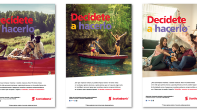
Using this system, and the accompanying imagery, colour, iconography, and other elements of the rebrand led by Interbrand, Santander is well-equipped to communicate with customers on all channels in a way that is recognizable, legible, and distinct.
Internal:
- A typeface system that is aligned to the brand values and personality
- Provide more clarity and consistency to the brand architecture
- Distinct font families and corresponding weights that allow internal teams to manage the brand identity across regions and sub-brands
- The ability to communicate in a strong, aligned voice in all customer touchpoints
External:
- Along with the broader rebrand, the exclusive typeface empowers an updated visual identity for Santander
- A typeface that will work in emerging and traditional channels, across global regions, and that is designed to accommodate for future expansion
- A consistent brand experience that warmly engages\ and inspires trust in key consumer segments


