Burlingame
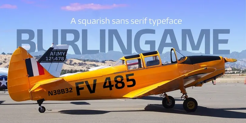
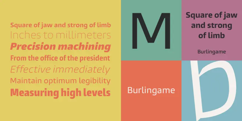
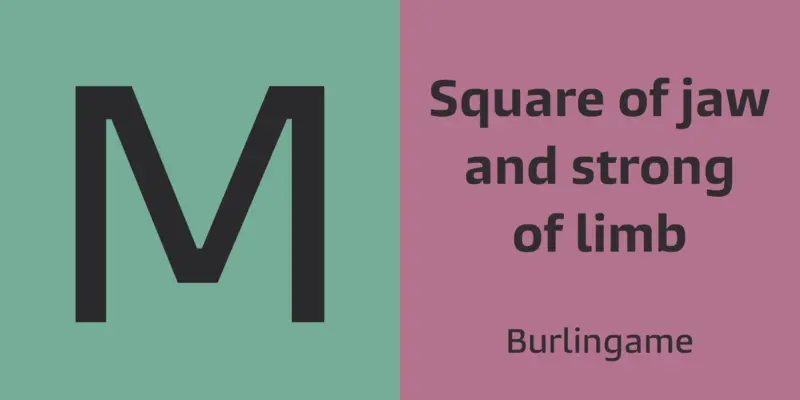
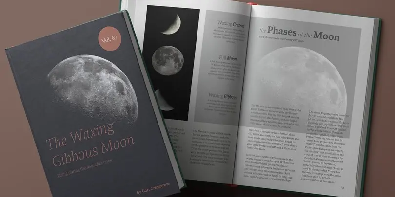
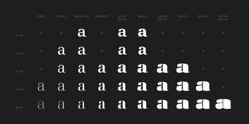
Burlingame is a multi-purpose font family that started out as a single typeface with a more specialist purpose: it was originally intended for a game identity. It has found a wider purpose following pioneering investigations by Monotype into the legibility of vehicle displays. The research revealed a set of optimum criteria for dashboard display fonts: large counters and x-heights, simple shapes and a loose spacing of characters.
A search of Monotype’s own library turned up nothing that fitted the bill exactly, so Carl Crossgrove was asked to develop his game font, Burlingame, suited to a wide range of uses, from packaging and publishing to game and motion graphics.
Ambiguity
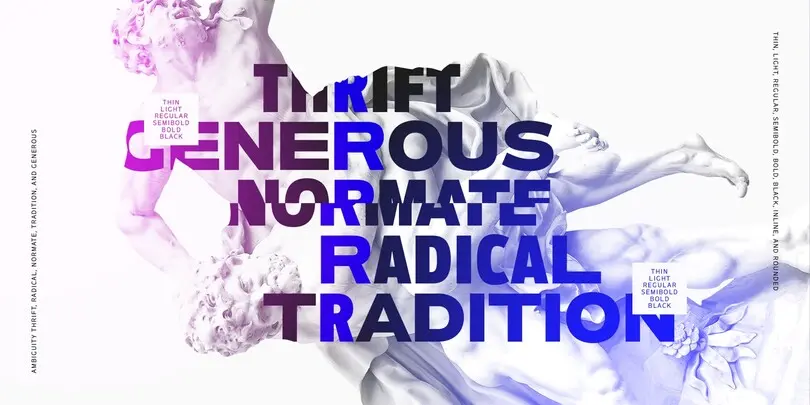
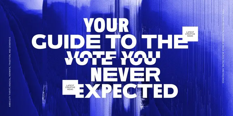
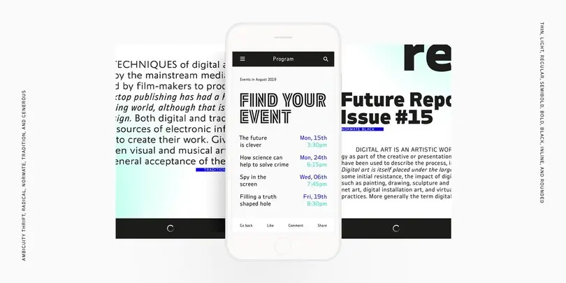
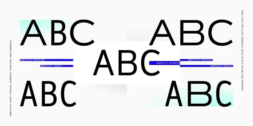
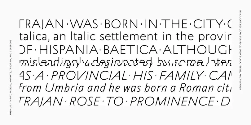
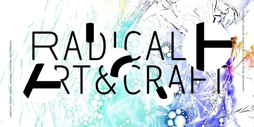
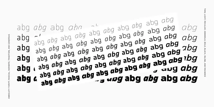
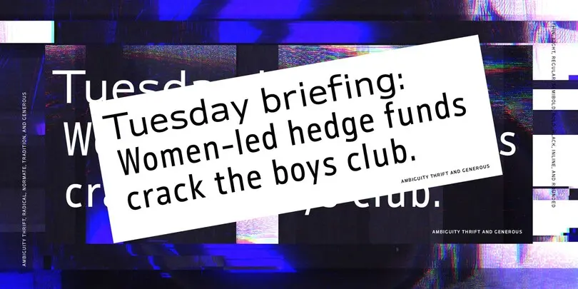
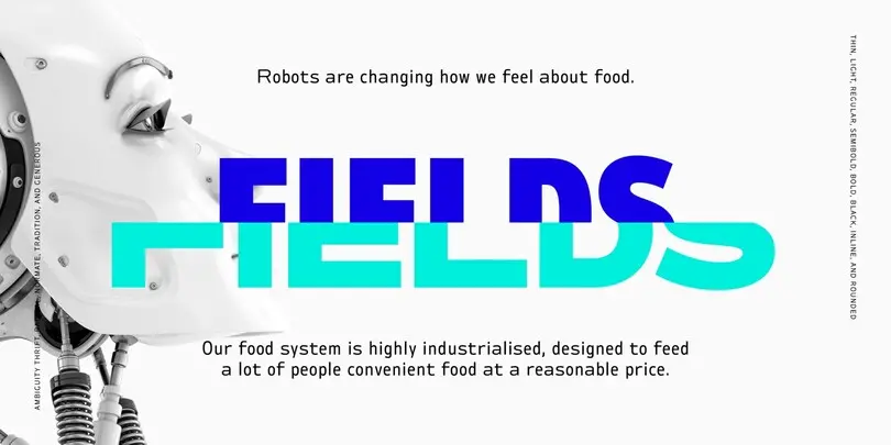
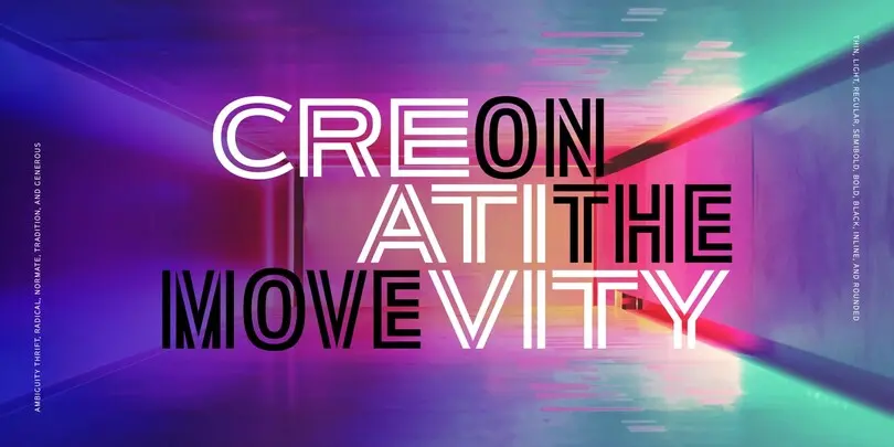
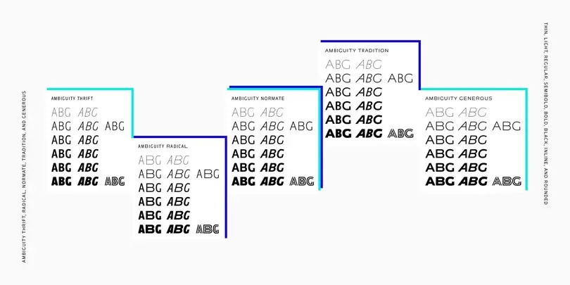
Ambiguity embraces both tradition and radicality, as well as generosity and thrift, encouraging us to question our beliefs about the intersection of style and meaning. With five distinct states of being—Tradition, Radical, Thrift, Generous and Normate—Ambiguity merges established concepts with inverse proportions, creating an exciting tool for tweaking text and expressing a range of attitudes and beliefs—from conventional to unorthodox and frugal to extravagant.
Mundo Serif
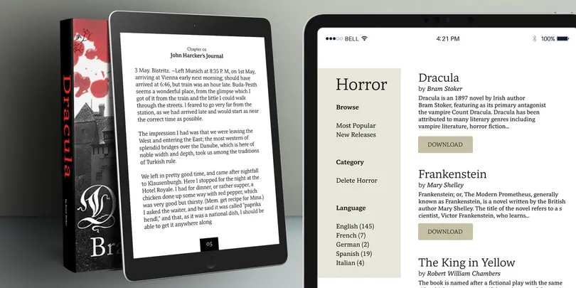
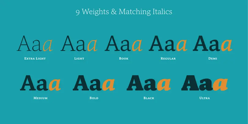
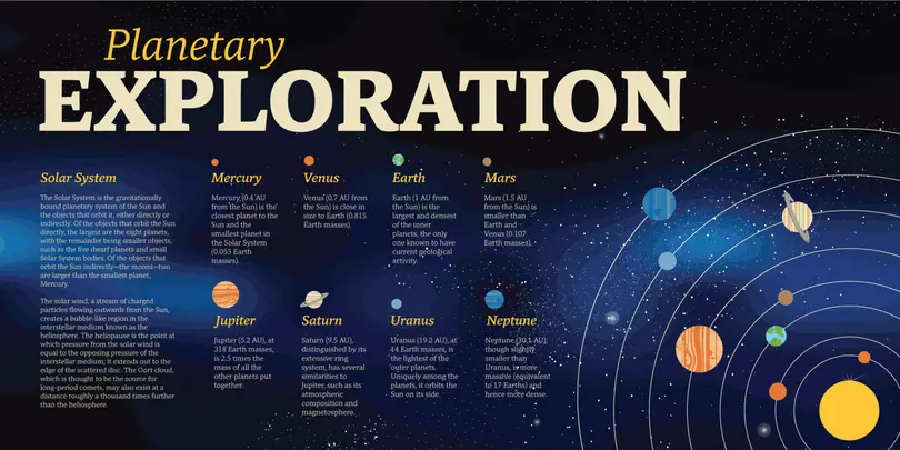
Drawn specifically for comfortable reading on-screen and in print, Mundo Serif is ready to take on just about any project. While primarily designed for text copy in print and digital, Mundo Serif becomes a powerful display type tool in the lightest and boldest weights. Headlines, navigational links and banners are naturals for this versatile collection of typefaces.
The design benefits from large international character set that includes support for most Central European and many Eastern European languages. For a stronger contrast, pair Mundo Serif with virtually any sans serif grotesque design.
Monarda™
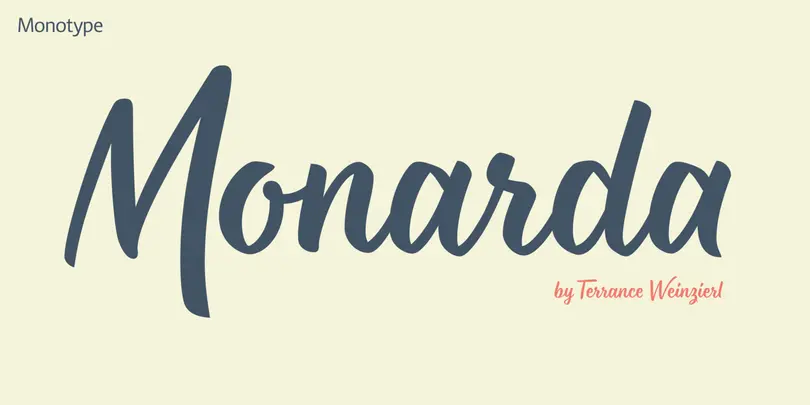
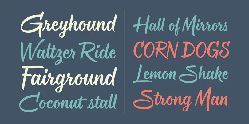
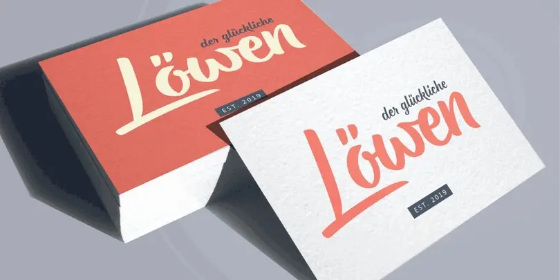
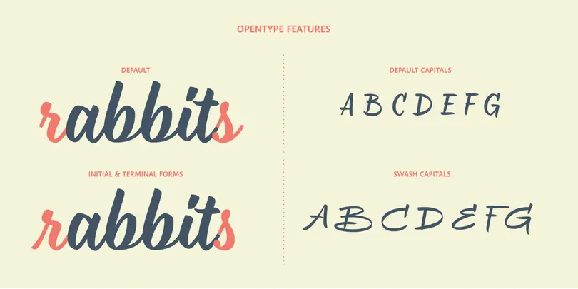
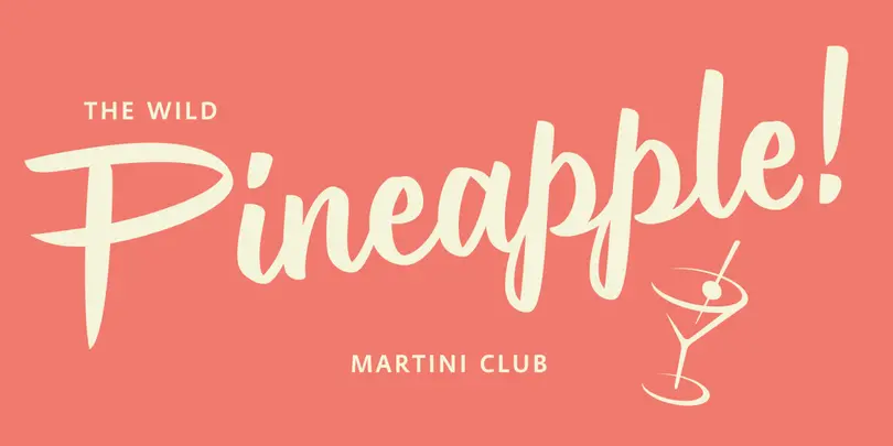
Monarda™ is Terrance Weinzierl’s take on the loud and splashy brush scripts of the 1950s. It’s energetic, playful, and equally at home in hardcopy headlines as it is in interactive banners. In addition to the basic alphabet, OpenType® fonts of Monarda are also awash in super-sized swash caps, contextual alternate characters and ligatures.
Placard Next®
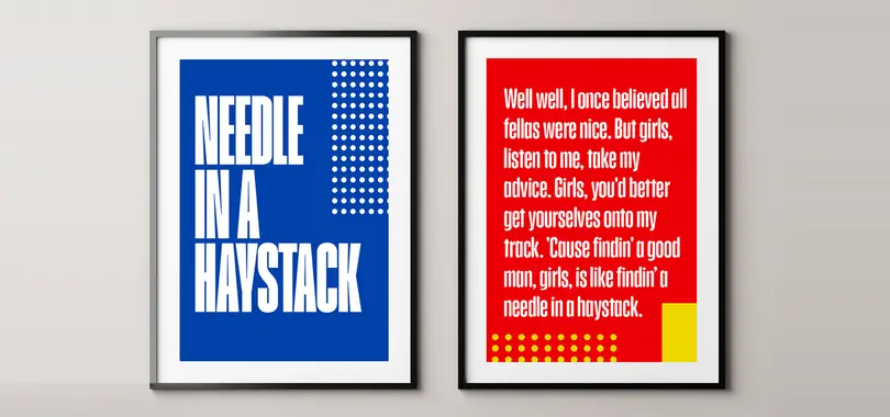
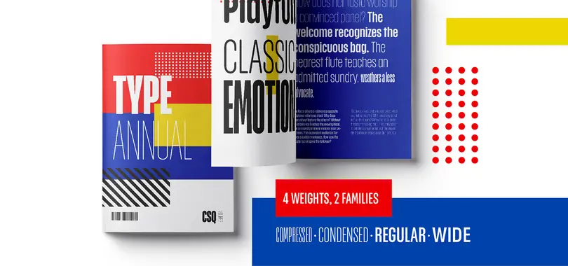
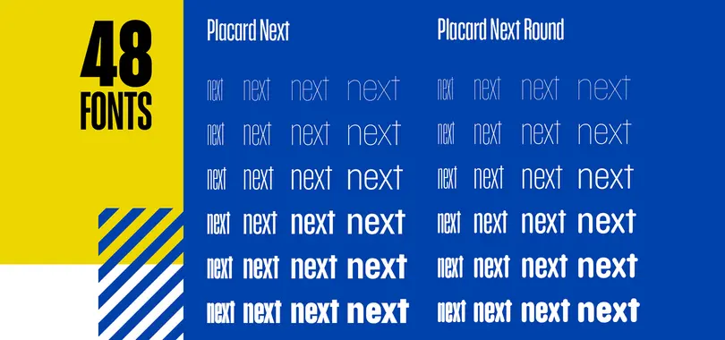
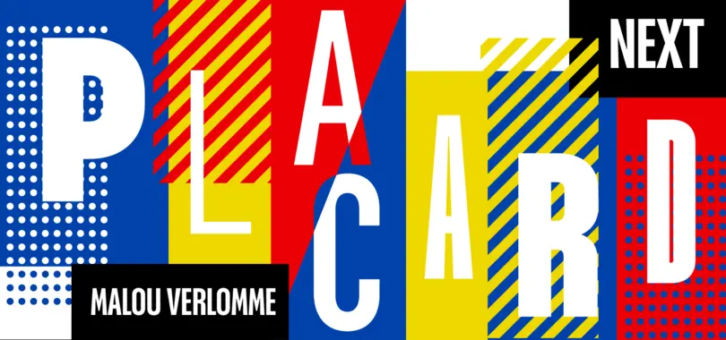
Unexpected details appear throughout the design, from its wedged diagonals and single storey ‘a’, to its round tittles – which would more ordinarily be square, and mechanical – the warmth and quirkiness of its character really shines through when set at larger sizes, making this a typeface for posters, headlines, and anywhere else designers need to make a statement.
Amarone
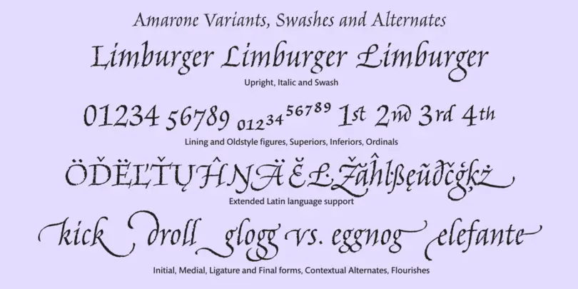
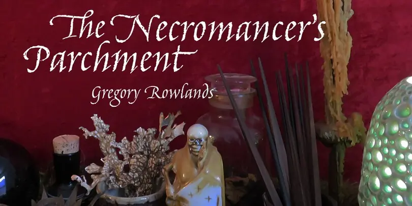
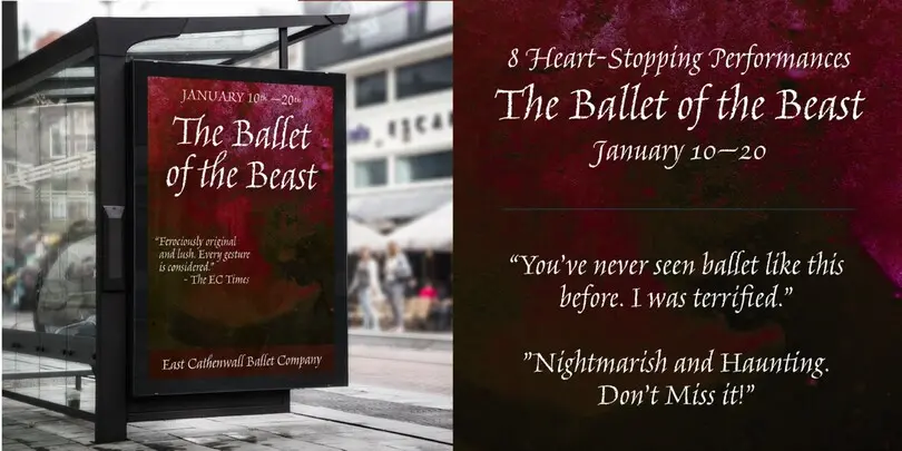
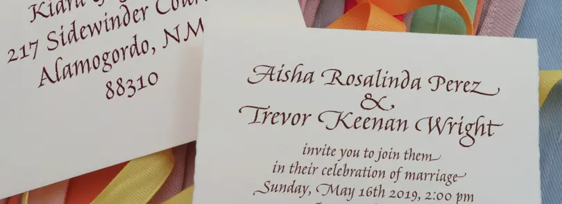
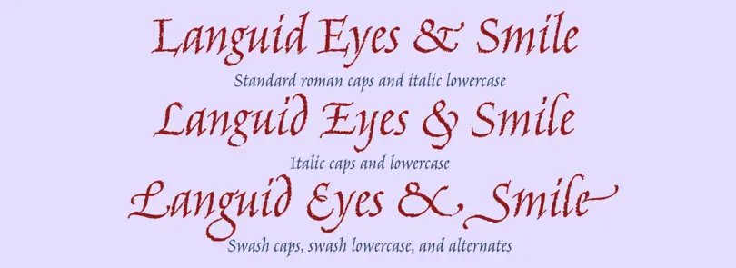
Amarone is a spiky calligraphic display typeface with some old fashioned flavour. It was designed by Carl Crossgrove, and includes an extensive set of swash caps which allow for extra drama where needed.
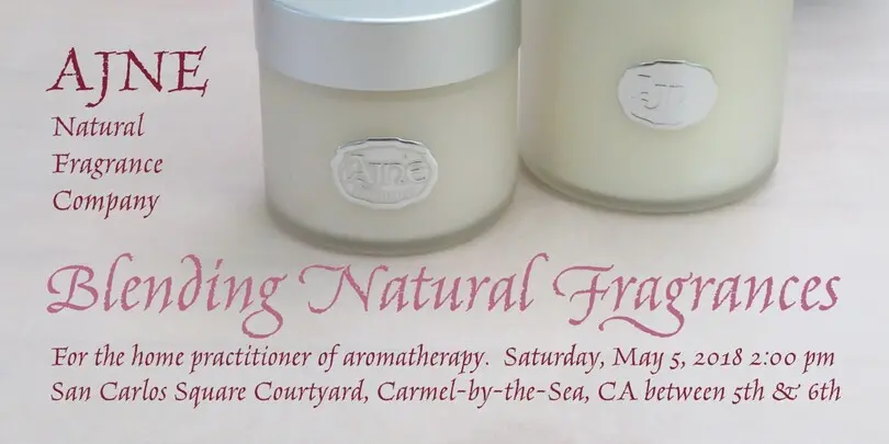
The Amarone typeface lends itself well to packaging, posters and editorial usage – or in any environment where designers need to evoke times gone by.
Walbaum
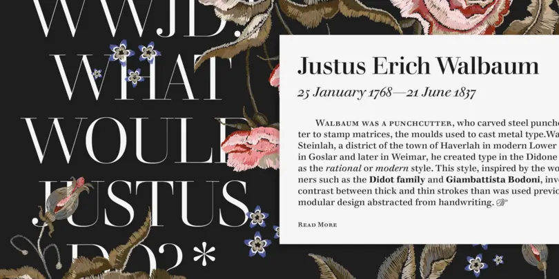
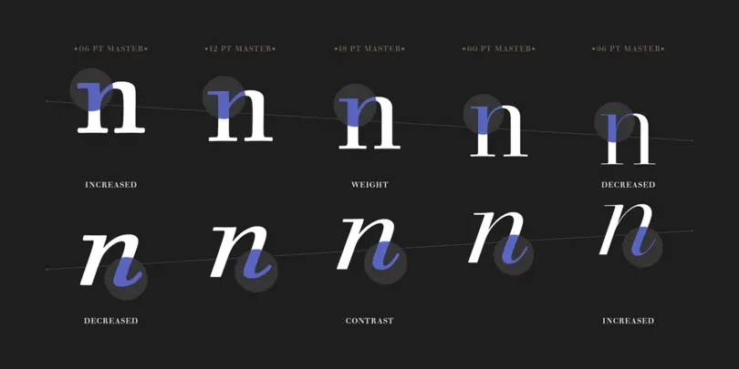
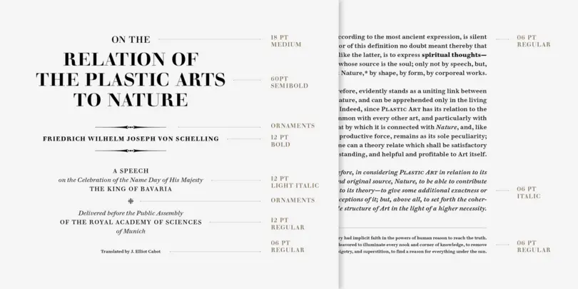
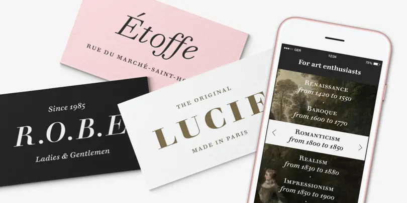
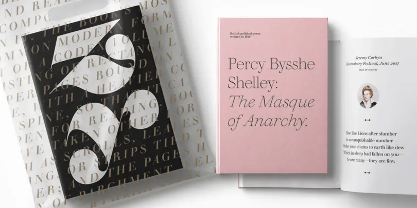
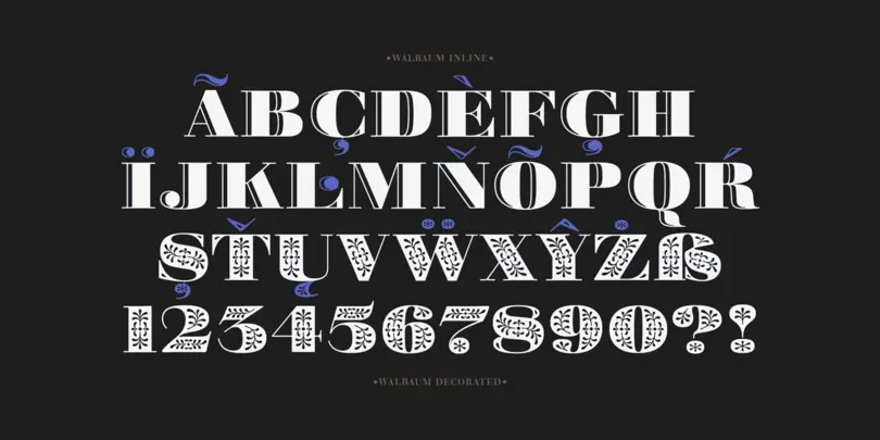
The Walbaum family, designed by Charles Nix, Carl Crossgrove, and Juan Villanueva, is a modern serif design that can be used in a wide variety of placements from micro caption text to massive headlines. Where other moderns preach austerity, Walbaum projects warmth—making it ideal for brands seeking a large type family that blends high style and approachability.
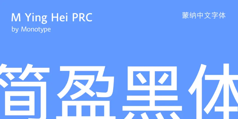
Monotype Ying Hei
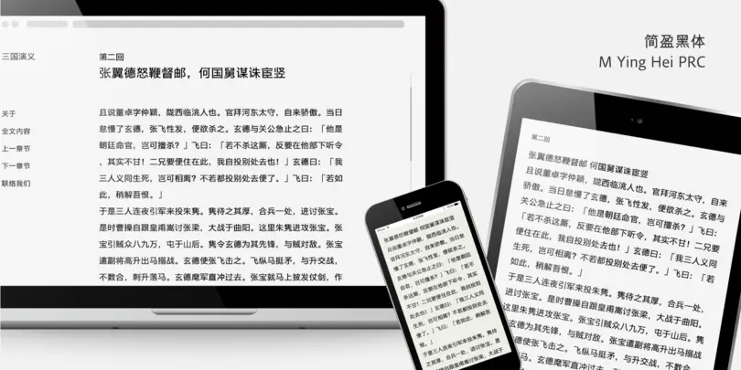
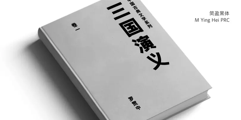
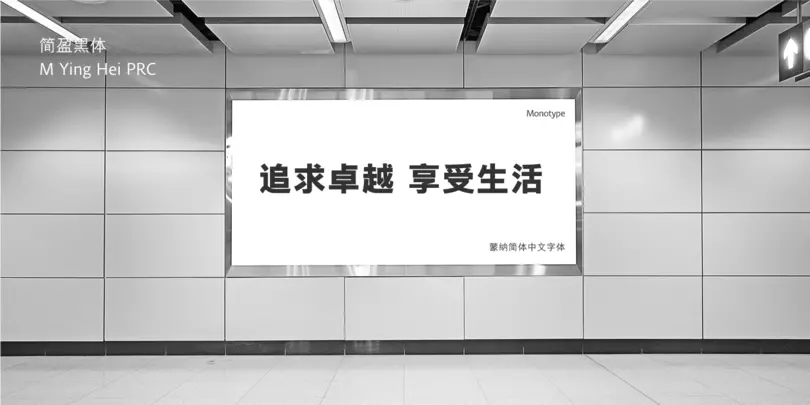
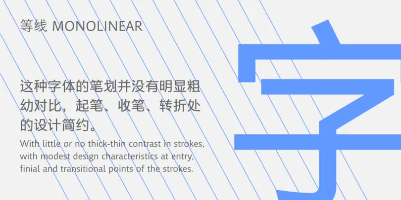
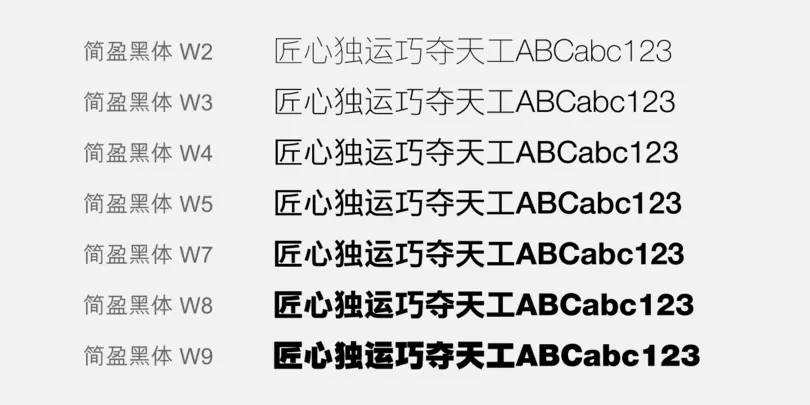
Monotype Ying Hei, a new Chinese sans serif family with five weights, was designed and built for performance and elegance on screen and in print. It covers both Simplified & Traditional version. Ample inter-character spacing, open shapes, varying proportions and unambiguous forms of design factors ensure consistent and optimal legibility at different challenging environment of usages.
