


Behind the creation of FS Renaissance, with Craig Black and Pedro Arilla.
Craig Black.
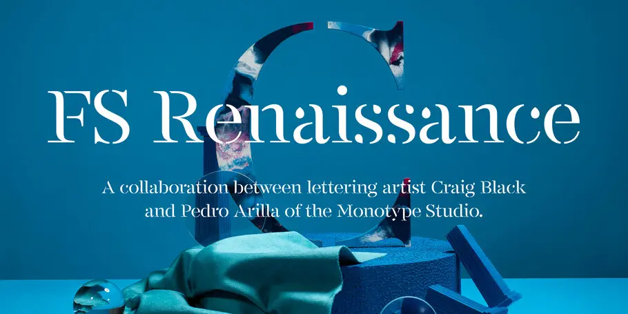
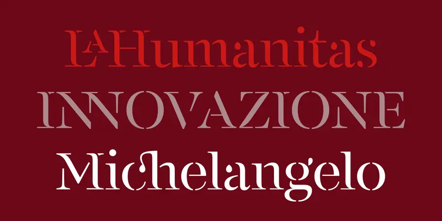
FS Renaissance is a handcrafted display font where each letter stands alone as a piece of art, and together forms a technically balanced, harmonious typeface and piece of design. The font is a collaboration between well-known graphic designer and lettering artist Craig Black and Monotype Creative Type Director Pedro Arilla. The aim was to explore the relationship between art and design, with artist and type designer working hand in hand, balancing beauty with function.
Craig and Pedro recently shared their perspective on the concepts and process behind FS Renaissance.
What was the original concept for the typeface and how did you decide on the direction it would take?
Craig: The term “renaissance man” was coined in reference to some of the most talented artists, inventors, scientists, and thinkers who lived during (and were the drivers of) the Renaissance, a period of flourishing progress in the arts, sciences, learning, and philosophy generally accepted to have begun in the 14th century and lasting through to the 16th century.
I’ve always admired the men and women of this time and how they diversified their skillset at incredible levels across different disciplines. One area in particular that fascinates me is the sculpture work and the stone carving of typography. I love the intricacy and admire the patience that must have been needed to create such beautiful artwork.
All of this inspired me to create a typeface that symbolises all these admirations by combining it with a modern influence of stencil typography. I knew we could take this original concept to the next level and create something special together.
Pedro, how did you feel when you first saw Craig’s concept?
Pedro: It was love at first sight. I knew Craig’s work pretty well and even though I was expecting to get surprised, I didn’t see this coming. It was kind of a piece of finesse typography but with a confident attitude that only a lettering artist could have embedded to it.
How much did the design evolve along the way and why?
Pedro: Craig’s original design was very good, but to make it work as a typographic system is a different task. After the initial “wow” moment, I started to look at the details. The core idea was there and it was powerful, but we needed to have a talk about how to build a system, proportions, black and white balance, and all those things that we type designers are obsessed with.
We discussed how to do this without compromising the original concept. It was mainly a matter of finding out the true DNA of Craig’s piece and applying it to a typographic base. I would say that the design didn’t evolve that much but it did mature and settle down quite a lot.
Craig: Like Pedro said, the typeface didn’t evolve too much from my original drawings, but it did require a little finesse to work as a typographic system. Pedro’s dedication to his craft and eye for detail hugely benefited the balance and flow of the typeface.
How many designers were involved in the creative process and how did you work together?
Craig: I’m a huge believer in collaboration and working with Pedro has been one of the best yet. The two of us worked closely together to sort out the intricacies of the typeface. I created the original drawings but then I handed the reins over to Pedro to work his magic and he didn’t disappoint. As the work evolved, so did our relationship and that made for a far better collaboration and a more open platform to discuss our ideas as well as our challenges.
Pedro: It was basically the two of us talking regularly — sometimes not even about this specific project but about design and art! Craig trusted me from the beginning so I started to develop a typeface following his recipe. As soon as the character set began growing I needed to make more and more design decisions, so I tried to keep him in the loop. A second pair of eyes is always very helpful when designing a typeface, but in this case it was crucial. Craig’s feedback and opinion were always insightful and positive.
How would you describe FS Renaissance?
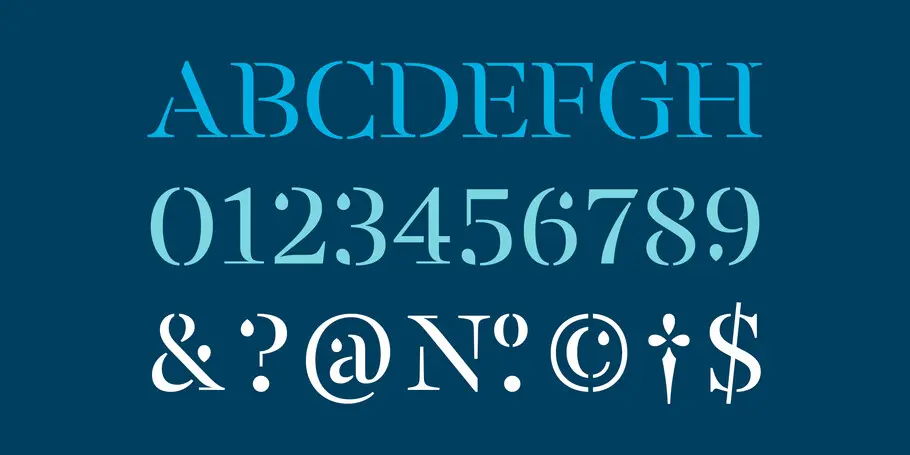
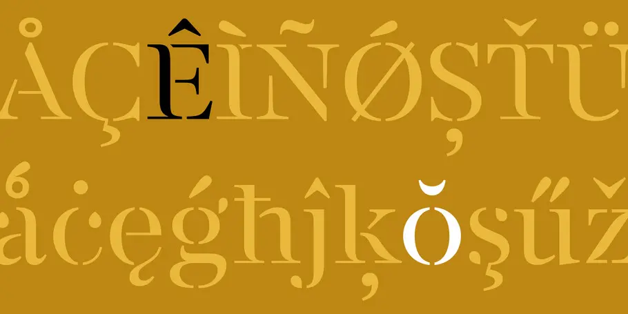
Pedro: The base is a transitional serif — but with the add-on of being kind of a stencil. From a more sensorial point of view, I would say that FS Renaissance is a display typeface of elegant contours and ageless demeanour. There is something magnificent about it. Paraphrasing Napoleon: from the heights of these letter-shapes, five typographic centuries look down on us.
What are your favourite elements of the design?
Craig: I particularly love the finesse found across the letterforms. Each individual letter can be treated as a piece of artwork, beautifully crafted and elegant on its own merit. Combining them together creates a fine balance between design and art, something that I am hugely proud of.
Pedro: I am especially proud of the texture. Even though it’s a display typeface, texture is still important and here there is a beautiful balance between black and white, connected and disconnected elements, and design and art.
What makes this typeface different from other display fonts on the market?
Pedro: For me, it’s the simplicity of the formula. I usually don’t like stencil typefaces but this is a different thing; the cuts are not rigid, here the typeface is dancing with the light. That results in a very unique, intrinsic elegance.
Craig: I totally agree with Pedro here (except I love a stencil typeface!) that the simplicity in the formula makes it work so well. The combination of shapes used to create an individual letterform results in a beautiful piece of artwork itself.
Q: What can it be used for?
Pedro: Headlines, posters, covers … anything where it’s necessary to show grace and delicacy, and express sophistication and refinement. Or the total opposite; since FS Renaissance is an irreverent approach to stencil typefaces, it can be used as an element of contrast in a more brutalist design.
What does it pair with?
Pedro: A sans or serif for the body text would be fine. However, the ideal companion for FS Renaissance would be a very geometric sans to emphasise the sense of typographic purity.
Why is it named FS Renaissance?
Craig: The genius of Leonardo da Vinci has always inspired me, a man who excelled in many fields. He was a painter, sculptor, botanist, mathematician, and so much more. He invented prototypes of flying machines, he studied human anatomy, and he achieved great (and clearly lasting) fame during his own lifetime.
What set da Vinci apart from the other men? One piece of the puzzle is that he was an absolute genius. But the fact that he tirelessly pursued his interests is what led to his many accomplishments in life and his legacy as a Renaissance man.
Da Vinci’s legacy has inspired modern man and thinking.
Being a modern-day Renaissance man doesn’t mean you have to be an accomplished poet or master sculptor. Rather, it means being as open to the world as possible and embracing all opportunities as they come your way. It means keeping your mind sharp and your body in good shape, for the mind needs a healthy body to achieve its full potential. It means learning as much as you possibly can. It means traveling and seeing the world, experiencing its people, and learning its language. It means not being afraid to be who you are and feel comfortable in your own skin.
These characteristics influence my own nature and I wanted to represent this through a typeface.
Can you explain a bit about the idea behind the launch concept? Craig
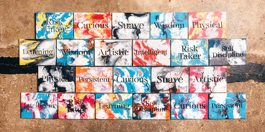
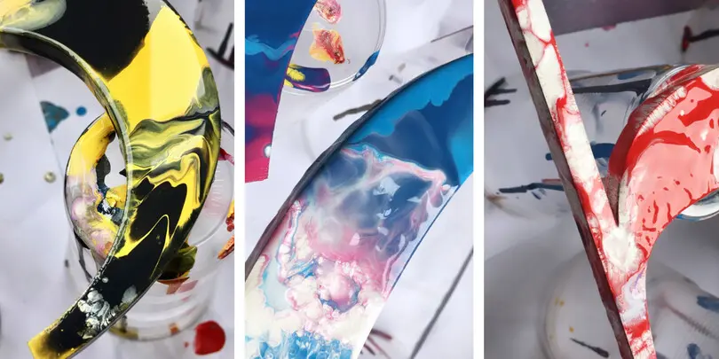
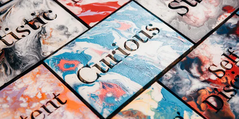
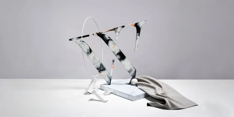
Craig: I was influenced by the paintings, sculptures and architecture of the Renaissance period. The shapes and combination of colours work so seamlessly together to create a beautiful balance and this motivated me through my acrylic fusion painting technique. I wanted to represent this period through my own interpretation of typographic sculptures and fusion of colours. It was important to combine the world of design and art and showcase how they can influence one another, so these typographic sculptures were created as a piece of artwork in their own right.
When admiring the artwork of the Renaissance period, I was always wondering, “how did they do that, how was that created?” especially considering the era in which they were created. This questioning got me thinking that the Renaissance man was so far ahead of their time and I wanted to represent this questioning through my own artwork. I aimed to create everything by hand as much as possible, just like the artworks of the Renaissance period, and make people question the composition of the typographic sculptures and how they were created.
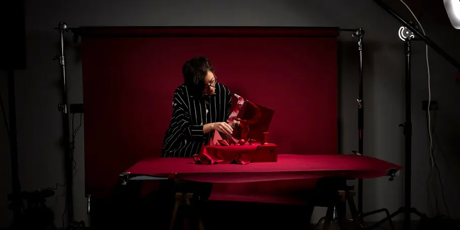
That is why I collaborated with the wonderful Susan Castillo who is an exceptional photographer. Her style and attention to detail worked so perfectly for this project and she really did bring this questioning thinking to life.
FS Renaissance is now available from MyFonts and through our Monotype Fonts platform.
Related content.

Fontsmith arrives in the Monotype library.
Fontsmith’s roster of typefaces, along with its years or experience and expertise, are part of the Monotype library and available for all Mosaic customers.


What are font superfamilies and why do we need them?
Font superfamilies are vast collections of type that can meet a multitude of needs without compromising on consistency. But what defines a superfamily, exactly?