


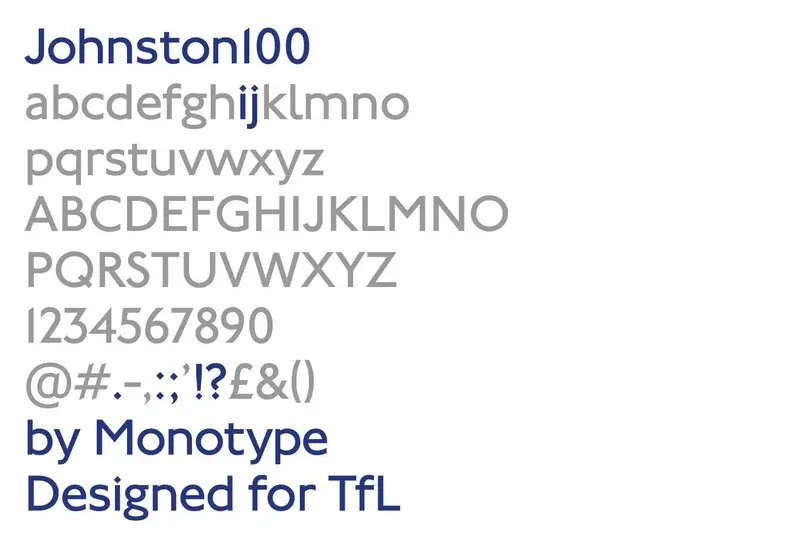
Introducing Johnston100, the language of London.
Transport for London commissioned Monotype to remaster the 100-year-old Johnston typeface.
For a century the Johnston typeface has been the typographic voice of London, helping to define the visual character of the city’s transport system.
First commissioned in 1913, British artist and calligrapher Edward Johnston was tasked with creating lettering with “bold simplicity” that would have clear roots in tradition, but wholeheartedly belong to the 20th century. The designer drew just one weight of the typeface, basing its proportions on the seven diamond-shaped strokes of a pen – which re-appears in the tittle of the ‘i’ and ‘j’.
Distinctive diamond-shaped ‘tittles’ on the ‘i’ and ‘j’
The design made its debut in 1916 and has remained largely the same for the last 100 years, most recently updated by Eiichi Kono for Banks & Miles in the late 70s for contemporary typesetting technology. Despite minor adaptations, Johnston has continued to define London’s character and visual identity, essential for tourists and locals alike. Its contribution to the graphic language of the city was celebrated this year as part of a centenary exhibition at The Ditchling Museum of Art + Craft in the UK, highlighting its place as an absolute classic of the type world.
New demands
Although Johnston’s lettering has undoubtedly endured its century of usage, the expansion of London’s transport system has put new demands on the typeface. With information conveyed across an ever-expanding range of outlets, from station maps to mobile apps, Transport for London (TfL) needed to expand and update Johnston without compromising the designer’s original intentions.

Johnston100 was commissioned to address the expansion of London’s transport system, from station maps to mobile apps.
“Our brief to Monotype was to go back to the original principles of Johnston, to reflect on the way the font is now, and see what we might have lost in its 100-year journey,” said TfL Head of Design Jon Hunter.
“We didn’t want to redesign it, but we did know that certain things, for various reasons, had changed,” he added. “Some of the lower case letters, for example had lost their uniqueness.”
The new Johnston100 family includes five weights of the design, including two brand new weights: Hairline and Thin. These two additions demonstrate the challenge of trying to strip a typeface of its mass and find its skeleton – both a design and research task. The result, especially the Hairline, is contemporary in flavor without undermining the characteristics that make it recognizable.
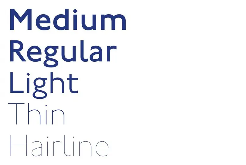
Johnston100 includes 5 weights, including the brand new Thin and Hairline weights.
Introducing idiosyncrasy
To maintain its identity, Monotype Type Director Nadine Chahine and Senior Type Designer Malou Verlomme carried out extensive studies of archive drawings to return to the typeface’s roots. Together they identified elements that had been lost over years of evolution – such as the distinctive diagonal bowl of a lowercase letter g, and a wider uppercase U.
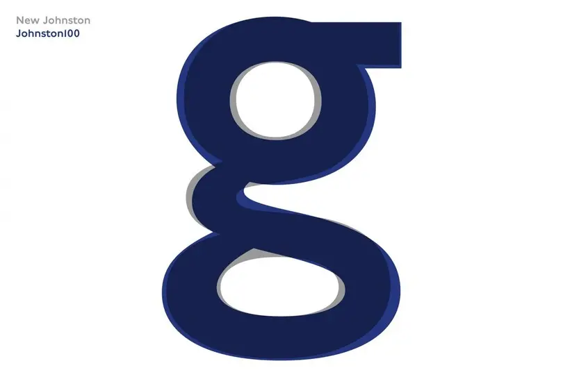
Johnston100 restores idiosyncrasies of Edward Johnston’s original design, such as the distinctive diagonal bowl on the lowercase ‘g’.
“The latest versions had started to become slightly mechanical, and a little bit uniform,” commented Chahine. “There were certain idiosyncrasies in the typeface that we thought were a little bit quirky, but they were good. If we can bring them back, then that might bring back some of that original soul.”
The designers also looked back at earlier TfL posters, which often emphasized the joy that could be found in taking the tube – something that’s become less prominent in today’s communications. By bringing back a slightly wider design, Chahine and Verlomme hope to reintroduce a sense of space to both the type and the experience of using the tube.
“It’s not about being mechanical and perfect,” added Chahine. “It’s about accepting it in all of its quirky little details.”
A constant companion
Johnston100 will be rolled out by TfL starting July 2016. Initially it will be used for printed material such as tube maps and posters, but over time the typeface will be used within TfL’s trains and station signage, including London’s new Crossrail Elizabeth Line – scheduled to open in 2018.
“We like to see our branding and our signage as an invisible member of staff,” said Hunter. “It’s like you have someone with you, holding your hand, along the way,” said Chahine. “That really helps as well because that typeface and that design language sets itself apart from everything else.”
The Studio team.
Related content.

A bespoke handwriting typeface for Sir Quentin Blake.
Monotype worked with noted illustrator Sir Quentin Blake and his team to recreate his handwriting as a bespoke typeface.

Type with heart for Southwest Airlines.
Monotype and Lippincott worked closely with Southwest Airlines to craft an authentic typographic voice that formed the center of a fresh new identity.
