


Good Type, part 1: Good type respects its elders.
Every font has a piece of history associated with its creation. Much as elements of ancient myth and folklore re-emerge in today’s popular culture, so do glimpses of designs from decades ago find their way into new fonts.
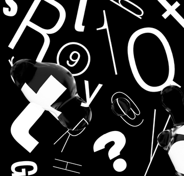
Fonts are alive with history
Even classics such as Bodoni hint at aspects of their predecessors, with the forms of earlier designs such as Didot, Fournier and Baskerville all an essential part of its DNA.
“We’re unconsciously dependent on each other for the raw materials and creativity we then repackage as our own thing,” says Monotype Director of Product Design Jamie Neely. “If you look closely at typography you’ll see more than just letters. Typefaces often reflect the mood of the time in culture, politics, design and fashion, and they also reflect, inspire and complete each other. That’s what drives the art form forward.”
So with type being created in a melting pot of visual and cultural influences, it’s no surprise that traces of the same forms and styles emerge again and again – sometimes in entirely new designs, and sometimes in revivals of historic typefaces.
Everything old is (eventually) new again
Rudolf Koch’s Kabel is a perfect demonstration of a typeface that’s been through several successive editions, but lost none of its unique character and charm – thanks to designers that respected its history. Originally created in the 1920s, Kabel’s first revision arrived in the 1970s when ITC ‘retuned’ the design, updating it for the demands of new technology but also nudging it closer to the aesthetics of the time. There’s still much of Kabel’s constructed, geometric appearance in this update, but it includes a little extra playfulness that the original lacked.
In 2017, the typeface was reshaped again by designer Marc Schütz, and Neue Kabel was released. As any good designer would, he delved into the archive to find Koch’s original drawings and ensure that his approach remained true to history. However, Schütz also included his own twist, restoring some liveliness that had perhaps been lost over the years, and adding italics and extra glyphs that would open Neue Kabel up for branding and editorial use. In the ultimate nod to its heritage, all of the historical alternatives of the original design are included, and OpenType allows designers to choose between Schütz’s round dots and the diamond shapes of the original.
Further proof that all fonts are – in one way or another – a remix, comes in Monotype’s own extensive collection of revived, restored and expanded designs. This ranges from Walbaum – a sensitively modernized and extended version of a 200-year-old design – to Metro Nova – an updated classic, rescued from museum archives. There’s also Monotype’s Wolpe Collection, which includes five renewed versions of typefaces created by Bertholde Wolpe, re-assessed for contemporary use and adapted accordingly.
All stand as proof that type’s history cannot, and should not, be ignored. The influence of classic designs echoes across generations of designers, and new releases continue to be inspired by, and add to, this rich heritage.
“It’s probably not talked about so much, but every time one of these remixes or revivals happens it inspires a new group of type designers, and a new group of graphic designers,” says Neely. “They take some raw ingredients from this and they package it up and create something of themselves, and so the cycle continues. Good type respects its elders.”
For more Good Type, check out part 2: Good type has a voice. Video recorded live at Adobe Max 2017.