注目の記事
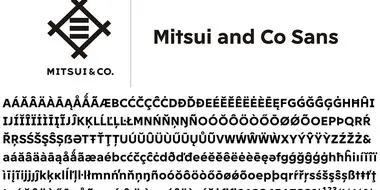
Shorai Sansは、幾何学的な形状が特徴のMonotypeの日本語書体です。Monotypeクリエイティブタイプディレクター小林章とタイプデザイナー土井遼太、そして書体デザインの第一人者、中村征宏氏を制作メンバーに迎え開発されました。


Today we’re welcoming Annie Atkins, a creative in the film industry (just like our last guest, Holly Fraser). She’s known for her graphic props and set pieces for Wes Anderson’s Grand Budapest Hotel and Isle of Dogs. Tune-in to learn about the magic of film.

In episode four we talked with Tré Seals, founder of Vocal Type, about his efforts to break down stereotypes in design and how a middle-school side gig, born out of a brush with serious childhood medical issues, helped him become the artist he is today.

Find design inspiration in an age of information overload.

We are thrilled to have Aaron Draplin on the podcast this week and to dig into the “heavy stuff” with him – existential musings on life and building a career, the importance of hanging on to your inner kid, and the “weird little spot” he’s in as he approaches 50 turns around the sun.

Today’s brands must keep up with a fast-paced digital world and navigate a “new normal” that’s still emerging from the worst of the pandemic. The last few years shifted everyone’s digital expectations, how brands operate, and in some cases, impacted their business models. Moreover, issues like biodiversity, sustainability, diversity and equity, and brand activism are all booming. So how does this all impact brand building? These macro shifts are greatly influencing how companies position themselves, the services they offer, and how they communicate with their customers.

From alternates to X-height, this list of typography terms and definitions covers just about everything you’d want to know about fonts and typography.

Font superfamilies are vast collections of type that can meet a multitude of needs without compromising on consistency. But what defines a superfamily, exactly?

In early autumn of 2022, EDIT invited Monotype to partner on one of London’s most anticipated rebrands, the refurbished National Portrait Gallery which is home to some of the world’s most iconic and progressive portraits. Read on for the full customer story.
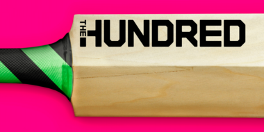
イングランド・ウェールズ・クリケット協会(ECB)は、新しい大会「ザ・ハンドレッド」の導入により、クリケットを再構築しました。Monotypeは、FutureBrand Londonと協力して、より幅広い観客を引き寄せるために大胆で自信に満ちたタイポグラフィのアイデンティティを作り上げました。

30年間にわたりHelveticaをブランドの書体として使用してきたBrainlabは、デジタルファーストの使用ケースに合わせ、独自のブランドDNAとヒューマンファーストが反映された近代的なデザインを求めていました。企業の個性、製品、および人々を反映するコーポレートフォントです。
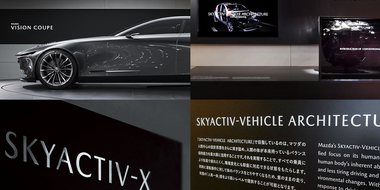
Monotypeは、世界的に愛される自動車メーカーの一つであるマツダ株式会社のクルマのオーナメントに使用する英数字フォントを制作しました。マツダ株式会社は1920年に創業され、スポーティで革新的な車両デザインと技術革新で知られています。グローバルに展開し、持続可能なモビリティの推進にも注力している企業です。
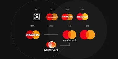
マスターカードはリブランディングの際に、ロゴから「Mastercard」という言葉を省くこと発表し、話題を呼びました。しかし、この決定は、ブランドが自らを表現する方法においてより広範なトレンドの兆候なのか、それとも単にマスターカードが変化する市場に対処しているだけなのか、どちらなのでしょうか?
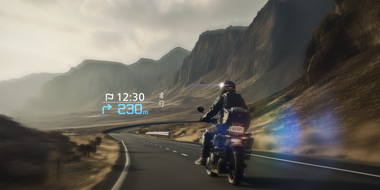
Monotypeの和文書体たづがね®角ゴシックInfoが、株式会社SHOEIのオートバイライダー向けスマートヘルメット「Opticson(オプティクソン)」のヘッドアップディスプレイの表示用書体として採用されました。
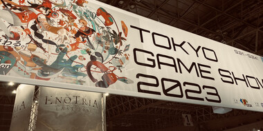
東京ゲームショウ2023(TGS2023)が、9月21日から24日の4日間開催されました。4年ぶりに完全開催となった幕張メッセの全展示ホールを使って、過去最多の44カ国の地域から787の企業や団体が出展。「ゲームが動く、世界が変わる。」をテーマに様々な角度からアプローチされた展示には国内外の多くの来場者でにぎわっていました。