Meet Placard Next, a poster typeface that’s packed with personality.

Placard Next is a reimagined version of a 1930s poster design, that takes all the original quirky details and refines them for digital use. Its condensed versions pack an instant typographic punch when used at large sizes, introducing some unusual flavor to posters, headlines and anywhere else designers need to make a statement.
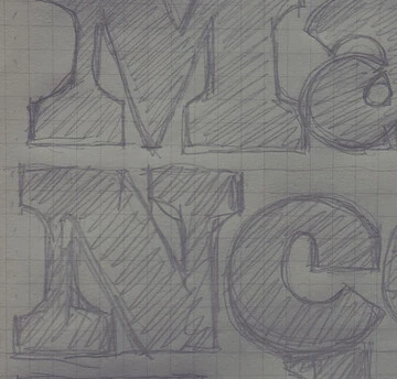
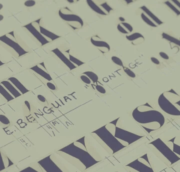
Type designer Malou Verlomme stumbled across the original Placard in the Monotype archive, and was instantly drawn to its quirky character. Details on its history are sparse, but the design dates back to the late 1930s and was a popular typeface when first released.
“It’s an interesting mix of different things,” says Verlomme. “It’s a condensed design, which is fairly useful and mechanical, but Placard has something more to it. It has an interesting, more playful shape – some diagonals are wedged, where you wouldn’t expect it, and other details are round where you’d expect things to be more mechanical and square.”

Featuring 48 fonts, the Placard Next family is a wonderful collection of display types with a wide range of options
Verlomme has redrawn Placard to create Placard Next, but maintained many of the distinctive details he was first interested in, including the signature single story letter a. His design covers four widths, each with six weights ranging from extremely thin hairlines to compact bold fonts. The compressed and condensed versions shine when set at large sizes, working particularly well for posters or in editorial environments.
“Placard Next is really a poster typeface, and if you set a few words in it, really big, it shouts at you,” says Verlomme.

Each has 4 widths: Compressed, Condensed, Regular and Wide. This allows you to make headlines fit into the size available.
For designers looking for a hint of the 60s and 70s, Placard Next Round introduces a slightly different flavor to the design, amping up the typeface’s character even further. As well as its possibilities for display, Placard Next Wide expands the typeface’s usability – offering up a more practical version that can be used for a huge amount of environments.
Verlomme has also considered how letter terminals align within words. “In the past I’ve heard graphic designers request this sort of thing, and I thought it would be interesting to try,” he says. “I’ve tried to create a typeface that can produce interesting word images right out of the box”

Placard Next works great on posters, ads, publications and anywhere you want to get attention.
Get Placard Next today
Placard Next and Placard Next Round each comes in 6 weights, from Hairline to Bold, in 4 widths. You can find it in Monotype Fonts, which gives you unlimited access to the full Monotype library.
