Ruq’ah - the new style.
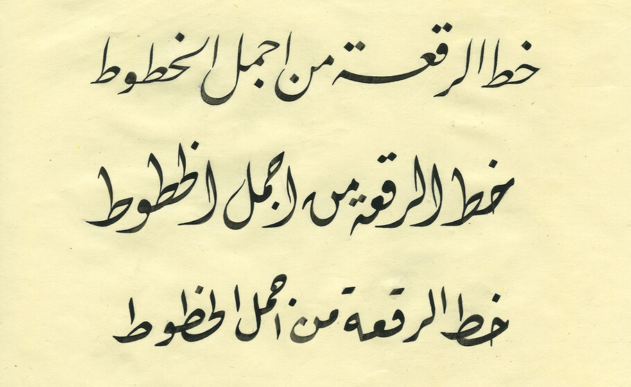
Monotype designer Gunnar Vilhjálmsson traces the origin of an Ottoman-turned-Arabic handwriting style, its historical development, and how it became ingrained in the visual landscape of the Arab world.
In the mid-19th century, in the Ottoman Empire Government offices in Istanbul, Ruq’ah was born. Before its arrival the government offices – called the Bab-ı Ali, or the Sublime Porte – used four different script styles: Ta’liq, Siyakat, Dīwānī and Jaly-Dīwānī. Each style had its own specific use, either for legal or fiscal documents, or in the case of Dīwānī and Jaly-Dīwānī exclusively used by the Ottoman Royal Chancery, and made purposefully complicated to ensure confidentiality and protect court documents from forgery.
To resolve the complexities of this four-style system, Ta’liq and Dīwānī were recreated as a single, new handwriting style – Ruq’ah, which shared the same diagonal word structure – the ‘hanging’ – as well as some other stylistic glimpses of its parent styles.
Stripped of all needless elongation, decorations or lifting of the pen, Ruq’ah is made to be fast and efficient. With individual letter-shapes reduced to the minimum horizontal and vertical strokes, it became the simplest form of the Arabic script. By estimation, this simplification saved the government scribes an average of two seconds in every word, meaning a saving of 16 minutes for a 500-word document.
Credit for the formalisation of Ruq’ah as a handwriting style is commonly given to a Bab-ı Ali calligrapher named Mümtaz Efendi (1810-1872); but it was another hand that canonised the style – that of Mehmed Izzet Efendi (1841- 1904). This ‘Izzet Efendi Ruq’ah’ was to become the version most commonly used.
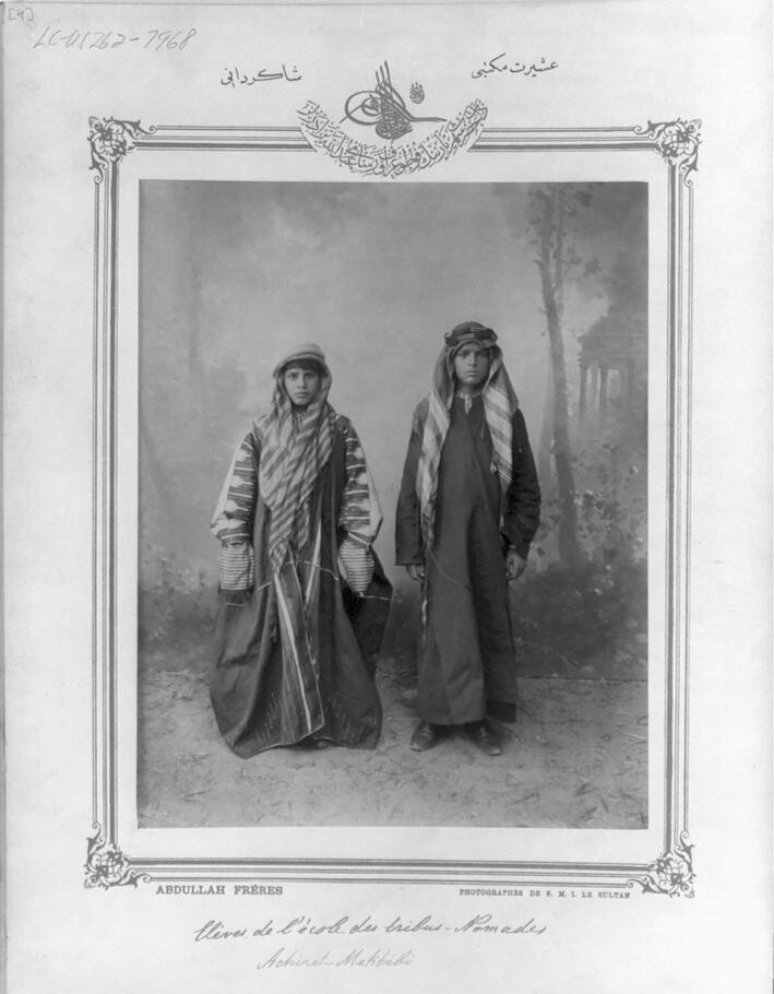
Students of the state - financed Ottoman schools learned to write in Ruq’ah style. Students from the Asiret School (Tribal school) in Istanbul, 1893.
Cultural impact
Aside from making life easier for the bureaucrats, Ruq’ah also had a wider cultural impact. Around the time it was created, there was a push to reform schools throughout the Ottoman Empire. At this point, the Empire consisted of a group of provinces that extended from North Africa and the Arab states up into the Balkans. State-financed schools of all levels were established, from elementary/lower secondary and upper secondary, to professional level. As public schooling reached every corner of the Ottoman territories, so more and more students learnt to write using Ruq’ah.
In their writing manuals students would begin by practicing writing dots and the first letters of the Arabic script: Alif (ا) and Bā’ (ب). Exercises would gradually become more complex to teach students proportions with the rhombic dot system, and later the cascading and contextual factors of the style, enabling them to write complete words and sentences.
It was this universal education, in addition to wide distribution throughout the Ottoman bureaucracy, which allowed Ruq’ah to become an integral part of everyday life for common people in the Empire. Still, today, the most exhaustive use of Ruq’ah is in handwriting and lettering. This is evident in the streets of cities in countries formerly under Ottoman rule, where the style is deeply rooted in the visual landscape.
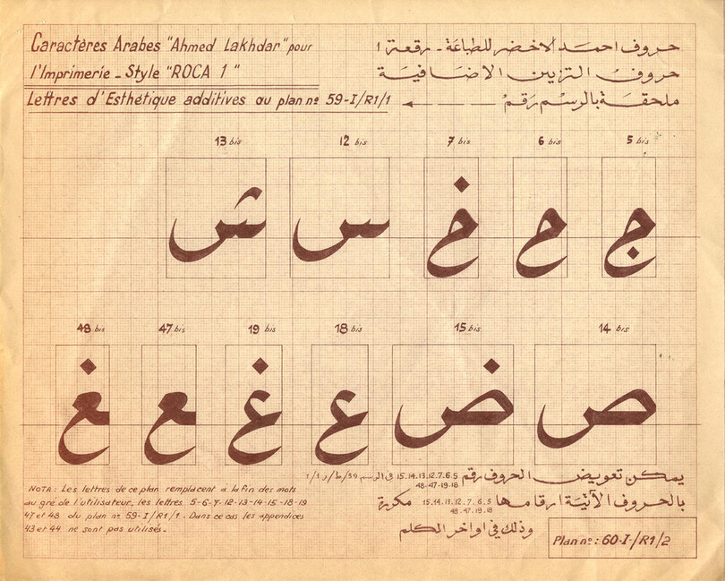
Lakhdar Roca was one of the mid-20th century attempts at adapting Ruq’ah to mechanical typesetting that never took off properly. Image courtesy of the Monotype Archive, Salfords
Elements of a new typographic style
At the turn of the 20th century various factors – an increase in literacy, freedom to publish and easier access to printing technology – contributed to a publishing explosion across the Ottoman Empire. With a flood of new books, newspapers and other publications came new roles for Ruq’ah as a secondary typeface in chapter headings, sub-headings, captions, content lists, body text and as bold emphasis. In much the same way that in 18th century Britain darker-looking types like Fraktur were used as bold companions for antique types, and Clarendons as companions to roman types in the 19th century, so Ruq’ah was used as a bold companion for Naskh-style typefaces. Both of these Arabic styles were normally written in small sizes in calligraphy, yet interestingly, in calligraphic documents those two would never have been used as companions. That means using them together was a fresh idea and the printers were inventing a new system of hierarchy and emphasis for Arabic typography.
This new typography was formulated in turbulent times for the 600-year-old Ottoman Empire. Shortly after it was dissolved in the aftermath of WWI, Mustafa Kemal Atatürk, president of the newly founded Republic of Turkey, set in motion a script reform, introducing the Latin alphabet and banning the use of Arabic script in the state. However countries formerly under Ottoman rule continued to print using Arabic script, sustaining the demand for cold metal Arabic typefaces.
History shows that, despite its simplicity as a written style, translating Ruq’ah into a functional typeface proved to be a challenge. An early attempt by the Armenian printer Ohannes Mühendis-oğlu in the late 1800s features some of the style’s defining attributes, but the limitations of cold metal typesetting and the complexity of Ruq’ah’s non-horizontal nature means the design has poor spacing and kerning. Further attempts in the 1950s were also undermined by the limitations of mechanical typesetting, meaning that although the shapes were in the spirit of the style, they lacked the defining elements of Ruq’ah.
In the early 1980s, the flexibility of phototypesetting opened up new possibilities in design for the Arabic script, by providing contextual interaction between letters. Linotype started work on a Ruq’ah tailored for its CR Tronic machines. Designed by Tim Holloway, it’s a beautiful take on the conventional Izzet Efendi model. But even though the technology was advancing, a solution to handle the multi-level and cascading features of Ruq’ah was only halfway there, and the design was simplified. Because of the limitations in presenting the peculiarities of the style, the typeface never gained acceptance by Linotype’s customers and was eventually taken out of circulation.
Perhaps the first satisfactory representation of the script as a typeface was around the same time, when DecoType introduced the Arabic Calligraphic Printer (ACE). The software was tailored around the complexities of typesetting Ruq’ah, built into the Microsoft OLE server and integrated into Microsoft Word. The design followed the Izzet Efendi model strictly, and the software later evolved into the innovative Arabic Calligraphic Engine. This was used to make fonts for the Adobe InDesign plug-in Tasmeem.
Arguably, the most technologically advanced Ruq’ah of recent years is DecoType’s design from 2011. Made with the ACE engine for Tasmeem, it is possibly the only typeface that exhaustively presents the style – by teaching the engine the rules of Ruq’ah, it can output every combination possible.
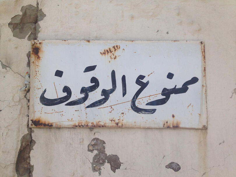
No Parking sign lettered in Ruq’ah, Beirut, Lebanon. Image by the author.
Other notable contemporary adaptations of Ruq’ah are Waseem and FF Amman. Waseem, one of the typefaces included in Apple’s Maverick OS, was designed by Hamid Al-Saadi for Diwan Software, first released in 2001 as part of its Arabic font collection. The beauty here is that only the skeleton is based on the traditional Izzet Efendi model, but the meat on the bones employs a distinctive, elegantly soft, felt-pen-like flavour. Using Apple’s AAT technology, Al-Saadi has presented the style impressively. FF Amman was designed as part of a rebranding of Amman, the capital of Jordan, in 2010. Here the designer Yanone proposes a fresh new role for Ruq’ah in typography, serving as a cursive italic companion to a Naskh style face, an idea mirroring that of FF Amman’s Latin counterparts. FF Amman has a monoline Ruq’ah hybrid and a more ‘calligraphic’ version, both available in multiple weights, making it the largest type family ever made in the style. The simplified design, in the spirit of Arabic hot metal typefaces and characteristics of personalised handwriting, gives it a distinctive overall pattern and appearance.
In his 1953 book Arabic Writing: A Practical Introduction to Ruq’ah Script, TF Mitchell notes that the style was used for the normal purpose of handwriting throughout the Arab world roughly east of Tripolitania (administrative division within Italian Libya). Today, although Ruq’ah is still a widespread and popular writing style there are only a few typefaces available.
Undoubtedly, the golden years of Ruq’ah were at the turn of the 20th century, when it played multiple typographic roles. Since then, these roles have been lost as a result of its unfulfilling relationship with technology and new ideas in Arabic typography. There’s irony to be found in the fact that a handwriting style destined to embody simplicity and efficiency has turned out to be one of the most complicated styles to adapt to the evolution of printing and font technologies.
This feature is extracted from The Recorder Issue 1. You can purchase The Recorder from our shop.


