Albertus® Nova
The Wolpe Collection.
The Wolpe Collection.
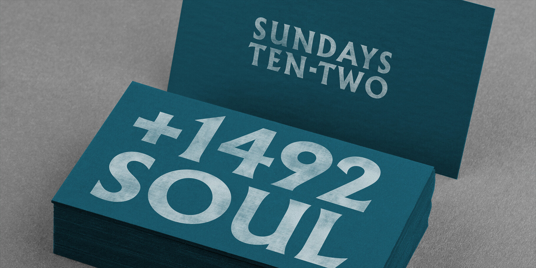
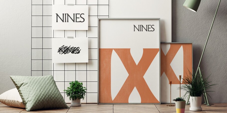
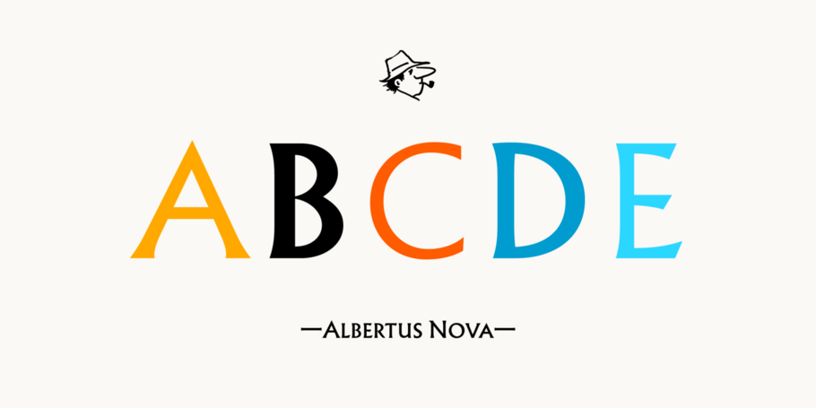
Albertus Nova is part of The Wolpe Collection of typefaces, and takes the best of the original Albertus design and expands the original character set with multiple weights, a set of small capitals and a number of alternate and original characters. The Wolpe Collection celebrates Berthold Wolpe’s outstanding body of work, and includes five iconic typefaces, digitized and updated by Toshi Omagari of the Monotype Studio.

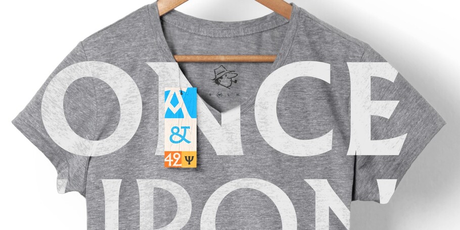


Albertus Nova is part of The Wolpe Collection of typefaces, and takes the best of the original Albertus design and expands the original character set with multiple weights, a set of small capitals and a number of alternate and original characters. The Wolpe Collection celebrates Berthold Wolpe’s outstanding body of work, and includes five iconic typefaces, digitized and updated by Toshi Omagari of the Monotype Studio.
In 1932, Monotype commissioned Berthold Wolpe to create the Albertus typeface. After World War II the City of London adopted Albertus as the font for all their street signs. Since then Albertus has been used on Sainsbury’s packaging, in cult-classic TV series, The Prisoner, on album covers of New Order, Coldplay, The Smiths and The Beach Boys, and on the crest of Liverpool FC.
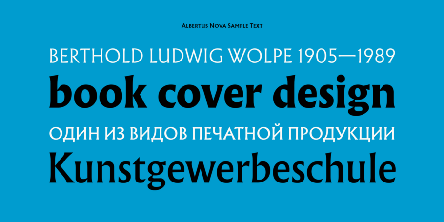
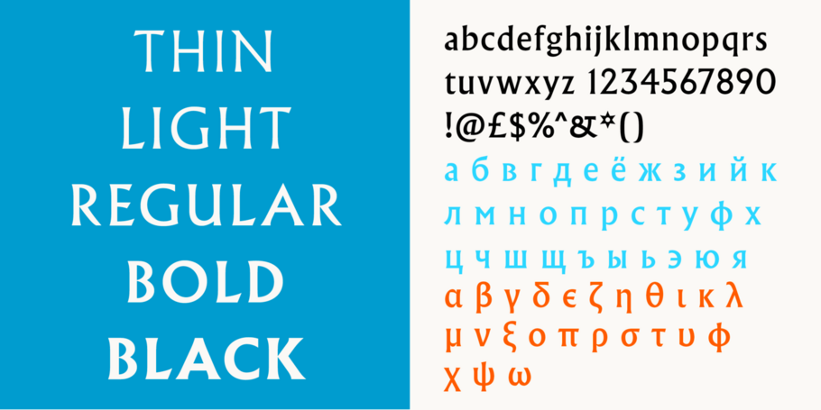
In the Albertus Nova typeface, Toshi Omagari has revived a number of alternate capital letters created by Berthold Wolpe that have been unavailable in the existing digital version. This includes the uppercase M, W, J, E, R and Q. He designed five weights - light, thin, regular, bold and black- as well as Greek and Cyrillic characters.
His main focus, though, has been on righting the wrongs, as he sees them, of the digitally available lowercase version of the Albertus typeface. The crude internal angles and planed-off curves of some lowercase characters, Toshi discovered, were introduced to compact Wolpe’s letterforms for metal typesetting and these decisions were carried into the existing digital format. Toshi has designed the Albertus Nova typeface for modern applications.

With a focus on multilingual typography, Senior Type Designer Toshi Omagari has created fonts for several major brands and worked on some of Monotype’s most recent major type releases. He is a regular speaker at events like ATypI, sharing his experience and insights on multilingual type design.
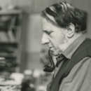
Berthold Wolpe helped shape graphic design in post-war Europe. His book jackets, with their intense colour and vivacious typography, were way ahead of their time, and his Albertus® typeface continues to be widely admired and used by designers today.
We offer a number of ways for you to start working with our typefaces.
Monotype worked with noted illustrator Sir Quentin Blake and his team to recreate his handwriting as a bespoke typeface.
One of the best rebrands of 2016, the new Premier League identity features a typeface that performs confidently from screens and jerseys to TV and league tables.
